Curtin University’s Alan Tapper, Alan Fenna and John Phillimore have released a fantastic research paper (below) examining the extent to which welfare policies across the period 1984 to 2010 have favoured the elderly at the expense of the young.
Their three main findings are that
Advertisement
there has been a substantial shift over this period in favour of the elderly;
this trend has accelerated rapidly in recent years under both the Howard and Rudd Governments; and
as a result of this accelerated trend, elderly households today are on average well off by comparison with younger households.
Below are some key extracts from this report, which are particularly eye opening considering that Australia is facing an ageing population (with the proportion of workers to the elderly projected to shrink), and many younger Australians are already ‘locked-out’ of home ownership due to escalating housing costs (which have broadly benefited the older generations).
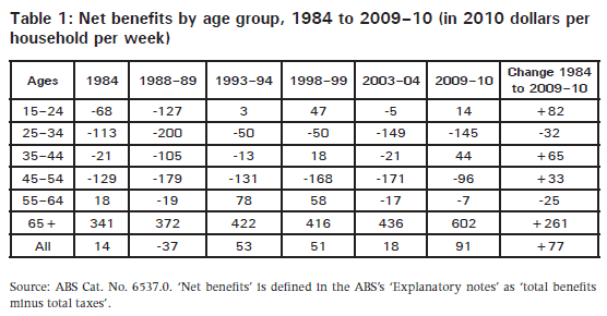
If we compare each age group with the trend for all households, two things stand out. First, there are large losses to two age groups: those aged 25–34 (down $109pw compared with the general trend) and those aged 55–64 (down $102pw); and there are large gains to those aged 65 and over (up $184pw). Support has swung sharply towards the end of life.
In Figure 1, we compare final incomes in these age groups across 26 years. The general trend (not shown in Figure 1) is flat for the first decade, rises slightly in the second, and rises sharply in the last six years; overall there is a 59 per cent gain. The relevant question is whether the five age groups rise or fall relative to that general trend. The youngest groups, 15–24, 25–34 and 35–44, gain by 44 per cent, 45 per cent and 47 per cent respectively. The middle age group, 45–54, gains by 50 per cent. The 55–64 age group remains rather flat in the first two decades, then leaps dramatically in the last period, gaining 75 per cent overall. Similarly, the elderly group, 65 and over, gains in the last five years, rising 98 per cent overall. Thus, the older groups gain relative to the general trend, while younger households fall relatively. The swing favouring the elderly is largely a feature of the 2000s.
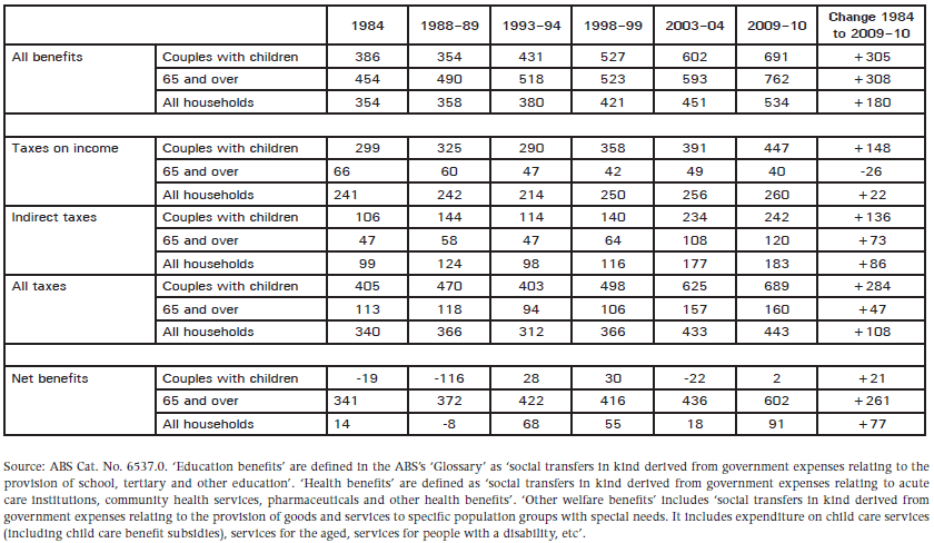
How should we interpret the trends in the age group data? In Table 2 we look at the break-up across time of taxes and expenditures for three household types. We include couples with dependent children, since they are one useful benchmark against which to compare the fortunes of elderly households. For a broader and more basic benchmark, we also compare the elderly with ‘all households’.
Table 2 shows how changes in taxation have played an important part in changes in net social support. Income tax has both grown and shifted target. In 2009–10, those 65 and over paid $40pw in income tax, less than was paid in 1984; while a couple with dependent children paid $447pw, 50 per cent more than in 1984. For all households, income taxes grew by only eight per cent in that period. Indirect taxes have also grown and shifted target in a similar manner. They have grown for the elderly, but not as much as for all households, and markedly less than for couple families. Overall, taxes on the elderly grew by 42 per cent, on couple families by 70 per cent, and on all households by 30 per cent. Taxation changes have disadvantaged couple families. The elderly have also increased their share of taxation, but by a considerably lesser fraction.
On the benefits side, we can see that both the elderly and couple families gained very considerably when compared with all households. The biggest single factor here was health care expenditures, which have both grown overall and swung in favour of the elderly. In 2009–10, those 65 and over received on average $316pw in health benefits, while the average for all households was $181pw. Compared with 1984, the share for the elderly nearly tripled, while for all households the increase was 100 per cent (for couple families it was 80 per cent)…
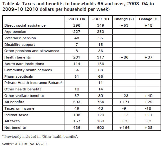
The factors operating here are varied, as Table 4 shows. While taxes stayed steady, social expenditures were growing substantially. Overall benefits per elderly household grew by 29 per cent. The largest growth was in health expenditure, up by 37 per cent…
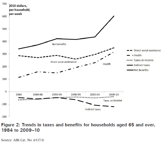
Figure 2 shows the overall history of taxes and benefits for elderly households. What stands out is the recent surge in net benefits, which took place mostly under Coalition government. Critics might argue that in this period the long Australian tradition of relative restraint on expenditure on the elderly, under both Labor and Coalition, was here abandoned…
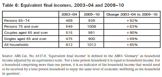
We might suppose that increasing support for the elderly is an expression of increased recognition of need. To test this claim we need to be able to rank ‘neediness’. This can be partly done in terms of ‘equivalent final incomes’… Table 6 shows the equivalent final incomes of the elderly and all households. Note that this table exaggerates the increase in EFI between the two surveys, because here the EFI for 2003–04 has not been adjusted by the CPI. The point of the comparison is not the relative change between 2003–04 and 2009–10 within each group, but the gains and losses of the different groups relative to each other in this period.
…the most interesting comparison is that with all households. Rapid gains to the elderly in this period have brought them close to the EFI for all households. The gap in 2003–04 stood at about 21 per cent (based on an estimate that the EFI for all elderly households was about 505). In 2009–10 it had fallen to only about five or six per cent (estimating that the elderly EFI was about 960)…
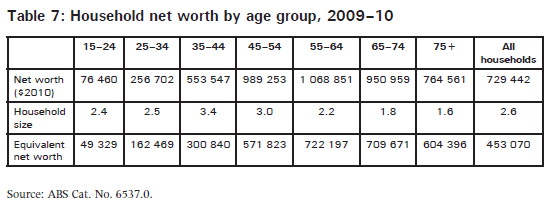
As Table 7 shows, wealthier households are older households. Net worth peaks at around age 60. A sharper picture is obtained if we take household size into account using equivalence scales. Here we have used the square root of household size (a method that approximates quite closely to the ‘OECD modified’ scale used by the ABS to calculate equivalent final incomes). The resulting ‘equivalent net worth’ indicates that even households aged 75 and over are one-third better off than the mean for all households, while households in the 65–74 age group are 60 per cent better off than the mean…
Given that equivalent final incomes for the elderly are now close to the average for all households, and that the net-worth distribution is skewed in favour of older households, we can reasonably infer that an integrated measure would show that households headed by persons 65 and over are better off than the average for all households under that age.
If all this is right, the Australian system of social transfers to the elderly is much more than a safety net. Viewed in ‘lifecycle’ terms, it shifts resources from the income-rich but asset-poor stages of life to the asset-rich but income-poor stage. Viewed in terms of the ‘vertical’ dimension, it is a system of upwards redistribution from the less well off to the better off…
Back in March, I wrote how the developed world is facing an inter-generational war as the ageing of the population and transfer payments to the elderly (paid for by a declining tax base) threatens economies and creates social tensions. This report from Curtin University highlights the extent of the issue in the Australian context.
Leith van Onselen is Chief Economist at the MB Fund and MB Super. He is also a co-founder of MacroBusiness.
Leith has previously worked at the Australian Treasury, Victorian Treasury and Goldman Sachs.