Find below an interesting series of charts from Wilson HTM:
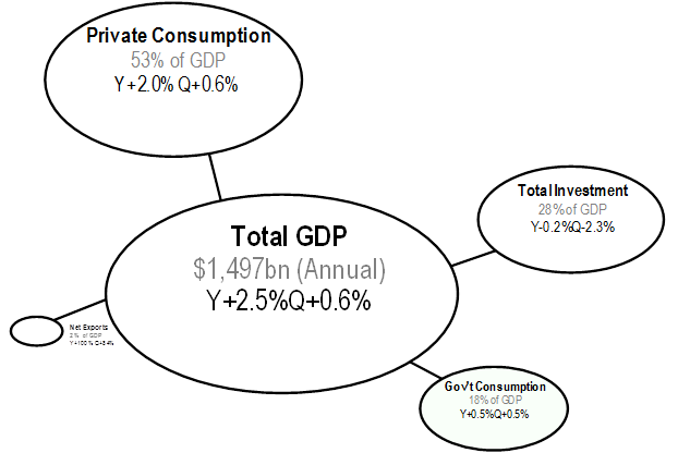
Step 1.
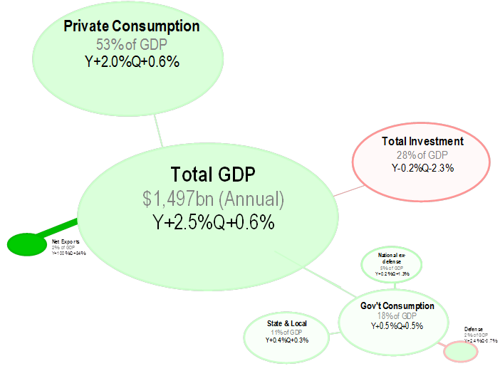
GDP = Consumption + Investment + Gov’t + Net Exports
We can express this as bubbles – each bubble showing the size of the components
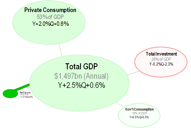
Step 2.
Add some colour.
The background of the bubbles shows the growth rate from dark green (strong positive growth) to dark red (strong negative growth) with white being neutral (no growth).
The line around the box shows the quarterly growth – eg below you can see that the line around the investment bubble (pun intended) is a lot darker than the background, indicating that the quarterly growth rate is a lot more negative than the annual growth rate.
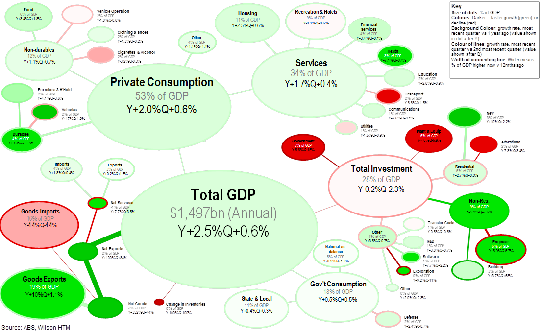
Step 3
Note the thickness of the connecting lines, which shows how the sector has changed as a % of GDP. For example above the investment has a thin line and is shrinking as a % of GDP while Net Exports has a thick line indicating that it has grown dramatically.
Step 4
Add in subsectors. In this one I have added in details on government consumption – you can see that defense spending shrunk on a quarterly basis but has grown over the year.
David Llewellyn-Smith is Chief Strategist at the MB Fund and MB Super. David is the founding publisher and editor of MacroBusiness and was the founding publisher and global economy editor of The Diplomat, the Asia Pacific’s leading geo-politics and economics portal.
He is also a former gold trader and economic commentator at The Sydney Morning Herald, The Age, the ABC and Business Spectator. He is the co-author of The Great Crash of 2008 with Ross Garnaut and was the editor of the second Garnaut Climate Change Review.