The history of Australian property values (part 2)
Back in February, Phil Soos created an epic chart pack on 150 years of the Australian housing market. Now Philip is back with part 2 of his chart series. Philip is a research Masters candidate at the School of Management and Marketing, Faculty of Business and Law at Deakin University, and is a researcher for the Land Values Research Group, Melbourne.
Presented here is another comprehensive chartpack illustrating the Great Australian Land Bubble.
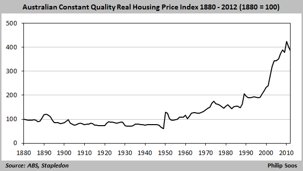
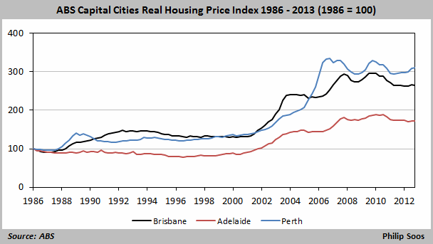
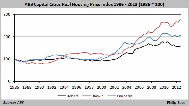
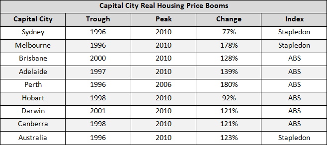
The most obvious indicator of a housing bubble is the long-term trend in housing prices, adjusted for inflation and quality. Prices increased by 123% between the trough in 1996 and apparent peak in 2010.
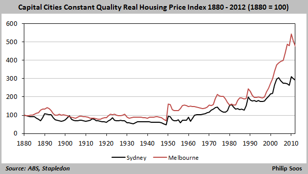
Between 1996 and 2010, real prices increased by 77% and 178% for Sydney and Melbourne, respectively. The growth in housing values for the latter city has far outstripped the former, which may be the result of Melbourne’s lower housing prices at the outset, allowing for higher prices before the interest repayment burden hits a wage-financed ceiling.
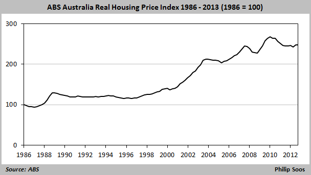
This is the “recovery” the spruikers are foaming about: housing prices tracking the rate of inflation. Further, the ABS index does not control for increases in the quality of the housing stock which would result in a .5 – 1% downward adjustment on an annual basis and does not take into account townhouses, apartments, and units.
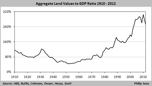
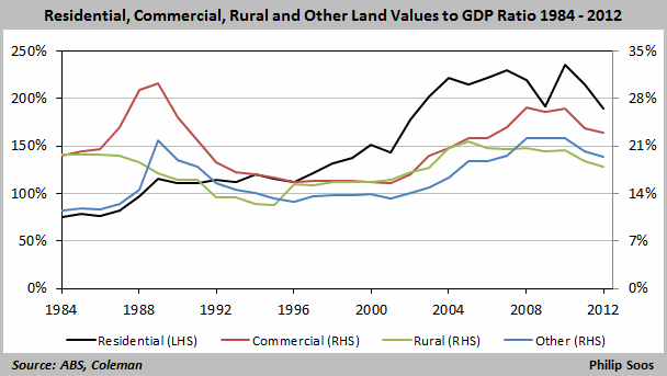
More specifically, the housing bubble is a land bubble.
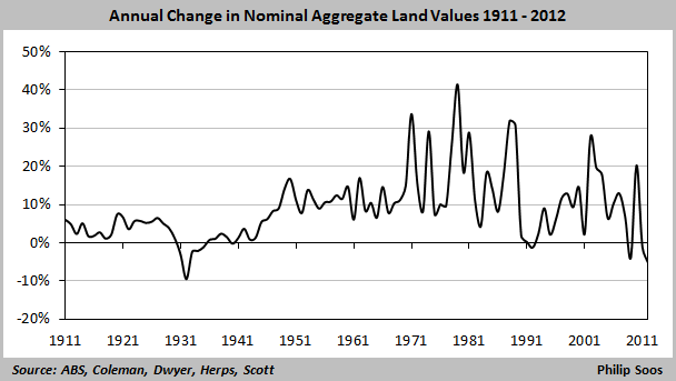
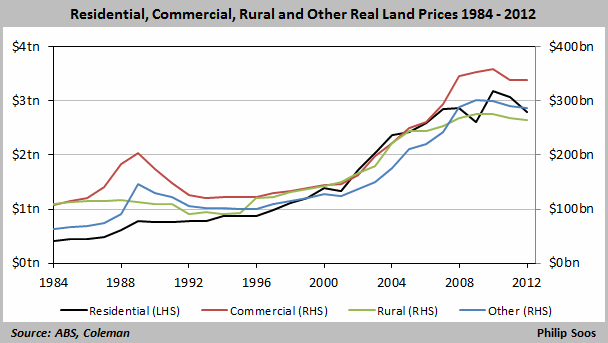
Strong falls in nominal land values have proven to be extremely destructive, especially when growth turns negative. The worst on record was during the Great Depression, and the 1990s fall resulted in a recession and the worst financial fallout since the 1890s depression. It again dipped in 2009 due to the effects of the GFC, and is currently at the lowest point in history bar the 1930s.
The entire land market is now worth $3.7 trillion, with residential land at $2.8 trillion.
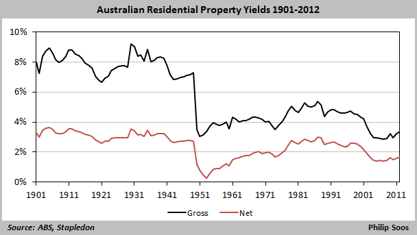
The residential land bubble has resulted in abysmal gross yields, falling to a record low in 2007.
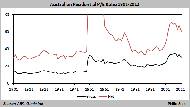
The price to earnings ratio for residential property indicates severe overvaluation. Just as economists and the “experts” ignored this fundamental metric during the Dot-Com bubble in 2000, it is treated the same today.
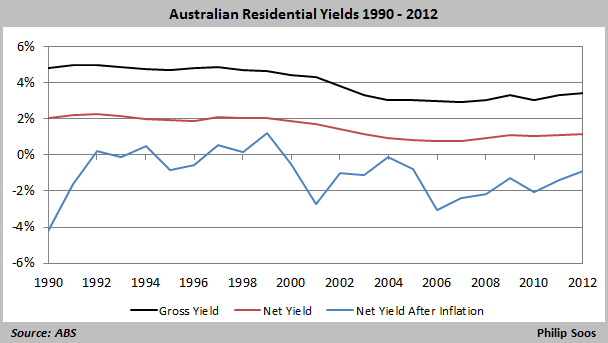
ABS estimates of residential yields show negative returns, only made tolerable by gains in real housing prices.
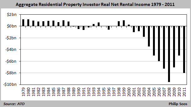
The latest ATO taxation statistics shows property investors have made their second-largest loss in history in 2011.
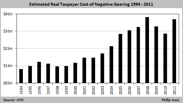
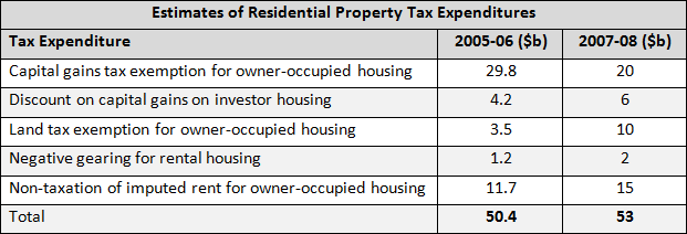
In 2011, the estimated cost of negative gearing as a tax expenditure was $3.7 billion.
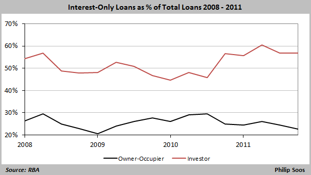
The level of interest-only loans demonstrates the speculative impulse of property owners.
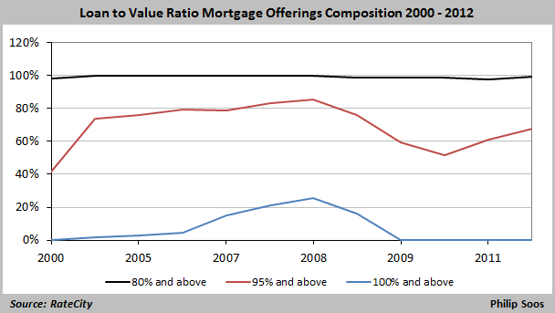
That 26% of all loans on offer had a loan to value ratio of 100% and above in 2008 illustrates the reckless nature of the banking and non-banking financial lenders.
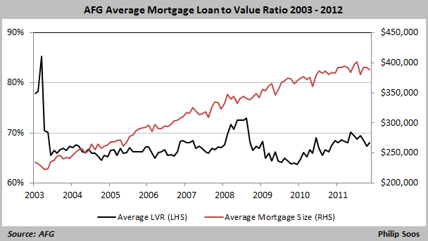
The average LVR has remained at around 65 to 70% while housing prices have boomed, explaining why the average loan value recently reached $400,000 across Australia.
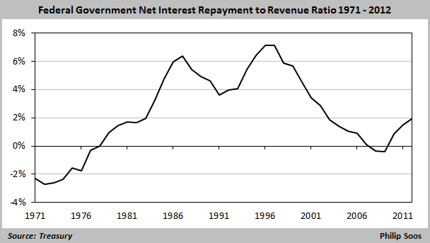
Despite the utter drivel disseminated today about public debt blowing out of all proportion, it is easily sustainable.
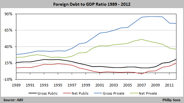
Public foreign debt is likewise at low and manageable levels, unlike private debt.

