

As noted yesterday, the White House on Friday released the Economic Report of the President, which is a 456-page report compiled by the White House Council of Economic Advisers assessing the major forces driving the US economy.
The report contained a bunch of great charts on the US budget deficit and some of the forces expected to shape it over coming decades.
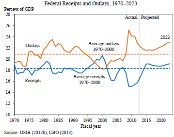
First, the below graph shows federal receipts and outlays from 1970 to 2023:
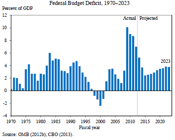
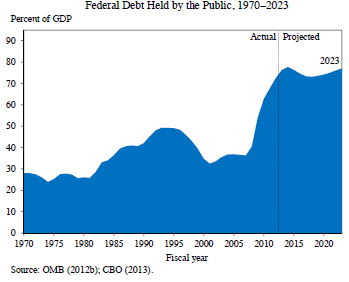
And the next charts show the Federal budget deficit as a percentage of GDP:
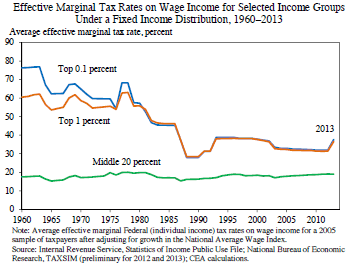
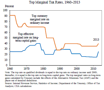
One of the reasons why budget revenues have flat-lined that effective marginal tax rates on high income earners has fallen sharply over the past 50 years:
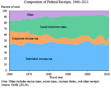
The share of tax receipts from corporations has also tanked, offset by an increase in social insurance taxes:
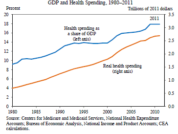
One of the factors that has contributed to the increasing budget outlays is rising health care costs, which have rocketed over the past 30 years:
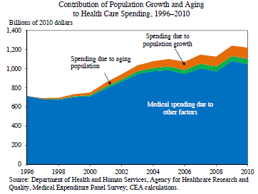
But only some of these rising costs are due to population ageing:
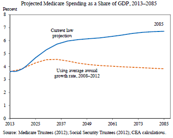
Nevertheless, projected Medicare spending is projected to nearly double as a percentage of GDP:
unconventionaleconomist@hotmail.com
