The Reserve Bank of Australia (RBA) has released its monthly Chart Pack – “a set of graphs that summarise macroeconomic and financial market trends”. Let’s have a closer look at a select few interesting and relevant charts for MacroBusiness readers.
World Economy
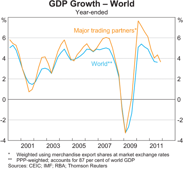
Its pretty simple folks – growth, whilst positive, is slowing down. This series of charts if fairly self-explanatory, but the first, showing both world GDP and our major trading partners shows a distinct deceleration:
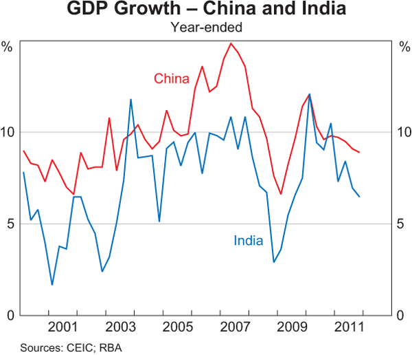
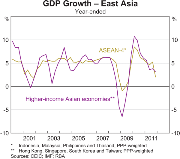
The areas slowing down? Asia and emerging economies, with China attempting to pull off a soft landing, which is seems to be achieving so far:
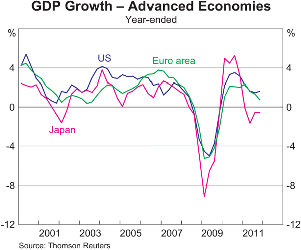
Surprisngly, or perhaps not given the tremendous use of liquidity, and in the case of the US, huge deficit spending, the advanced economies are looking slightly better on a GDP basis:
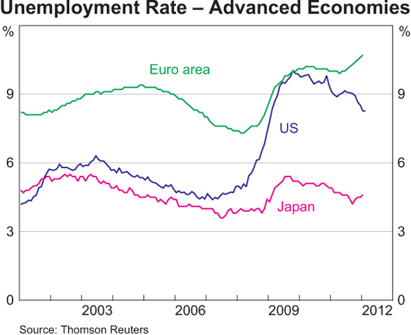
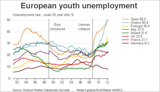
Europe is seemingly heading for inevitable recession, whilst US growth has ticked up alongside Japan. However what remains the most important economic problem? Government Debt? No. Inflation? No. Unemployment? Yes:
You can also plainly see that the very tight U-3 measure for the US has improved marginally, but still at multi-decade highs around 8%. If a recovery is underway and continues at this pace it will likely be the end of the decade before unemployment, in the US at least, “recovers”. But Europe looks set to having a lost generation of youth who may not know what having a job is like – current youth unemployment is around 30-50% around the continent.
UPDATED: h/t Delusional Economics
Australian Economy
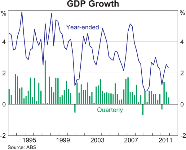
I hope new readers can understand the trend in Australian economic growth with this chart, which we’ve highlighted before on MacroBusiness as well below trend, on a per capita basis and after tremendous stimulus.
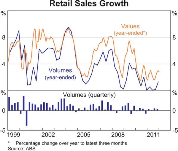
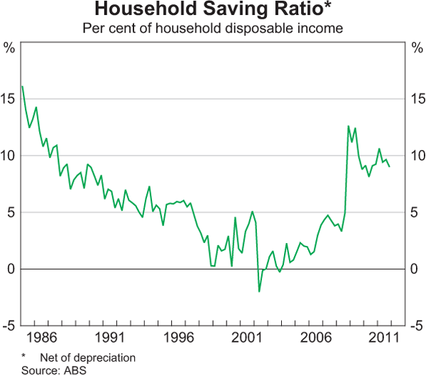
By the way, almost every market economist recently surveyed reckons this year and next will see GDP growth at 3% or more – iff the economy is to lift itself out of this stupor, in the “biggest boom in the century”, then you’ll need to go start spending and stop saving:
Are we all starting to finally see that its not the Holes, but the Houses. Here’s the latest ABS Dwelling Price Index (they’ve changed back this month to nominal prices):
This is an obvious double dip in house prices going on. Look to the left with the dip in 2008/9 – what was required to boost it back to the most recent highs? Can anyone remember?
- 1.2 million or 5.7% increase in population
- $270 billion increase in housing debt
- $42 billion in government stimulus
- 300 basis point (3%) reduction in cash rate (total 400 points peak to trough)
Think we can do this again?
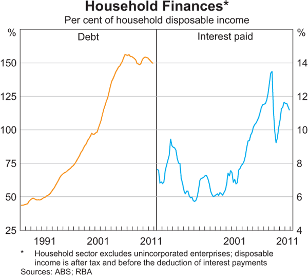
Moving on, the reason we are all “wealthy” – amongst the highest indebted countries in the world, having tripled our debt load and paying approx. 30% more on interest on the household budget than at the height of the 17% mortgage rates of the last recession:
For some reason, this chart doesn’t seem to be wildly read by consensus market economists. Interesting no?
Interest Rates, Credit and Money
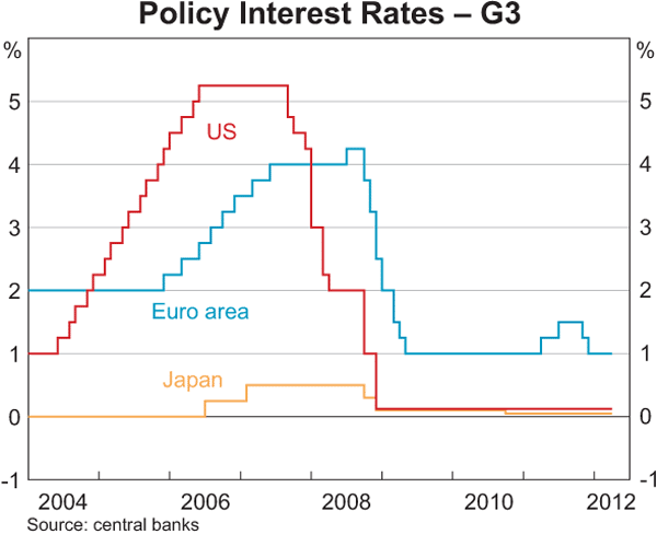
With all the hoopla yesterday over the RBA’s decision to hold rates, let’s put this in context. First, the interest rates faced in US, Euro Area and Japan, zero or near enough not to matter:
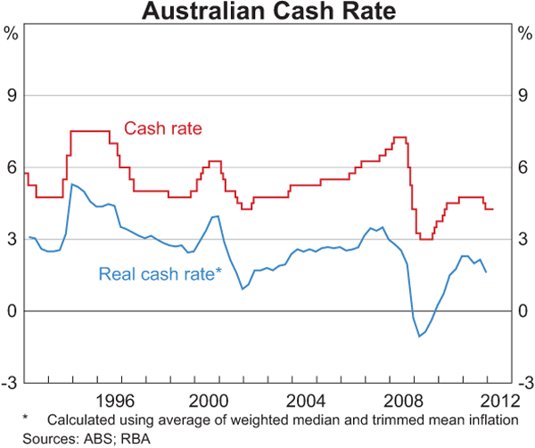
Now in Australia, and adjusted for inflation (i.e the real rate), you can see the offical cash rate is back to near 2001 emergency levels, but not as low as 2009 levels, yet nowhere near the countries of above – is this our path?
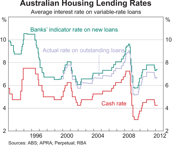
But what matters now is not the RBA rate, but the standard variable mortgage interest rate provided by the banks. Why? More than a trillion dollars in household debt is why. As the Unconventional Economist pointed out recently, even a 25 basis point (0.25%) move in interest rates can have a dramatic effect on household sentiment.
I’ve made this chart full size for a reason (to Editor: leave alone!) – notice how the RBA has kept the official cash rate steady (red line), but the actual rates have ticked up and are at 2004 levels, when household debt was approximately half the current size:
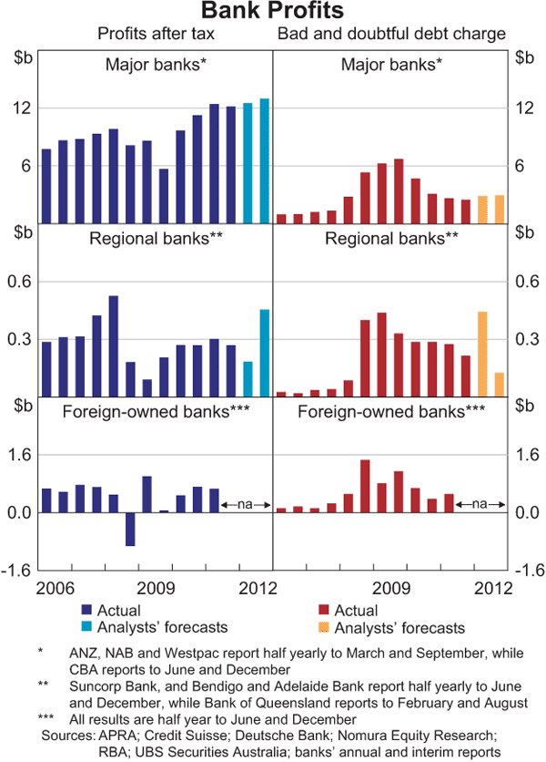
Why is this so? To protect profits of course.
