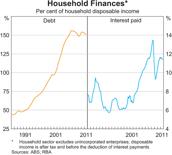
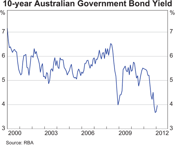
The Reserve Bank of Australia (RBA) has released its monthly Chart Pack – “a set of graphs that summarise macroeconomic and financial market trends”. After this mornings quite disappointing GDP results, let’s have a closer look at a select few interesting and relevant charts for MacroBusiness readers.
World Economy
First, what will likely be our future largest export partners and arguably the two rising superpowers in Asia: China and India.
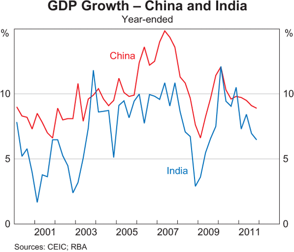
India’s economic growth, while positive and high, continues to decelerate, whilst China appears to be in the same boat, although the deceleration is a bit slower the path to “sustainable” growth, even at 7.5% is murky.
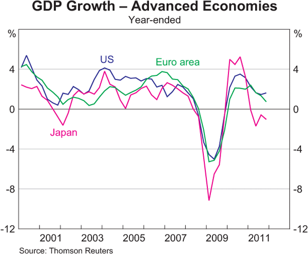
Contrast that with the developed economies growth which although positive is well below the boom era of the last decade, and the standout is the USA (which is growing faster than Australia – WTF?) Japan remains in the doldrums, whilst Europe is heading to inevitable recession (printed -0.3% last night):
What is still the most important economic problem in Europe? Debt? No. Inflation? No. Unemployment? Yes:
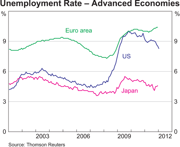
You can also plainly see that the very tight U-3 measure for the US has improved marginally, but still at multi-decade highs around 9%. If a recovery is underway and continues at this pace it will likely be the end of the decade before unemployment, in the US at least, “recovers”. But Europe looks set to having a lost generation of youth who may not know what having a job is like.
Australian Economy
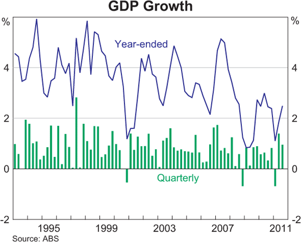
I hope new readers can understand the trend in Australian economic growth, which the National Accounts revealed this morning to be WAY below trend – something that was obvious with anyone with a ruler, an understanding of credit growth and how a sovereign government’s spending affects the economy:
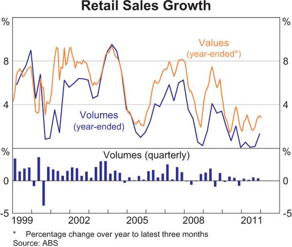
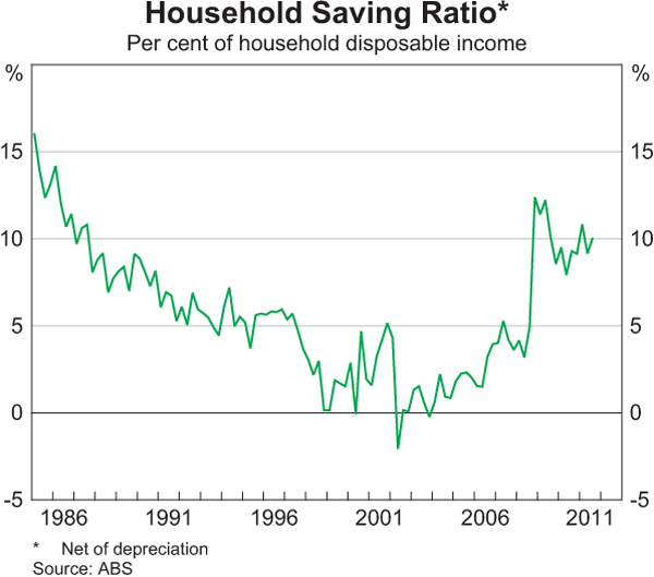
If the economy is to lift itself out of this stupor, in the “biggest boom in the century”, then you’ll need to go start spending and stop saving:
Finally, what really drives the economy? Are we all starting to finally see that its not the Holes, but the Houses. Here’s the latest ABS Dwelling Price Index (they’ve changed this month to a growth factor, not nominal prices):
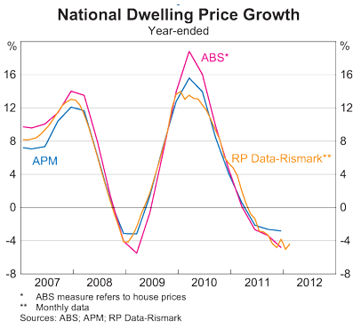 This is an obvious deceleration in house price “negative growth” – but look to the left with the same dip (but shorter in magnitude) in 2008/9 – what was required to boost it back up again? Can anyone remember?
 - 1.2 million or 5.7% increase in population
- $270 billion increase in housing debt
- $42 billion in government stimulus
- 300 basis point (3%) reduction in cash rate (total 400 points peak to trough)
Think we can do this again?
Moving on, the reason we are all “wealthy” – amongst the highest indebted countries in the world, having tripled our debt load and paying approx. 30% more on interest on the household budget than at the height of the 17% mortgage rates of the last recession:
For some reason, this chart doesn’t seem to be wildly read by consensus market economists. Interesting no?
Interest Rates, Credit and Money
With all the hoopla yesterday over the RBA’s decision to hold rates, let’s put this in context.
First, the interest rates faced in US, Euro Area and Japan, zero or near enough not to matter:
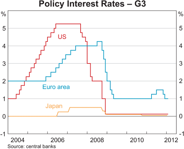
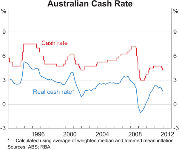
Now in Australia, and adjusted for inflation (i.e the real rate), you can see the offical cash rate is already quite low, but nowhere near the countries of above – is this our path?
But what matters now is not the RBA rate, but the standard variable mortgage interest rate provided by the banks. Why? More than a trillion dollars in household debt is why. As the Unconventional Economist pointed out recently, even a 25 basis point (0.25%) move in interest rates can have a dramatic effect on household sentiment.
I’ve made this chart full size for a reason (to Editor: leave alone!) – notice how the RBA has kept the official cash rate steady (red line), but the actual rates have ticked up:
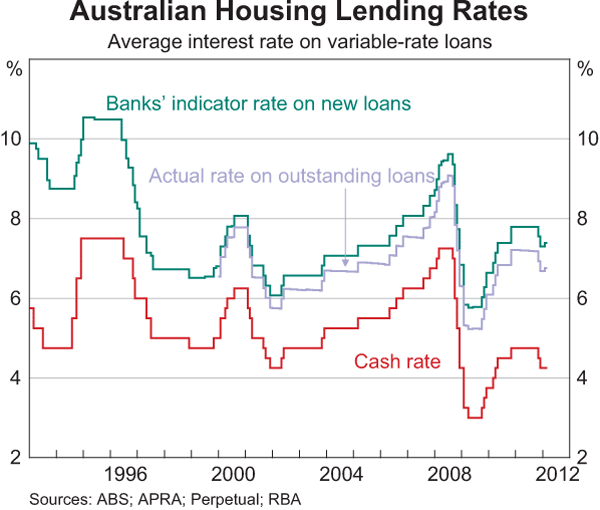
Why is this so? To protect profits of course. The talk of “plenty of ammunition for the RBA to cut rates” is just that – talk. From this chart it is clearly evident that rates that households are actually paying are still above average over the credit boom cycle period, whilst the cash rate – apart from the GFC emergency setting – is at a low. Can this divergence be sustained?
Bonds
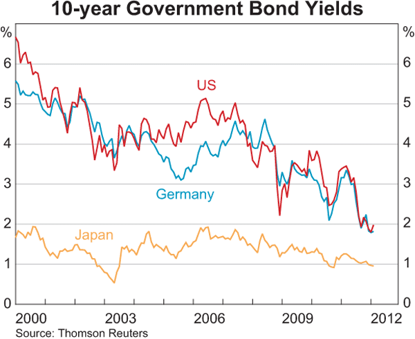
Finally, lets look at bonds. I cover these daily in my Market Morning posts as they are a true insight into the real financial health of economies. There is still a race to the bottom with the government bond bubble still showing no signs of abating. Here are the US, German and Japanese 10 year bond yields:
And the Australian, catching up to its brethren, and now well below the official cash rate (actually below 4% last night) with an inverted yield curve:
