
Please find below another guest post from MacroBusiness reader, Nathan Webb. Enjoy!
The monthly AFG Mortgage Index has been actively followed by Delusional Economics, owing to their extremely timely releases. They manage to get their numbers and analysis out to the public within a week of the end of the month. Impressive stuff! But what’s not so impressive is AFG’s analysis of the data. May 2011 was a good example. They heralded the result as a big jump from April. But April was always going to be below average, due to Easter, and that jump was always going to happen.
So that inspired me to put together a seasonally adjusted model of the AFG series. And here are the results.
Firstly, “seasonal” doesn’t just mean the seasons, or Easter and Christmas. It can refer to any cycle that has an influence on the data. The key to the AFG series is that the volumes are strongly correlated with the number of working days in each month. So I set about building a few models based on that.
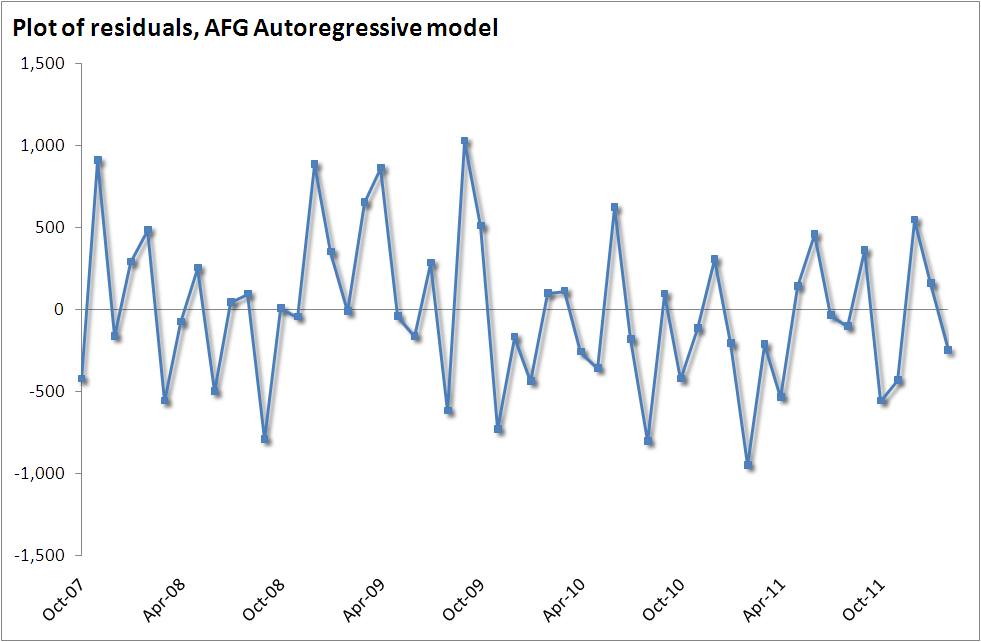
Secondly, once you have created a model, it’s not complete until it has been validated. To do that, you need to look at the residuals, which are the differences between the actual values and the values predicted by your model. A good model will have small residuals with no discernible pattern. In some months, the difference between the actual and predicted will be positive, sometimes negative, there will be some short runs above zero, and some below. But there shouldn’t be long runs, generally considered to be 8 or more, and no obvious curvature or shape.
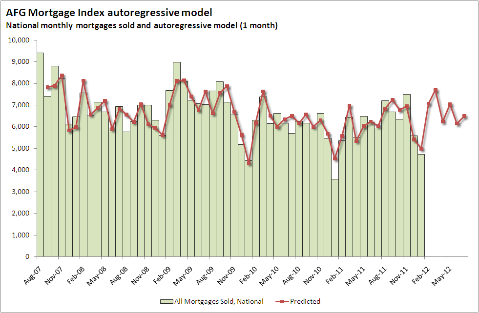
The next chart shows the results of one of the models. Of the various models that I tried, this one came out the best. It is an autoregressive model, which means that one month’s value is highly correlated with the previous month’s value. If the market is down this month, it is likely to stay down next month too.
And here are the residuals. Nice and random.
OK, so that’s all well and good. This model looks like it’s accurate, and might earn a big pat on the back for predicting the next month’s volumes. But that’s not the aim. The real aim is to see how this flows onto the broader housing market, and this isn’t the model for that. It doesn’t really tell us if the volumes are good or bad.
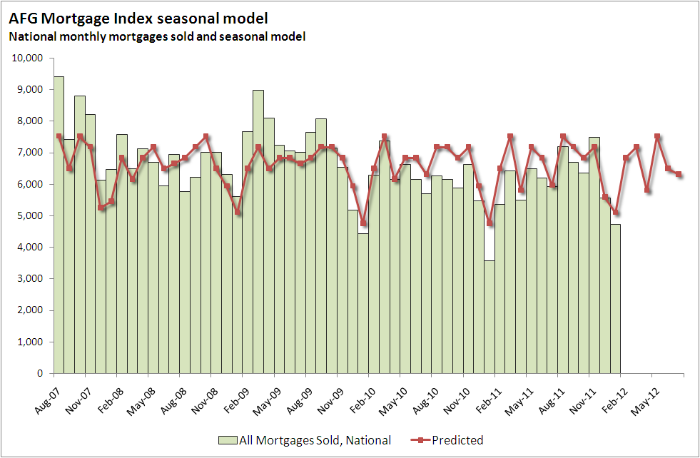
It turns out that a much more basic model might tell us that. This model only does seasonal adjustments. No trend, no auto-regression, and it’s not as accurate. The key is to look past accuracy, and look at the residuals – the difference between the predicted values and the actual values. The residuals tell us if the mortgage sales for the month are above or below the average of the last few years, after making some basic seasonal adjustments.
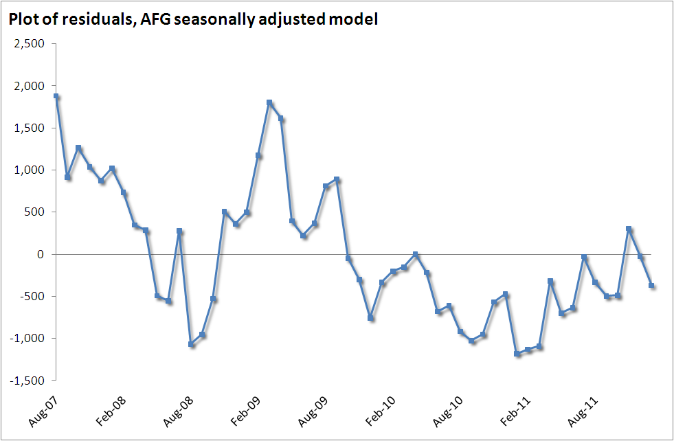
And here are the residuals. They’re not very random, and it’s not a very good model. The chart of the residuals shows that the model has had large deviations from the actual values, with long periods of time when it was either over-, or under-estimating what the mortgage sales would actually be. But the chart shows a very interesting pattern, and you might recognise some of the peaks and troughs; a sharp drop in 2008, followed by a massive, but short-lived spike, and then two years in the doldrums.
And the reason that this model is the one to use comes back to the question of, “how does this flow onto the broader housing market?” It’s an interesting model because it has a strong negative correlation with the monthly change in SQM’s national stock on market report. So during periods where the model under-estimated the actual, it is effectively saying that the actual mortgage sales were above where they should be, after adjusting for the number of weekdays in the month. During these times the residuals would be strongly positive, and the stock-on-market would fall. Likewise, when the model over-estimated the actual, or in other words, the actuals came in below where the model suggested that they should be, stock on market would rise. The next chart shows the correlation between the two.
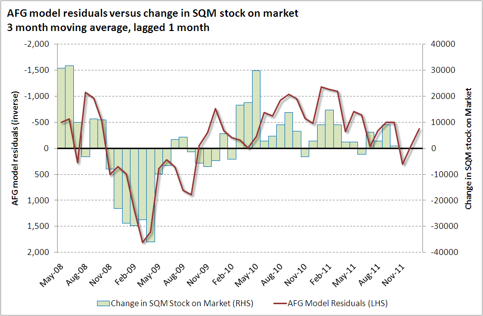
The correlation coefficient (R-value) between May 2008 and December 2011 is -0.63. While it’s a moderate correlation, it’s not perfect, but mortgage sales would only ever explain part of the stock on market.
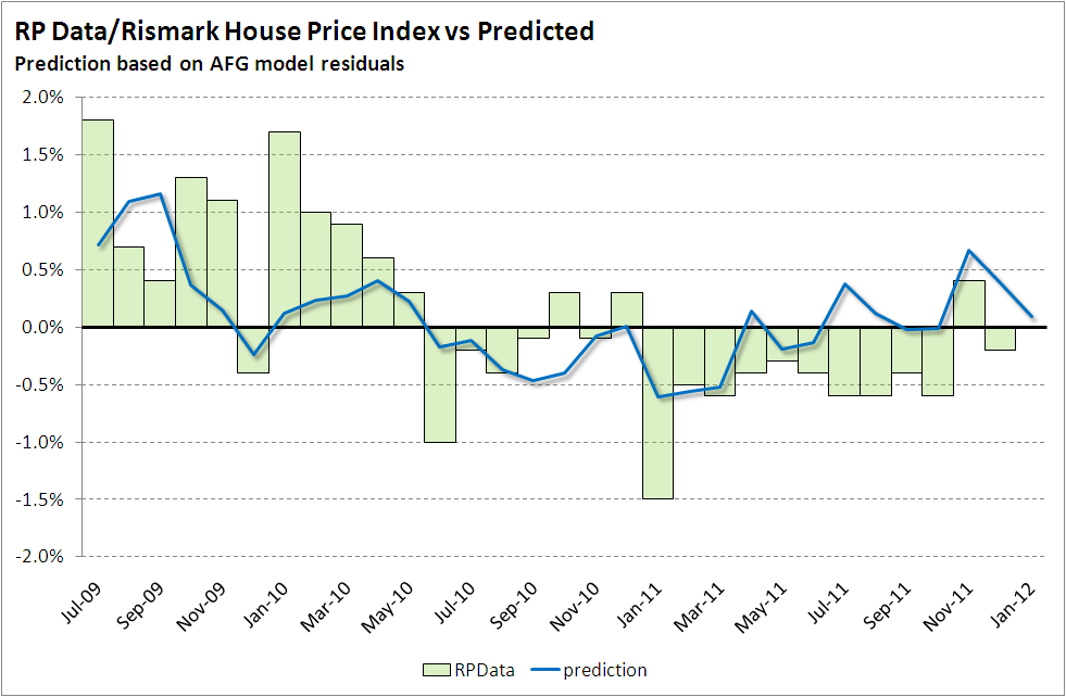
This also can be linked to the RPData house price series, which unfortunately is hard to find. I’ve used the monthly revisions from their website. Rather than using the residuals in their raw format, here I’ve created a second linear regression, which allows the charts to line up a bit better. This also allows forecasts to be made. Here’s a first cut, without any lag. The correlation coefficient is 0.57, which is pretty good.
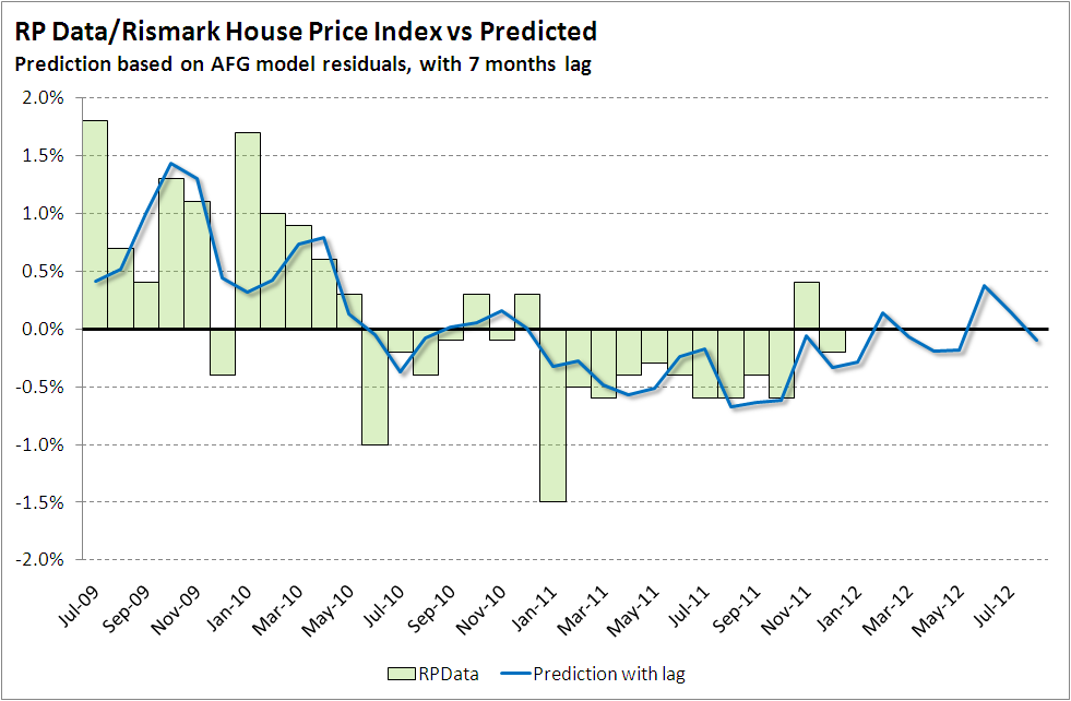
And here’s another version, using a lag of 7 months. The correlation is much stronger at 0.72, but somehow I find it hard to believe that this series would lead house prices by 7 months. There’s not enough history here to confirm either.
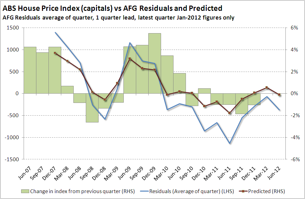
And to round it out, here are the ABS figures, using a 1 quarter lag. The correlation here is a healthy 0.63, so there is some strong evidence to say that the AFG figures are a leading indicator by a few months, but it’s difficult to say by how many.
When you put it altogether, I think the numbers match the narrative. After a flood-affected low point at the start of 2011, the trend was for an improving market throughout the year. There were some random bumps up and down, and finally a positive result in November. If this is a leading indicator, then it looks like the first few months of 2012 will bring out the odd month of growth in house prices and a few declines, with the sum total likely to be somewhere around zero.
So what of the latest figures? The numbers are back down, but doesn’t really break the upwards trend just yet. However there’s enough evidence and analysis on MB to believe that the November bounce was due to NSW stamp duty changes, and if that’s the case then I expect February and March to show further negative residuals, a broken trend, and another leg down in house prices after the calm.

