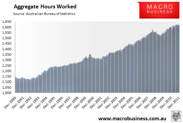
Yesterday’s analysis of the Australian Bureau of Statistics (ABS) December labour force data threw up the below chart showing how aggregate hours worked across the Australian economy rose in the month of December, but remains relatively flat compared with 12 months prior:
Reader, Avid Chartist, requested that I provide a chart showing aggregate hours worked per head of population, which was followed up by a request from reader Nick asking that I show this chart as per head of working age population instead.
Pulling the data together was more tedious than I had expected owing to the fact that I needed to compare the monthly labour force series against quarterly (population) and annual (working age population) data sets. Nevertheless, the results are interesting and are presented below.
First, consider the average number of hours worked per head of population:
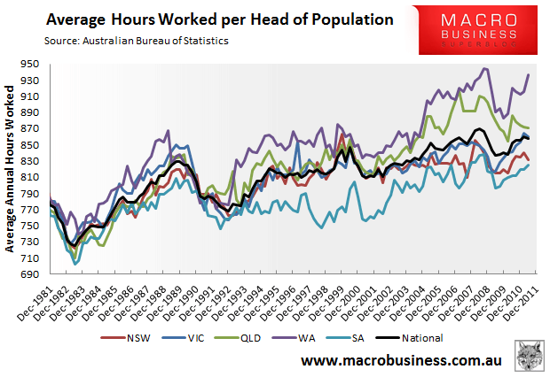
As you can see, average hours worked has been trending upwards, with clear dips evident around the time of the early 1980s recession, the early 1990s recession, the post-GST induced slowdown, and the global financial crisis. Note also the breakout evident from the early 2000s in the mining states – Western Australia and Queensland.
Turning to the average number of hours worked per working age population (assumed to be 18 years to 65 years old) and the trend is similar:
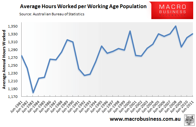
One thing to note is that in both series, the average number of hours worked has been trending upwards for the past three decades. Reflecting this, the labour force participation rate – i.e. the percentage of the total population who are willing and able to work – has exhibited a similar upwards trend:
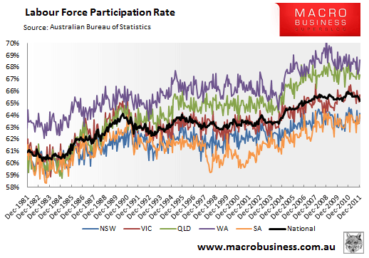
One underlying reason for the upwards trend in the participation rate is that Australia’s population has, for the past three decades, reaped a demographic dividend from the large baby boomer cohort – those born between 1946 and 1964 and currently representing one quarter of Australia’s population. This group entered the workforce in in the 1970s and 1980s, resulting is a large increase in the ratio of workers to non-workers:
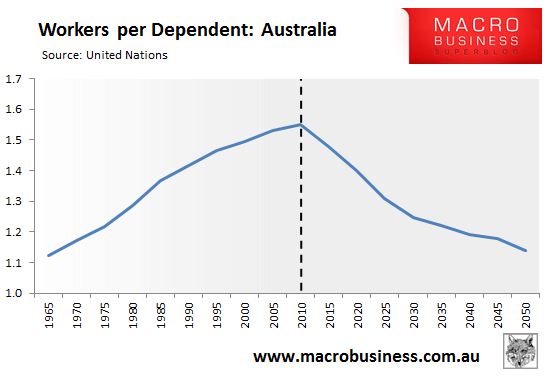
As shown above, the ratio of workers to dependents peaked in 2010, but is now projected to decline each and every year going forward as the baby boomers enter retirement [the first of the baby boomers reached 65 in 2011]. This suggests that Australia’s participation rate should start trending downwards, which should reduce the average number of hours worked per head of population; although the likely impact on hours worked relative to the working age population is less clear.
Food for thought…

