Global consumer electronics leader Apple (AAPL) reported earnings last night, with Q1 earnings more than doubling, due mainly to the iPad and iPhone products. Remarkably, gross margins improved to almost 45% (what a business!)
Looking past the earnings headlines numbers, what’s important from an investment strategy point of view, is how much other investors are willing to pay for those earnings.
This is critical – you could scour through hundred’s of financial reports finding “bargains”, but unless you have the capital of one Warren Buffett and can buy the entire company at a price (mainly) of your choosing, the price is still determined by other market participants (and non-participants…..)
In that vein, Scott Barber at Reuters (I urge you to follow him on Twitter, he has some great charts) put together the following chart showing the forward Price/Earnings ratio of Apple vs the broader S&P500 share market index:

I would have preferred a semi-log scale, to display the variations in the S&P500 P/E ratio a bit better, but the outcome is the same. Even with record earnings and a solid, fantastic underlying business, investors are only paying for those earnings with the same premium applied to the other industrials on the S&P500.
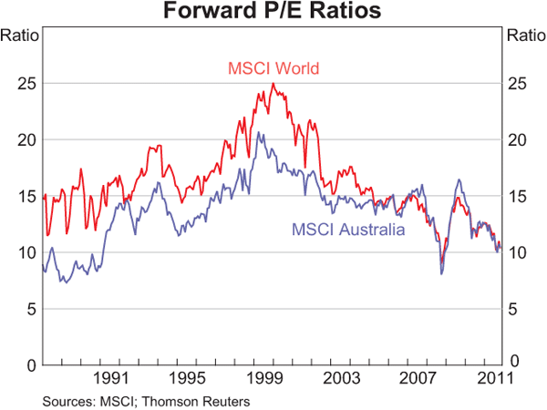
This phenonemon is even seen at a macro scale, as this oft-quoted (by me) chart from the RBA shows how developed world share markets are now converging on the Australian share market in P/E premia (i.e regardless of economic growth, business conditions or fundamentals):
