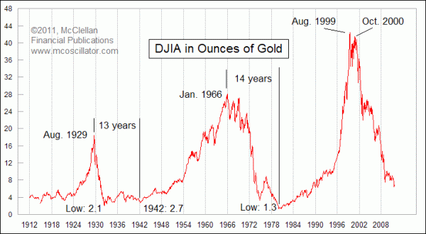
Today’s chart comes from the McClellan Market Report (via Pragmatic Capitalism) and implies that the secular bull market in gold has several more years of outperformance over the equity market.

Using this Dow Jones to Gold ratio, the previous two secular bull markets where gold dominated were of 13 to 14 years duration and occurred after a secular bull market in equities that ended with a bubble (in chronologically order: the swinging ’20’s, the “Nifty Fifty” 1960’s and the NASDAQ bubble of the 1990’s).
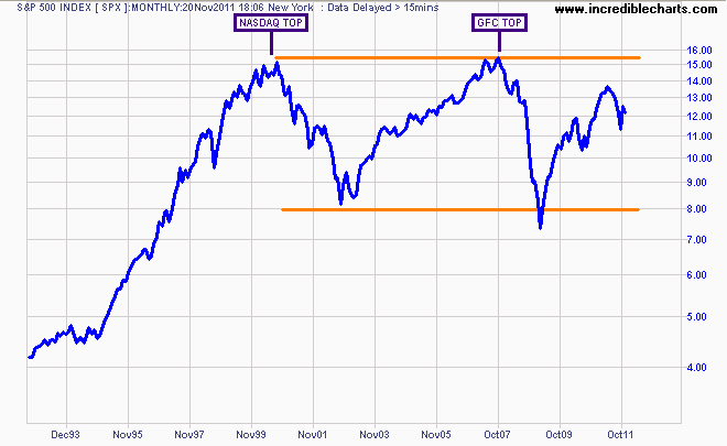
Note some economists still don’t understand that the US equity market has been in a secular bear market since 2000.

The average length of secular bear markets in equities is approx. 14 years, and using the above ratio implies several more years of volatility, but as the post states not “how far”:
The bottoms for this ratio in the 1930s and 1940s were down below 3.0, and it got all the way down to 1.3 at the low in January 1980 (based on monthly closes). If the DJIA were to stay around 12,000 for the next few years, then a ratio of 2-3 would mean gold at around $4000 to $6000 an ounce. Or the ratio could get down below 3 by having gold stay where it is, and the DJIA get cut in half, or some other combination of movements.