
Given last night’s undollar crash included an immense correction in gold, which was called by House and Holes here, I thought Data Diary’s chart on gold vs the USD is timely and convincing.
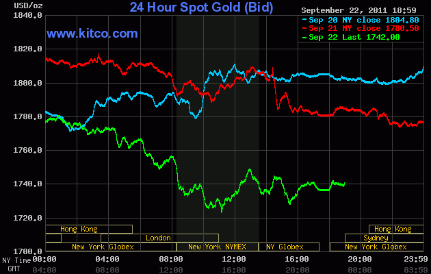
First, here’s what happened in the last 3 days of trading gold, note the wild trading range:
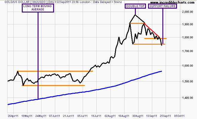
Here’s my technical chart of how gold broke down – for the pattern traders out there, it was prefaced by a double top, a descending triangle (the base is the horizontal orange line, the angle the smooth downtrend from the 6 Sept high) and finally, a break of two support levels – the first at $1800, the next below the most recent low of $1741 in late August:
To Data Diary (whose blog I heartily recommend):
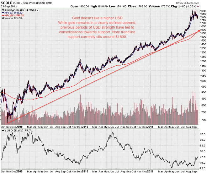
Note that prior periods of USD strength have taken the wind out of gold’s uptrend. With the 150 day moving average and the long term uptrend sharing the $1600 that area looks like the most probable target for this consolidation.
From Data Diary
I concur with his analysis – the $1600 level, which is the long term moving average and trendline from the GFC (Episode 1?) low, is the next major support level and target for a continued correction in gold. With a rising US dollar obliterating risk across all markets including currencies, equities and commodities – and gold is a speculative commodity, of that there is no doubt – in the short term, we still have to consider that the US and EU are not considering either further easing or raising interest rates in the medium term.
Consider the timeframe (and the premises behind) of your investment and hedging carefully.