Charting the RBA
The RBA has released its monthly Chart Pack and like last month’s release, I’m going to have a look at this impressive data set for MacroBusiness readers. A warning, its chart heavy (obviously).
The Chart Pack is divided into 16 categories, but let’s concentrate on a few, looking first at the economic “god” of GDP growth.
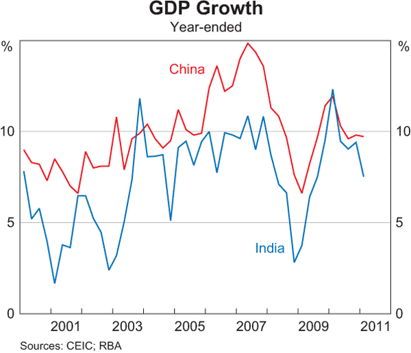
China (in red) is still hovering at the 10% annualised growth figure (which implies a doubling of the economy every 7 years), although the momentum of growth (i.e the rising annualised growth) of the last decade has been broken. We’ll see why in a few charts time.
India is decelerating its growth, although still impressive at approx. 7% and appears to be on a broad trend.
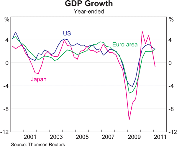 Not too sure they are that advanced – Japan is back to deflation, the US is stalling, but interestingly the Euro (i.e Germany) is picking up.
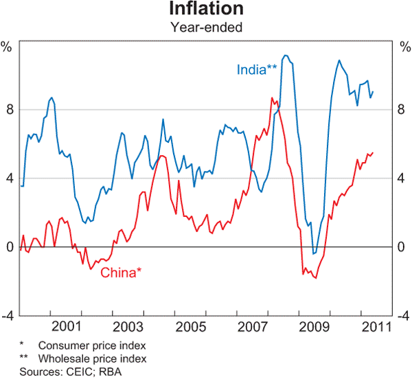 The FutureBoom proponents point to China and India’s exciting growth, but inflation is a major concern. It appears to be getting out of hand in China whilst the Indian authorities are struggling with enormous volalitity.
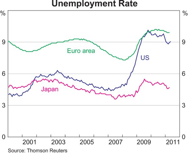
Take this chart with a grain of salt. The most truthful is probably Euro, which has had structural unemployment since 2000, whilst the US measure is ridiculously understated, more like 15-20%. However, the official measure clearly shows only modest improvement since the highs (lows?) of 2009. Japan continues to count anyone sitting at a desk as “employed”, but the chart shows a new uptick because of the earthquake tragedy.
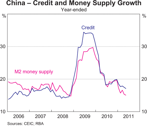
Wondering why China’s GDP is so high and how they “got through” the GFC? Growing your money and credit at 30% annualised can help. Notice the deceleration of the last 12 months. The Chinese tightened rates again yesterday and are set on the (ridiculous) path of price controls to combat inflation. Good luck with that.
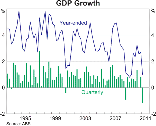 Australia’s GDP – anyone notice the trend? The overall GDP growth profile of the Australian economy is slowing down, moving from a secular bull to a sideways/stagnation.
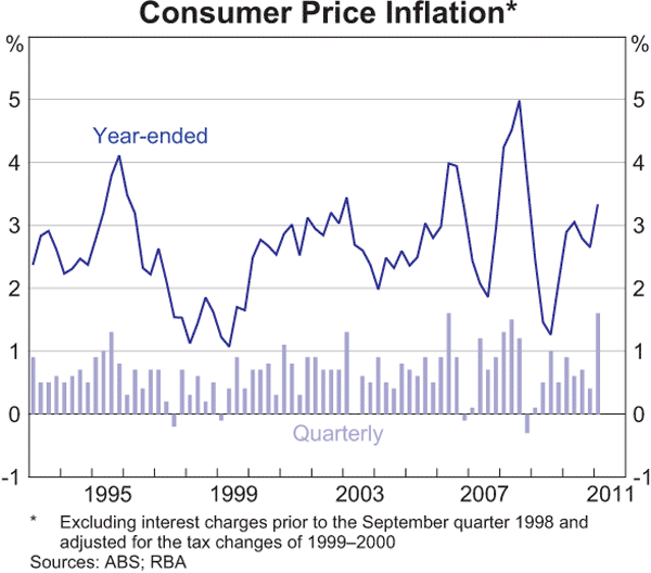
Again, this chart shows how the RBA has failed in its mandate to provide stable prices – the volatility of the CPI is clearly evident (wider ranges, higher highs, lower lows) and has averaged well above the target band of 2-3% Maybe Mad Adam is right. (Note: If I could clone myself (again) it would be interesting to re-construct the historical CPI figures by changing the “house price (imputed rent)” component to reflect the real change in house prices (use Rismark or ABS capital city data), and see what this HP-CPI looks like historically….)
Let’s move on to the juicy sections: Households
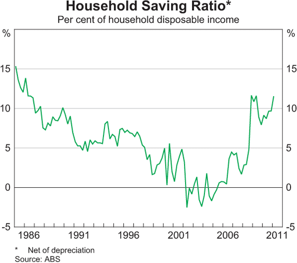
What a reversal – and its accelerating. Delusional Economics should be posting on this very interesting data in the coming weeks.
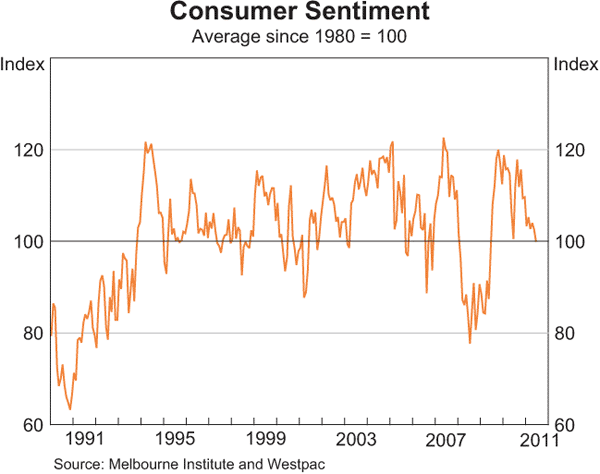
Fast approaching contraction – the cautious consumer meme abounds.
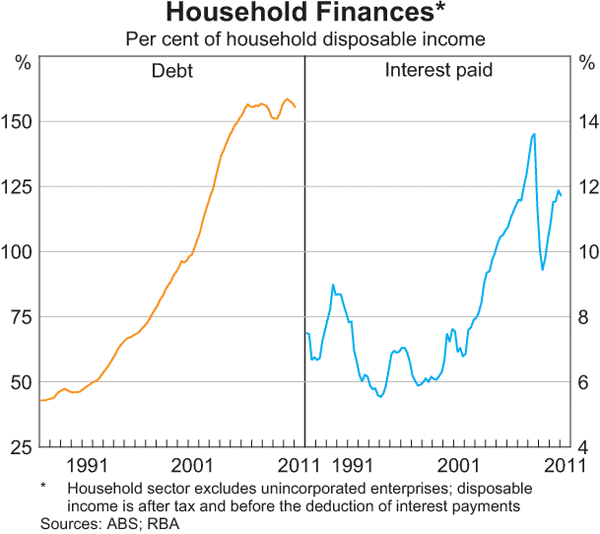 Has household debt peaked? It’s certainly turning around. Lending finance data comes out next week from the ABS. Note that interest payable is back to GFC highs, nearing 12% of income.
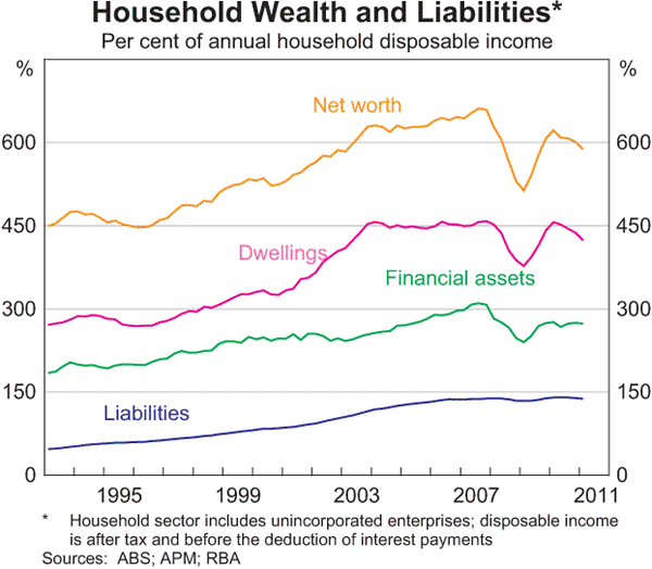 This is a fascinating chart (although it should be in semi-log scale) Note how dwelling prices have stuck at 4.5 times income since the end of the 2003 bubble after a 50% rise early in the decade. Net worth is still well below the pre-GFC high of approx. 6.5 times.
Let’s move to Business:
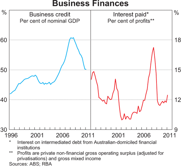 Although businesses have deleveraged, the “I” part of EBITDA is rising. With stable rates does this imply the “E” – earnings – are stalling? Whatever the condition, the real impact of rates and business lending is eating into profits.
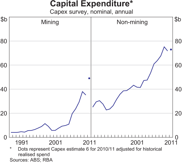
FutureBoom to the rescue. Mining capex dipped recently but is on track for larger spends, whilst the rest of the economy (remember them) are tracking sideways.
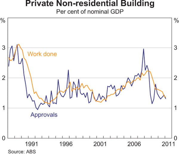 The AIG released figures recently that the construction industry shrank for the 13th month in a row. This chart shows the non-residential proportion.
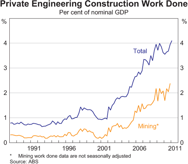 Although the mining sector is now contributing 2% of GDP towards engineering construction. This is obviously rising and a great boon to the engineering and mining services sector.
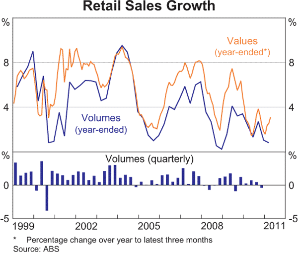 The deceleration continues in retail, with retail sales and volumes down.
Finally, let’s look at the real drivers of the economy: credit, money and the banks.
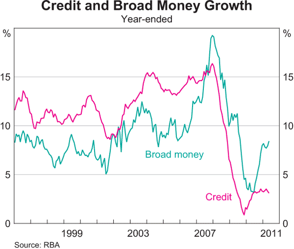 Its clear that credit growth has stalled at around 3.5-4%. Enough to keep the banks ticking over, but nowhere near like the phenomenal growth of the previous decade (Note: the correlation of the rate of change in credit growth and the ASX200 is remarkable)
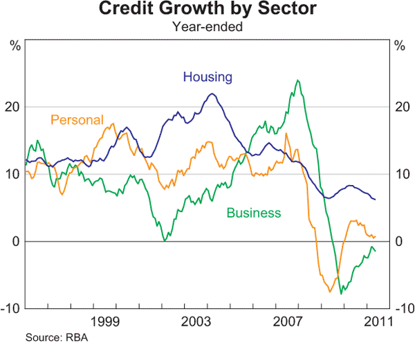 Housing credit growth is at GFC low (before the FHBG restarted the lending melee) whilst personal credit is decelerating, and business lending is still underwater.
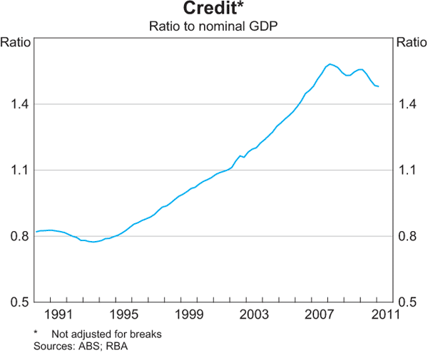
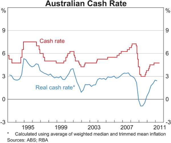 As a result, the country is dis-leveraging. That is, it is paying down debt whilst taking on new debt at slower rates. The actual cash rate still remains below the lows of the last 2 decades (excluding the extraordinary move during the GFC).
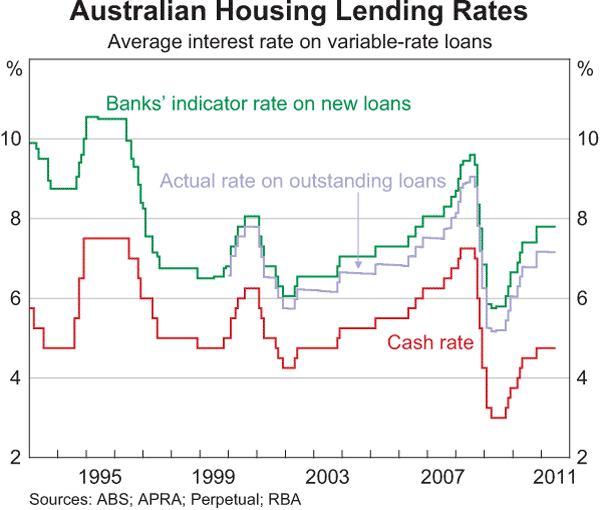 ….and mortgage rates are at their long term average – no structural shift there either.