
With the ructions in overnight markets given the poor state of data coming out of the US and continued sovereign debt issues in Europe, l thought I’d show how this is playing out visually in the important markets. There are a couple of “standout” charts that underline what is really going on:
US 10 year Treasury Note
First, the 10 year Treasury Note chart (TNX) – this is a proxy for safe-haven buying, as investors switch from “risky” (e.g equities, commodities, non-US currencies) to “non-risky” investments. The 10 year Note has formed a double top (the vertical axis shows the yield – so less than 3%) since the start of the year, and has slipped ever since.
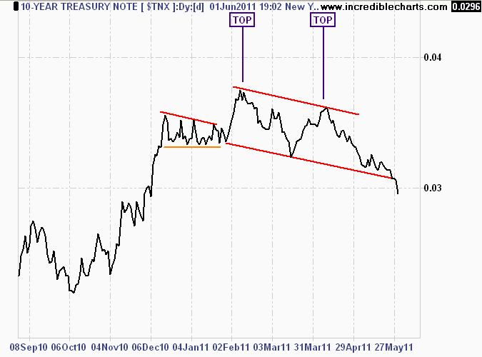
Daily chart of the 10 year Treasury Note - double top and break of trend
A longer term chart shows the effect of the pre-QE2 May 2010 “flash crash” and the flight to safety as yields approached a stunning 2% – Japanese territory. After the QE2 announcement and subsequent liquidity fill to equity and commodity markets, buyers stepped aside, as yields returned to a “norm”.
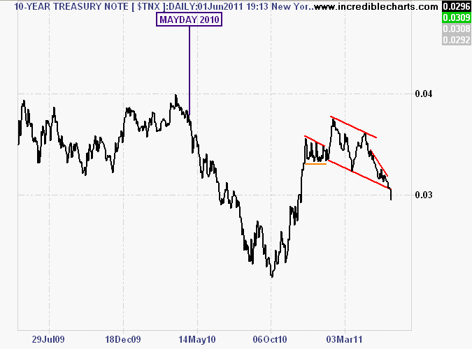
2 year daily chart of 10 year Treasury Note - volatility after May 2010....
Dow Global Index
Next, the Dow Global Index (DJWO), which aggregrates the major equities markets and is an indicator of global growth shows the bullhawks have been correct since the May 2010 crash, but the technical features of this chart show that they cannot afford to ignore or confuse the weight of daily market volatility.
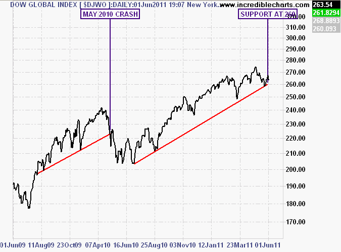
2 year daily chart of the DOW Global Index - note trendline since May 2010
It is obvious that equity markets are slowing down and now approaching the established trendline since May 2010 and the liquidity provided by the US Federal Reserve from QE2. A break of support at 260 points would provide a strong signal that new liquidity is required to keep growth (in equity and commodity markets at least) going.
Gold and the USD
I’ll look at gold last, and what is surprising is its resilience and move away from risk asset correlation. Normally, gold (in USD), moves in lockstep with “strong” currencies like the Euro and AUD, most major equity markets and an inverse correlation with the USD (portrayed by the US Dollar Index (DXY)).
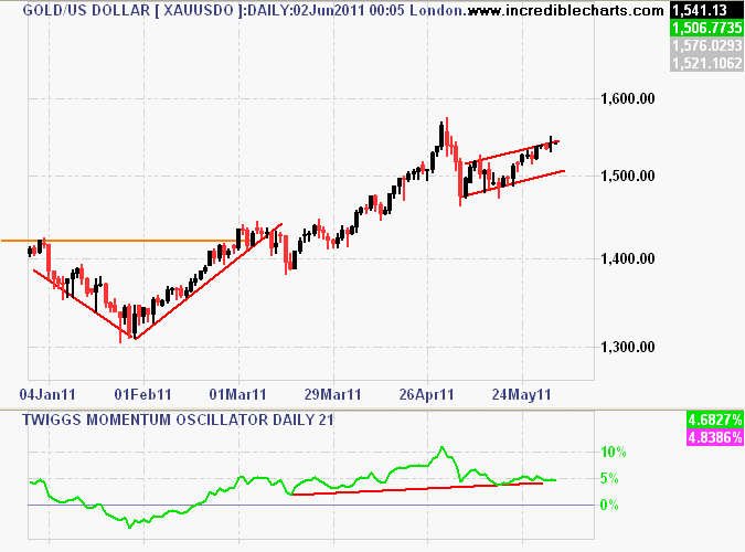
Daily chart of gold - rising, but near top of trend channel
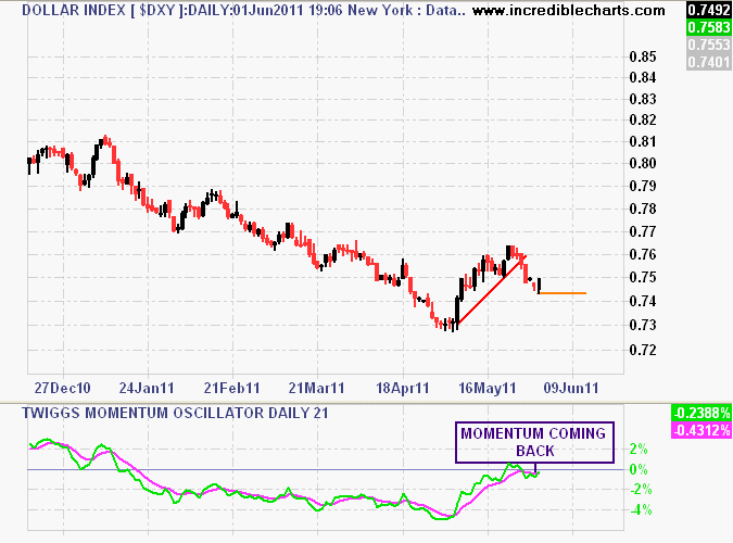
Daily chart of US Dollar Index - rising with gold, but weakly...
First, chartists will note that gold is near the top of a short term uptrend channel, and is approaching its recent historic high above $1550 USD an ounce. Interestingly, the USD reversed its recent rebound rally but is now finding support again – but very weak, as most currencies (AUD, EUR, JPY) have not fallen as much as equity markets. Is the USD safe haven status slipping as investors move to the shiny metal?