The Reserve Bank released its latest Chart Pack yesterday. As a technical analyst/chartist, I prefer a visual representation of data and have always found this series of charts fascinating. The whole pack can be downloaded here (1.28 mB or so) or viewed by section here.
Although it covers many areas, I’m going to look at 3 sections: interest rates, inflation and GDP.
Interest Rates
The main (only?) focus of the commentators regarding the RBA is the Cash Rate, which is determined at the monthly meetings. The graph below shows the published cash rate (in red) and the real cash rate (adjusted by CPI and in blue).
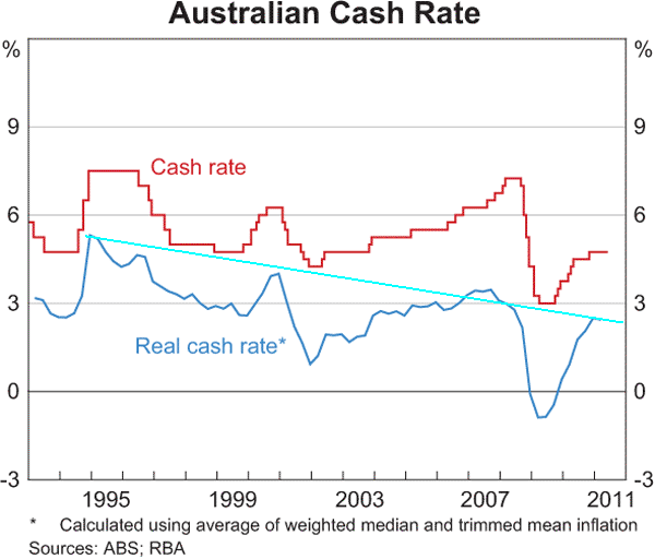
For all the wailing about mortgage rates (which are still determined by the cash rate), it is clearly evident that rates are still at near-historic lows. More importantly, adjusted for CPI, the real cash rate is extremely low – not even 3% – not exactly a tight monetary policy.
This chart shows three things: first, contrary to popular opinion, the current cash rate is very low; secondly apart from the too slow response of the early 2000’s RBA rate rises, it is at a 20 year low and thirdly, the trendline in the real cash rate points to a low inflation, possible deflation trajectory (light blue line).
You could take this one of two ways: either the obvious stress in the housing market is pointing to a much lower threshold for pain amongst households with historically high debt levels or we’ve become a bunch of serious whingers.
Next, let’s look at bond yields which reflect the low interest rate environment – starting with the Aussie 10 year.
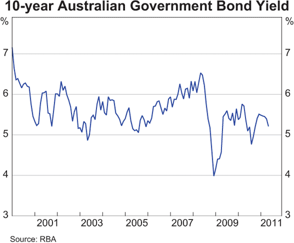
A quick glance shows that the average bond yield oscillates between 5 and 6 percent over the last 15 years or so. A longer glances shows how the bond yield rose (as bond prices dropped) when the 2004-2007 stock market bubble floated higher (more money went to stocks, hence bonds were bid down, yields then go up).
A second look since mid 2009 explains why the ASX200 stock market is now in a funk – bond yields are falling – testing the 5% level – which means, as during the GFC, insitutions are moving (and hence bidding up) away from stocks to Aussie bonds.
This is likely to continue as the realisation spreads that we are in for a bear market in stocks for a considerable period.
A race to the bottom
But what about 10 year government bond yields elsewhere? Well in the US, Germany and even emerging markets, there is a race to the bottom, to join Japan which is already there.
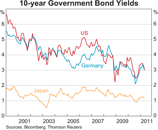
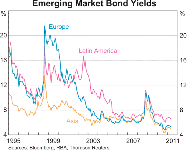
Now, some would say that high bond yields are reflective of a nation with poor monetary policy (e.g Greece, Ireland) or a history of default (e.g Latin America). What is clearly evident is that emerging and the developed world bond yields are converging, with average yields below 6%. This is reflective of a huge move towards government debt as an asset class over the last 30 years, as most nations have private and public pension schemes and finances that rely upon a liquid and growing government debt market.
The question is – is this a bond bubble? According to PIMCO, the world’s largest bond investor, the US market certainly is. The paradox is that government bonds – in almost any country – barely provide a real yield after inflation, but what else provides stable, albeit pathetic returns?
RBA has controlled inflation?
Now about that inflation – the measured CPI rate is wildly volatile – not exactly the hallmark of a well regulated monetary system. Notice the broadening triangle pattern since 1999 after moving out of a low inflation era.
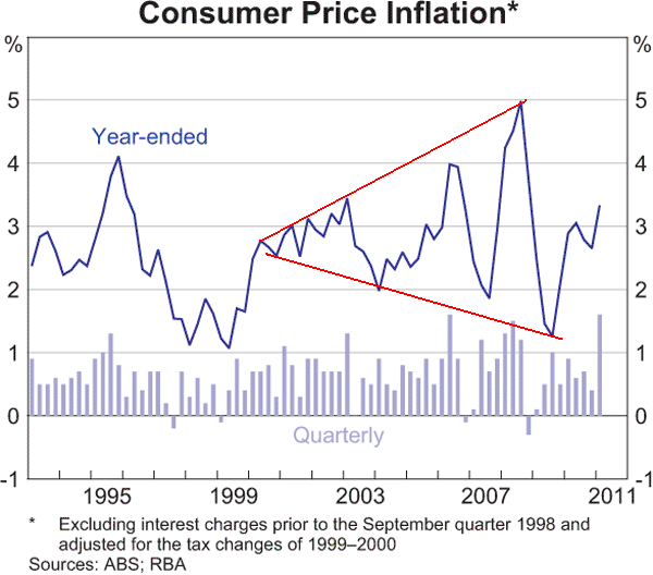
Some of this blame should rest squarely on the shoulders of the ABS, with their inadequate and untimely CPI data and hedonic construction. It is not clear what direction CPI is likely to go in future years, although recent bullhawkian panic surrounding its rise above its average of 3% is possibly correct in the short term. Note that on the quarterly histogram that every large push is succeeded by a significant calming thereafter (h/t Ben)
GDP Growth
I’m going to leave the best ’till last. I remember fondly my last meeting at the boutique financial planning firm with all the advisers and planners present. I made the call, based on my analysis of productivity, inflation (real purchasing power, not CPI) and profit growth of listed companies, that Australia’s GDP growth potential will be limited to, as Kevin Rudd likes to put it “growth with a 2 in front of it”. To say that least, I was rebuffed by those who though GDP would continue to rise at nominal 7-10% or real 3-5% forever and a day.
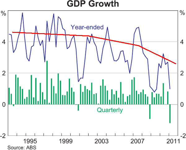
My version of the RBA Chart shows a deceleration in overall GDP growth – looking through the volatility, the trend is quite obvious. GDP growth – the hallmark of our democratic capitalist system, is visibly slowing down. Is this due to the ever decreasing incremental return on rising debt, without an increase in productivity? I’ll leave the detailed analysis to other bloggers here on MacroBusiness, but I’ll finish by looking at the visual effect of the mining boom – or FutureBoom!
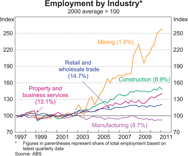
Employment in the mining sector represents less than 2% of total employment – having more than doubled in the last decade. Notice how manufacturing in terms of employment distribution and growth – more than 4 times the size of mining – has gone nowhere in over 20 years.
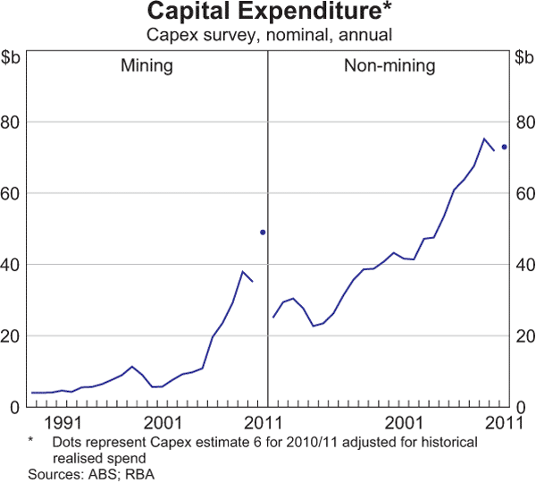
The much bally-hooed capital expenditure by the mining industry is clearly evident – well, the change is, rising exponentially since 2001 (left hand chart). What is interesting is the context – mining CAPEX is currently half that of all non-mining, although it is forecast to rise significantly in the coming years, bringing on significant supply at the same time as commodity prices sky rocket.
Summary
I wonder what the internal rate of return (IRR – a measure of the productivity on capital investment) would be on these massive projects if these prices come off the boil?
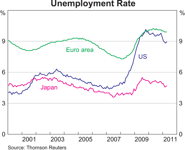
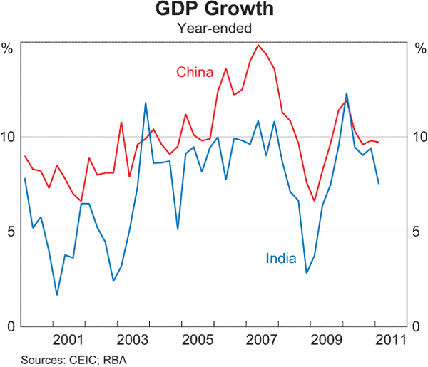
Now I’ve probably provided too much of a bearish interpretation of these charts – Acarrlytes will obviously point to how Australia has weathered the GFC fine, and in comparison to other advanced economies, employment is near full and our Asian partners are doing magnificiently. So in closing, as I show some charts that show exactly that premise, I’d like to hear your thoughts and interpretation.