
Regular readers may remember that each morning I peruse my bearish sounding “Crashlist” before starting the day trading the Australian equity markets. This list comprises the major currencies crosses, indices, gold, 10 year US T-Note and the US Dollar Index.
A well deserved dip in “risk” markets across the world has been transpiring for most of this week, although it seems the Aussie market is getting the brunt of it. But after waking up this morning and checking out the numbers (the daily Links section on MacroBusiness is gold for Antipodean investors and traders) my “Mayday” signals are about to go up.
H&H has outlined the major falls with his global macro analysis here, so I’m just going to add my technical charts, with some comparisons to the May “flash-crash” of 2010 for comparison. The similarities are eerie and there is reason to get excited.
AUD/USD
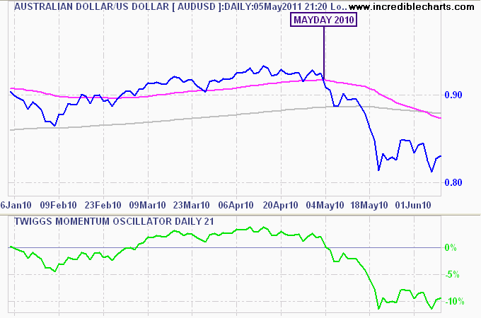
AUD plummets in May 2010
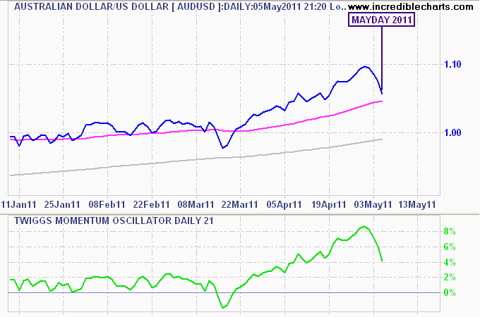
May 2011 - AUD plummets - almost 5 cents in less than a week
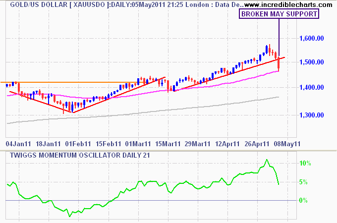
Gold (USD)
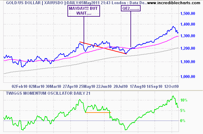
Gold tapers in May 2010, until QE2 kicks in August
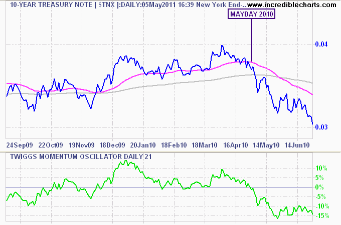
US 10 Year Treasury Notes (TNX)
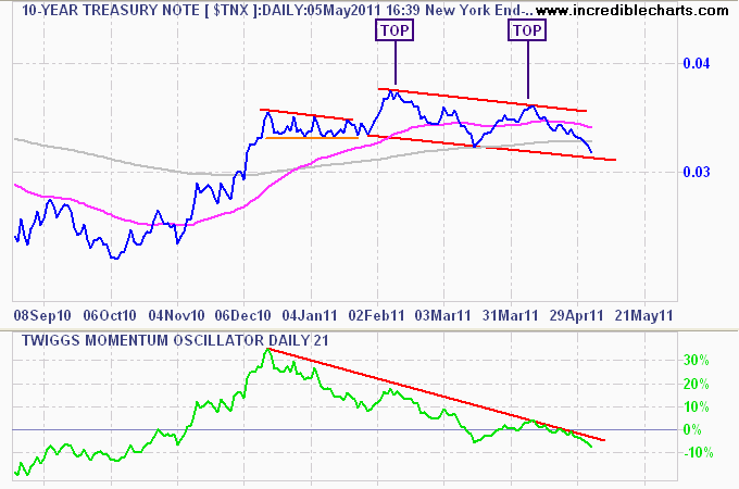
May 2011 - double top in yields and its risk off again
And the reason this is all happening?
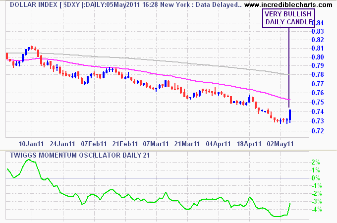
Oh say can you see - the US Dollar is back
I hope you’ve all switched your super portfolios to fixed interest or cash (you should have by now!) because its a bumpy ride until QE3 or EU raises rates.
Postscript: The Avid Chartist has some more technical charts here