The 9th Demographia housing affordability report was released earlier in the week, and covered here at MacroBusiness in some detail.
The NSW Department of Planning and Infrastructure was not impressed, offering their response here (pdf). The crux of Department’s letter to the SMH is:
The latest Demographia International Housing Affordability Survey (Sydney house prices ‘severely unaffordable’, 22/1/13) is a flawed survey which doesn’t reflect Sydney’s wide housing choice.
It is based on the median prices for houses. These are traditionally far more expensive than multi-unit dwellings, which represent the majority of Sydney’s new housing.
Sydney’s housing market, more so than many other Australian and international cities, supports well-located apartments close to services and infrastructure.
But there is a much more crucial problem with the Demographia study. It claims to be seeking evidence of detrimental price effects from planning controls, yet it ignores the rental market completely. If housing development is being constrained, then rents must also rise. Any variation between prices and rents can be explained by asset market behaviour. If BHP shares rise 20% but the iron ore price is constant, we don’t suddenly scream about iron ore shortages. But essentially this is what has happened for a decade now with home prices.
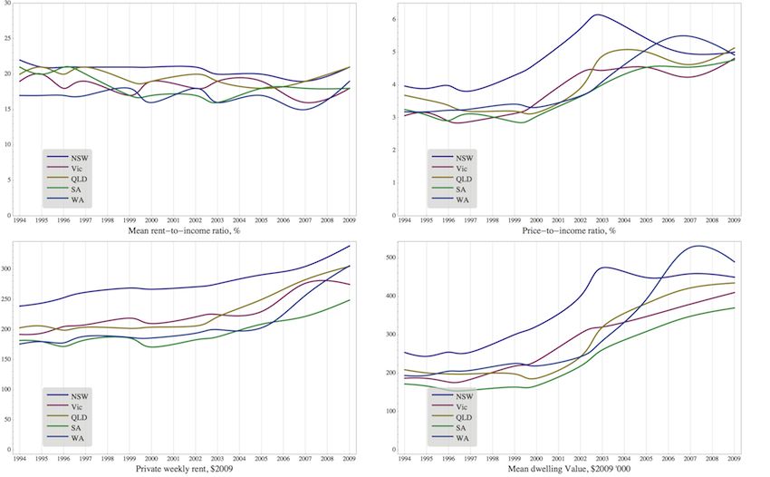
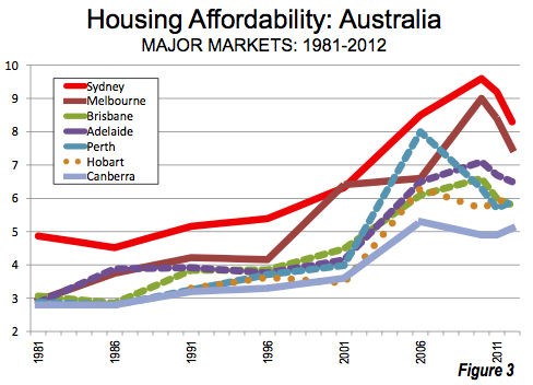
The graphs below show some key metrics for Australia housing markets from the ABS Housing Occupancy and Costs survey. While the most recent ABS data is from 2009, that year coincides with the peak unaffordable year in Sydney and Melbourne according to Demographia.
What are the important points to note in the ABS data?
First, and most critically for this debate, is that rents have been essentially flat compared to household incomes since the early 1990s. Since rents for residential housing are determined by competition for location between renters, it is expected that rents are simply a constant share of income. And they are, at around 20% of gross household income.
This also means that over the long run housing rents should rise by more than the CPI, if incomes are, which is generally the case. Welfare agencies should take note.
Second, the steep rental growth observed during the 2007-2009 period was mostly the result of steep household income growth. Waning income growth since then has led to waning rental growth.
Third, price-to-income ratios have shot up since 2000, but not quite as much as Demographia would have us believe (see top tight panel, and chart below). Perhaps their methodology, which ignores the apartment market, is generating bias in their results.
Finally, if one does want to consider price as a measure of affordability, they must at least be adjusted for changes to the interest rate. In the table below, using simple round numbers, it can be seen that a reduction in the interest rate on mortgages, from 10% to 5% means that prices can double while affordability remains constant in terms of the annual interest payment necessary to buy the home (median multiple of 6 instead of 3 in the bottom row).
If you want to be more conservative and consider principle and interests payments over a 30 year loan, then prices can increase by 63% while loan payments remain constant (median multiple from 3 to 4.89 in second last row).
In sum, the survey has little to add to the housing debate, apart from confusion. The price path we have witnessed for housing over the past decade has been the result of speculation, rising household incomes, and declining interest rates.
Please share this article. Tips, suggestions, comments and requests to rumplestatskin@gmail.com + follow me on Twitter @rumplestatskin


