
We all know that the cost of living is rising, we feel it every day, see it on the news and read it in the press. Part of Australia’s economic doldrums can probably be slated home to the fact that people are concerned about the rising cost of the high visibility items in their shopping basket and are saving more and spending less as a result.
So if that is the case then how can Australia be experiencing disinflation? How can the CPI have printed only 0.6% headline and an amazing 0.3% core? It is a theme that we are familiar with and one that came up in comments on our CPI piece on Wednesday and then on my Europe piece again yesterday. Inflation is going up isnt it?
Given the questions I asked Data Sword to put together some charts and thoughts in relation to the new ABS CPI weights in order that we could better explain the dichotomy between expectations and reality. So where exactly are the price pressures coming from?
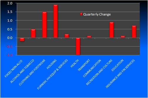
Looking at the movements across categories we can see that the biggest increases were in the Housing and Clothing and Footware categories, while there were price falls for Food and Non Alcoholic Beverages and Health:
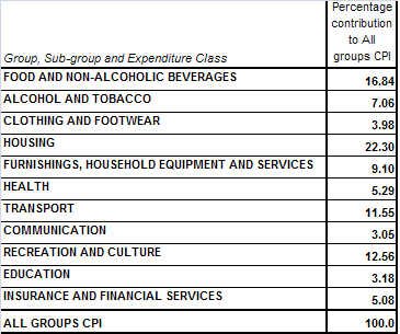
The actual impact of any category on the CPI outcome depends on the weighting of each category. According to the ABS, the 16th and latest series, weights the categories as follows:
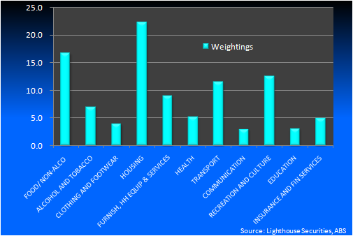
Now if we apply those weightings to the movements in each sub category it gives us a clearer picture of what drove the increase in inflation over the third quarter:
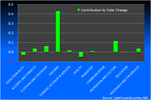
From the chart above it is clearly obvious that housing costs were the main driver of the 0.6% rise, accounting for a little more than two thirds of it. However, the movements within the housing component were also divergent. Here is the quarterly percentage move in each of “housings” sub-components.
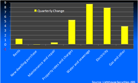
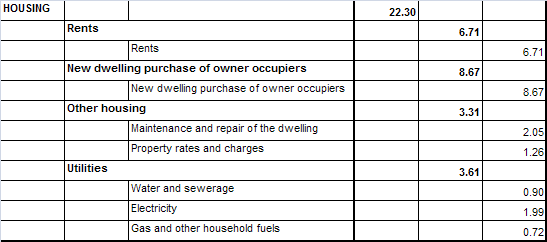
Clearly these are big material moves but the context of the moves must be looked at in terms of the weightings within housings 22.3% first:
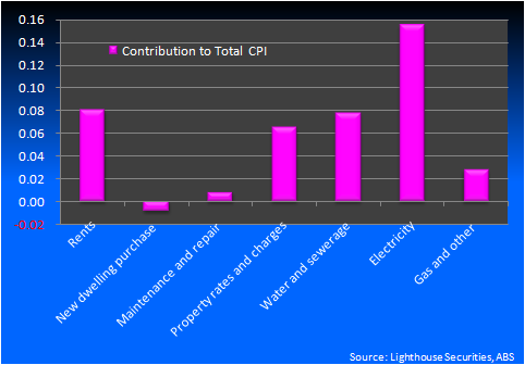
Now if we apply those weightings to the moves in each category we can see exactly what contributed to the final increase of 0.6% over the quarter:
So what does it all mean?
It means all our feelings that the high visibility items are rising fast is correct. But becasue of their relatively small weight in the overall CPI basket, these big moves are outweighted by the more benign outcomes in other sectors.
It’s probably one of the reasons that the RBA has been so inflation phobic. Imagine if their central tendency had have proved correct and Australian households weren’t dislevering and still spending like it was 2007 and 2008. Inflation would be through the roof.
But for now Australian inflation is more tame than they had expected, giving room for rate cuts. Not as much as the market has priced, unless we see an economic catastrophe offshore.