
The RBA and some commentators seem a little confused about the Australian labour market. Why? Because the ABS labour force data is showing the unemployment rate rising, while the Department of Education, Employment and Workplace Relations (DEEWR) data on income support payments (such as Youth allowance and Newstart) shows a declining number of welfare recipients.
When one properly understands the data, it is quite clear that the two data sets are measuring completely different things and there are very good reasons why the expected relationship between the two can diverge.
The ABS labour force data aims to measure the spare capacity of the labour market, while the DEEWR report – Labour Market and Related Payments Monthly Profile – contains simple counts of the number of recipients of different welfare payments over the month. These recipients could fall into employed, unemployed, or underemployed categories under the ABS definitions.
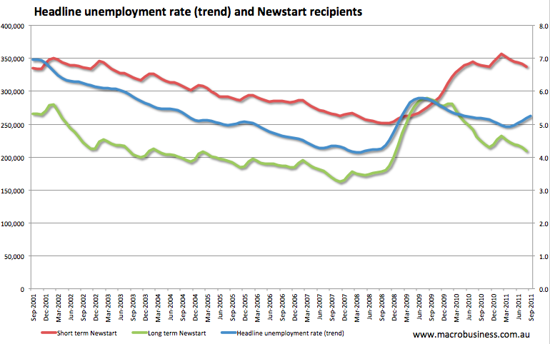
As you would expect there are common patterns in the data. Below we can see the headline trend unemployment rate plotted against short and long term Newstart recipients.
For the keen analyst there are important differences in the timing, composition, and seasonality of each data set.
First, the ABS data appears to lead the DEEWR data. In 2008, the headline unemployment rate (in trend terms) began to rise from the low of 4.1% in April of that year, while the short-term number of Newstart recipients continued to decline for another seven months before following the pattern. This is probably explained by the qualifying criteria for Newstart payments. Not only must you first be unemployed, you need to have less than $3,000 in funds available and meet Centrelink’s income and assets tests.
This also means that the coverage of this data is a much smaller sample of the population. People aged over 65 wanting to work won’t be included, nor will full-time students, nor will people who can’t meet the income and assets criteria.
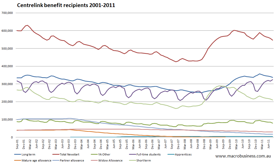
Second, the DEEWR data shows striking seasonality, with the number of recipients falling during each university semester, and large increases observed over the summer between November and February. This relationship is made clear in the graph below where the pattern of Youth Allowance (YA) recipients is also shown. One might imagine that the trend increase in (YA) recipients in full-time study means that fewer students are working to support their studies and choosing to rely on welfare. This surely is some reflection of labour market conditions for the unskilled and casual workforce.
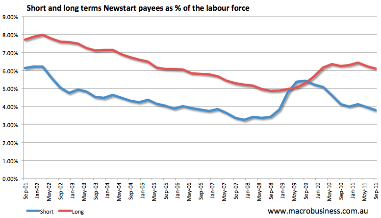
Finally, we can put some perspective into the DEEWR data by showing the Newstart figures as a proportion of the workforce. This graph shows that both short-term and long-term payees have stabilised and are following their expected mid-year seasonal patterns. It will be interesting to look back on this data after the summer seasonal pattern emerges.
In all, a better picture of the labour market is available by including DEEWR data into the analysis. However extreme caution is necessary due to the lags in the data, the fragmented population sample, and the strong seasonal patterns. For the policy-maker making monetary decisions under the principle of a Phillips Curve-type relationship between unemployment and inflation, this data doesn’t provide the best picture of excess capacity. The ABS trend measures of unemployment, underemployment and underutilisation are far superior in this regard.
Tips, suggestions, comments and requests to rumplestatskin@gmail.com + follow me on Twitter @rumplestatskin