The RBA has responded to my questions about their housing research paper released earlier this week. In particular, their use of real per sqm rents in their housing model, but their use of house price in their empirical investigation.
Sharon, the RBA’s public relations officer, offered a very brief response:
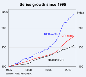
While I cannot respond in detail to the arguments you make, I am including below a graph that is relevant to your main point. In particular, I would caution against the premise that increases in real housing prices have not also been reflected in an increase in rents in real terms. While most series suggest that the price/rent ratio has indeed fallen somewhat, some (non-ABS) data suggest that rents have increased much faster than the CPI, as illustrated here.

I take that to mean the RBA believes that the CPI rent measure is flawed, and has grossly underestimated rents for the past 16 years. If so, it was a glaring omission from their submission to the CPI review last year.
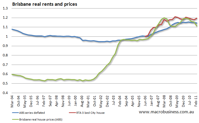
If what they mean is that rents and prices are in fact moving together, then they are only right since 2003, when yields flattened off at around 3.5% We can modify yesterday’s graph of Brisbane real rents and prices (below) to see the two measures tracking closely since that time. Both appear to have now peaked.
 But there is more to the story. My previous analysis has shown that only about half the house price increases seen prior to 2003 is explained by ‘structurally’ lower interest rates, and that prices are about 30% higher than justified based on rental returns.
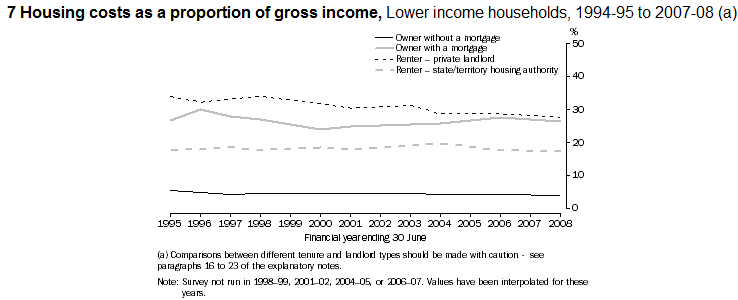
 It is also worth considering the rent to income ratio, which the ABS shows has declined for private tenants since 1996 (even for low income households). One result of the RBA’s model was that this ratio would increase under various supply restrictions.
My very non-supply side explanation of this recent uptick in real rents is that it is much more of a cyclical income surge flowing through the economy, which has since passed, and I expect to see real rents decline over the next couple of years. The picture of the housing market is still nothing like the RBA analysis suggests.
Tips, suggestions, comments and requests to rumplestatskin@gmail.com + follow me on Twitter @rumplestatskin
