There have been a vast number of discussions here and on many other sites about the future direction of the housing market. My own opinion, as I have stated a number of times, is that without some further government stimulus the market will continue its slide. This is mainly based on observations of the market itself and also an understanding of how boomer baby demographics and their asset holdings are going to effect the market in the longer term.
But as I say, this is just opinion. For an investor, you want to see data. But what data ? Is there really any data available that tells you with some confidence what is going to happen to the housing market?
While musing on this point, I realised I had talked about it previously without making myself clear. Here is what I said.
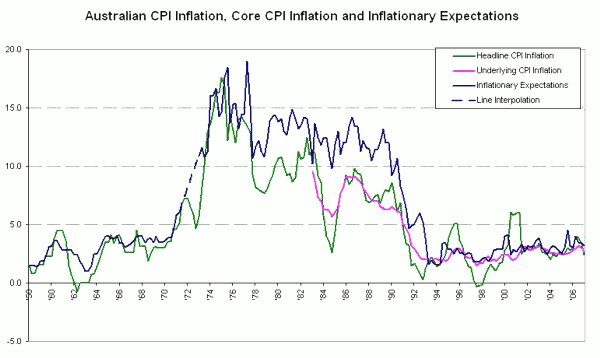
My parents purchased a 3 bedder in Townsville in 1983, it cost them $66,000 at the time. They sold it 12 years later for $113,500. Not bad , they nearly doubled their money in 12 years. Yes they did, but only because of inflation.
That same house sold again 8 years later in 2003 for just $25,500 more. However it sold again in 2004 for nearly $100,000 dollars more. Hang on you say, inflation was running at 2.5% in 2004. Yes it was, but by then it didn’t matter because another force had taken over the property market.
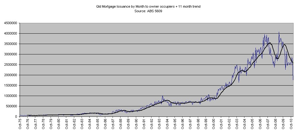
18 months later the house sold again for $80,000 more. Since then it has stayed with the same owner so I can’t give you anymore stats on it. However as I have said in previous posts I purchased my first house in 1998, I sold it 18 months later for just $3,000 more. I purchased a much larger house in 2001 for $190,000 I sold it in 2007 for $550,000. Have a look at the credit graphs above. Do you see any reason why you think this was possible?
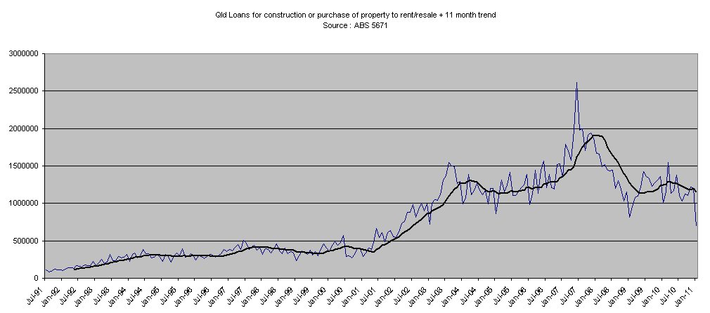
At the time of writing that post, I didn’t make it very clear what those graphs actually represented. The data is credit issued by banks per month for finance towards housing. This does not however represent the total outstanding credit in the private sector for housing because new loans can extinguish existing loans and existing loans can be payed down over time. What these graphs really represent is the transaction levels in the housing market, or as I like to call it the “Churn Rate”.
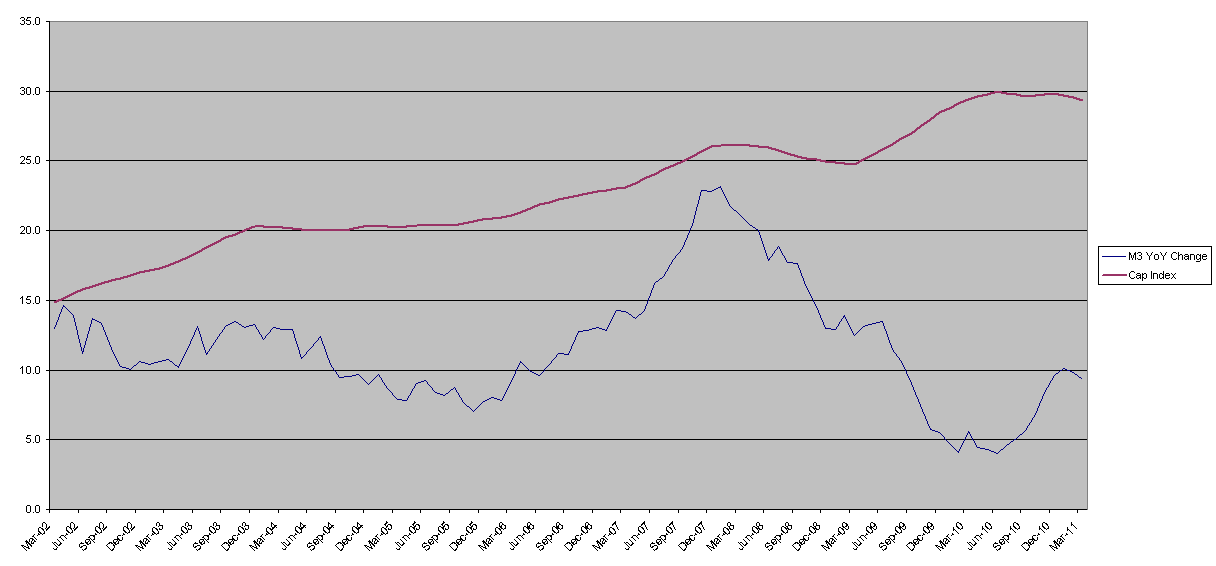
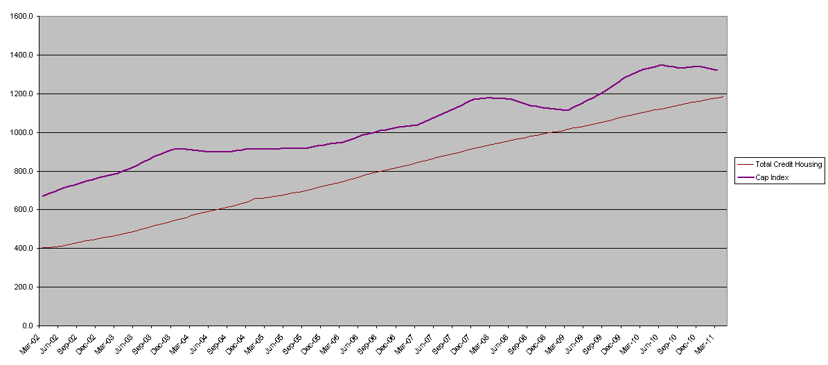
Transaction volumes and their relationship to price movements is something I have been talking about for a long time because I have always considered them very important in determining housing price futures. To prove my point I thought I would compare a number of other key pieces of available data that you would logically expect to be related to the movement in house prices. In each of the graphs below I have overlayed the ABS capital house price index ( in purple ) so you can see the relationship between the data represented and the movements in house price. The capital cities index has only been available since March 2002 which is why I have chosen this date as a starting point. If anyone has access to a dataset on prices with a longer date then let me know as I would be very interested to know how the data fits for a longer time period.
Firstly the RBA’s financial aggregate data for housing. No relationship between the total growth rate and house prices:
Next, growth in M3, which some argue is related. However, since 2009 it clearly has not been:
Next, outstanding private sector credit for housing ($Millions):
Getting closer, but you will notice that even during the GFC and the following boom of the first home buyers grant, that are both prominent in the house prices, the total credit line didn’t move off trend. From the chart you can infer that the long term trend in house prices is related to increase in credit, but the fluctuations in price certainly are not. It is therefore fairly useless in predicting any short-medium term trends in prices, which are relatively important from the “when should I buy perspective”.
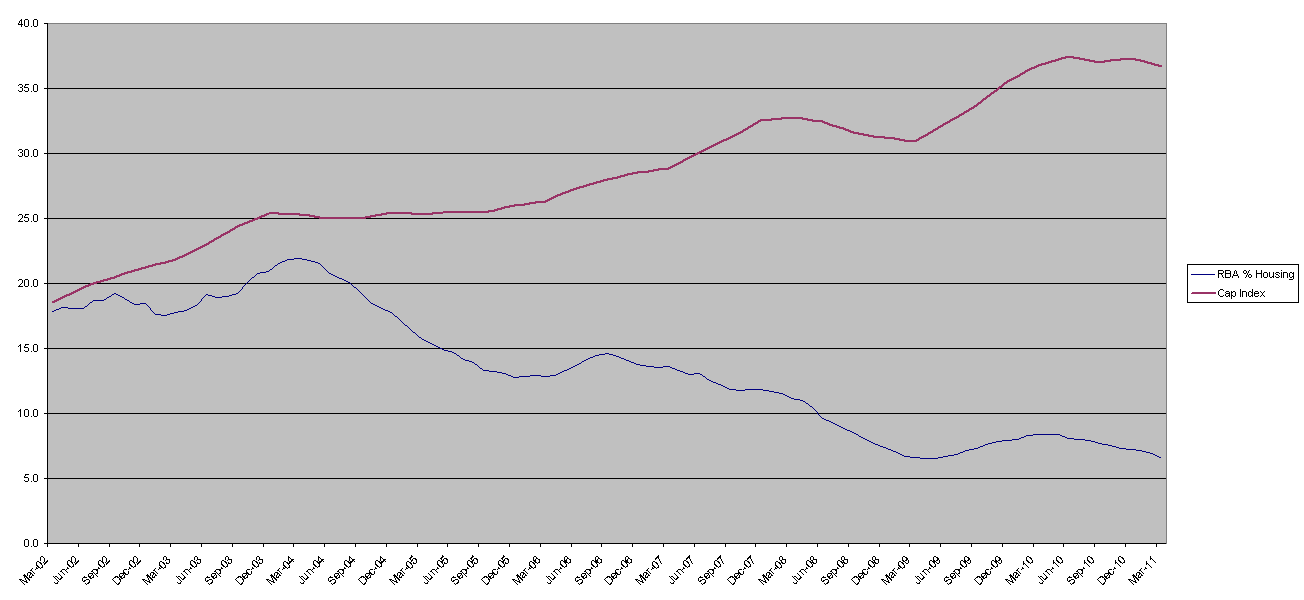
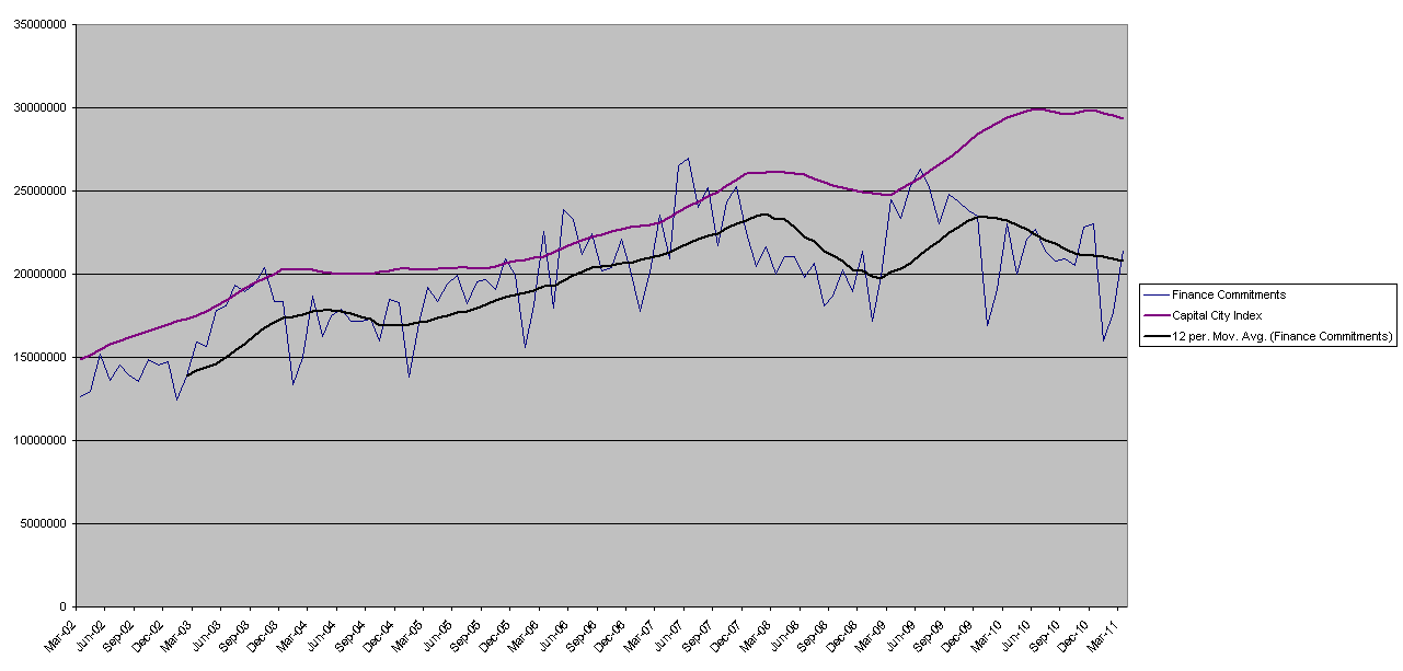
Something else is doing the actual driving, which brings us to our “Churn Rate” chart. Following is the financial commitments to housing per month by Australians. I have added a 12 month trend to the issuance data so that it matches the 12 month trend house price line.
You can see from the chart that the rate of issuance of loans by the banks is a leading indicator for price changes. So what does this tell us? In my opinion, the price of housing is driven by the demand for credit. So in times of high demand the price will go up and visa-versa. In other words “the market needs churn”. What drives prices is market liquidity. When credit is flowing freely then transactions occur more quickly and houses are “seen” to be in short supply. This drives up demand and therefore prices, but interestingly seems to have little effect on the overall trend growth in outstanding credit. The “Churn Rate” determines the price.
You can see there is currently a large divergence between prices and credit issuance. One must fall or the other rise.


