Technical analysis is the study of patterns of movements in price action of a market or asset as a predictive tool for the future movement of those prices. Technical analysis recognises that price volatility is greater than fundamental volatility and for me technical analysis is a really important tool in the armoury of a trader of investor. How you use it depends on your predilections and often in my experience over the years people either love technical analysis or think it is soothsaying and witchcraft.
But love it or hate it, it is a very important driver for many participants in financial markets and particularly traders in the short term. It can be a very important tool also for more medium and longer term players as well. I must confess I always start with the charts even if it’s just to get a picture of how the market is trading.
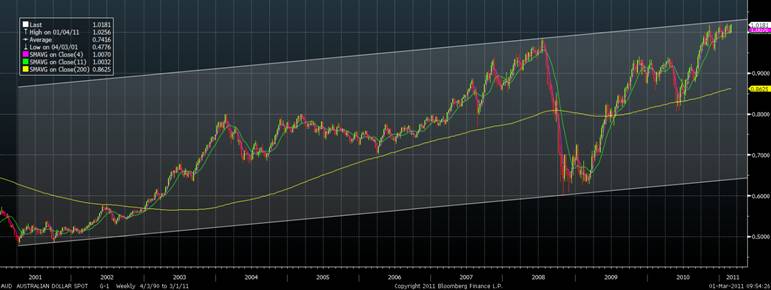
Check out this AUD Chart…its the AUD since the all time low in April 2001. Pretty clear it’s a broad uptrend but equally clear we are near the top.

What I wanted to do was have a look at how technical analysis is used in the market. This is not meant to be a Masterclass in technical analysis however, nor is it meant to be exhaustive as there are so many different ways to undertake technical analysis that we could start a whole new blog and probably blog away forever. If you are interested in learning more about technical analysis I would recommend John Murphy’s book. I got my first copy of this when I was a sckeptical fund manager so it has to be almost 20 years ago now.
There is also various technicians dedicated to technical analysis. People like Robert Prechter of Elliott Wave International. I also got my first “Turtle” trading system back in around 1990ish and I’ve always liked their approach both in the way they trade and in their approach to money management. This approach used to be a cracker for knowing when the hot money was going to flow into the FX pairs. But my favourite approach is to use Fibonacci levels with Japanese Candlestick charts. The briefest of descriptions can be found here. This sort of approach suits my style (I think the Candlesticks really give a good feel for how the market moved on any given bar or timeframe) and the important thing is to find something that suits your style and approach.
But remember that technicals are just part of the toolkit I use. There are many who only use technicals and some who never use them and make plenty of money. Returns in FX markets like assets generally depend on your entry and exit levels, stop losses and time frames. When trading short term, technicals have much more weight than when I am looking at very long term charts. But whatever time frame I’m looking at I always have them as an input in my 5 drivers model.
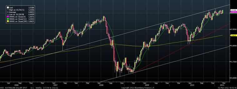
Here is another chart of the AUD where I have a shorter time frame for the AUD, since 2006 and you can once again see the trendlines in place and like the very long term chart it is clearly in an uptrend but once again at the upper end of that uptrend.

But perhaps a little bit of history might help the skeptics who think technicals are witchcraft. We know you are out there. As I noted above I came to technicals as a sceptical fundamentalist but I was lucky enough to sit opposite a great bloke when I was at State Super who used to chart the old fashioned way, by hand with point and figure charts. He taught me a thing or two and then I saw some articles in Technical Analysis of Stocks and Commodities Magazine by a New York Fed Staffer Carol Osler who did an investigation into some specific Technical Analysis signals and order clustering. My take at the time was that she proved that whether they worked because they worked or they worked because everyone was watching the levels the effect was that they worked. From then on I was hooked and always incorporated some form of Technical Analysis in my investing or trading strategy.
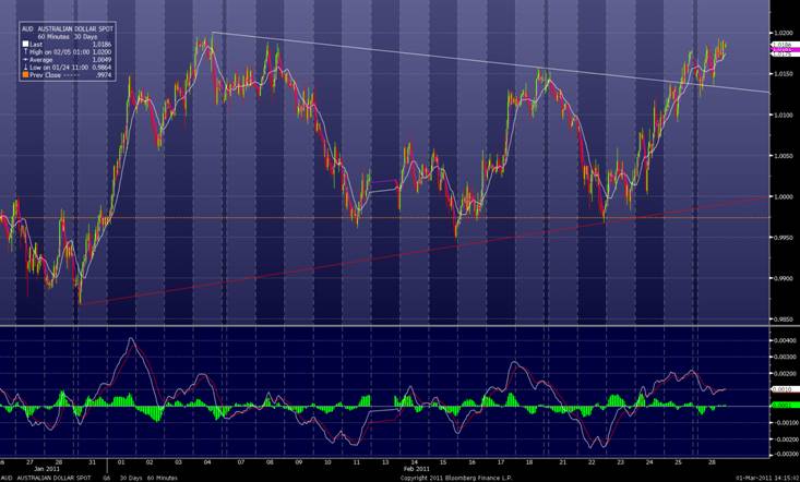
Think the AUD just below 1.02 at the moment. It doesn’t seem to be able to get through this level whether equities rise or fall, whether the USD is weak or strong. There just seems to be resistance there. Osler’s research showed why this occurs but equally tells you that if this level breaks in the very short term there might be stop losses on the other side so it might run.
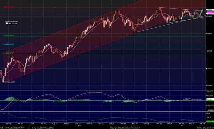
The two charts below are a few days old as I am not attached to the Bloomberg today. On the daily chart since then there has been a few more red bars, down days, likewise on the hourly chart below the AUD has turned tail just under 1.02 and the price is sitting around 1.01 at present. But on daily chart you can see that the AUD is losing upward momentum, has broken out of the uptrend from last year’s lows but hasn’t crashed. You can also see the Fibonacci levels from the low to the high on this move which show where the support will be if it falls out of bed. 0.9400/50 will be huge.


One thing you might also note on these latter charts is some momentum indicators and some shorter term moving average lines. I use these to help me in the short term stuff that I do.
I could write for ever on this topic but I think that is probably enough for one blog. But hopefully you can see how I build up the technical view from the very long term outlook above all the way to the hourly chart for short term trading. Whether you love them or think they are soothsaying without technicals your analytical framework is all the poorer. Certainly it’s easier to be a historian than a prophet but technicals can sometimes help with a few signposts.
Over time as I see specific patterns that occur in the AUD or other markets that I know work (or at least they work for me) I do a little blog on them.