

By Chris Becker
Ever since the depths of the Global Financial Crisis, the consensus mood has continued to strengthen around a sole contention that the future must be inflationary; because to rid the world of its massive debt millstone, inflation will be engineered by monetary printing. The corollaryof this consensus thought is that the only way to offset this inflationary risk is to buy gold.
Yet with the Japanese central bank hell-bent on doubling its monetary base, the US Federal Reserve “flooding” asset markets with cascading piles of freshly printed USD, and similar operations from the European Central Bank and the Chinese with their “mother of all” stimulus packages to keep their grossly imbalanced economy trundling along, where is the inflation?
Why hasn’t gold exploded after its direct correlation with real inflation prior to the GFC? Why isn’t gold priced at $2000 USD per ounce or $3000 Euro per ounce or 13000 yuan per ounce?
(actually gold priced in Yen has exploded, reaching new highs – I’ll come back to that hole in my theory later)
Last night we saw spot gold USD drop nearly 6%, falling through its 2 year support key level:
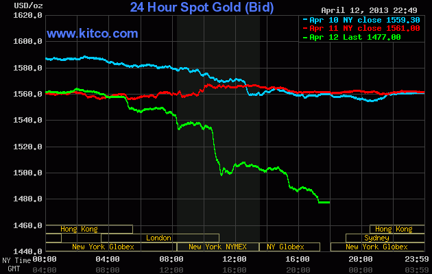
I study price, not because I believe that price is the be all and end all or like most economic theories that equate it a near-religious meaning. To me it’s just a temporary consensus of a limited number of participants and non-participants and it provides the trigger to my actions as a speculator. But the price action for gold – seemingly confirmed by the commodity complex – is shouting to me loud and clear: deflation.
Let’s move on…
Remember, the following views are my own, do not constitute advice and are for information purposes only. I may have positions in any or all of the below and their associated markets both long and short, on an intra-day, daily and weekly basis for my own account. Please seek advice from a licensed adviser before making any investment decisions.
Commodities
I’m going to look at commodities first this week. For Australian investors particularly, there’s three major commodities to watch: crude oil, copper and iron ore. I’ll leave the last to Houses and Holes with his excellent daily updates (although it’s non tradeable for retail/private investors – Fortescue Metals (FMG) and Atlas Iron (AGO) are excellent proxies, both of which I trade regularly).
I said last week that price “charts cannot lie about the forces of supply and demand. If everyone is “printing money” and economic growth is strong worldwide, why isn’t their higher oil and copper prices – the two key commodities in the industrialised world?”
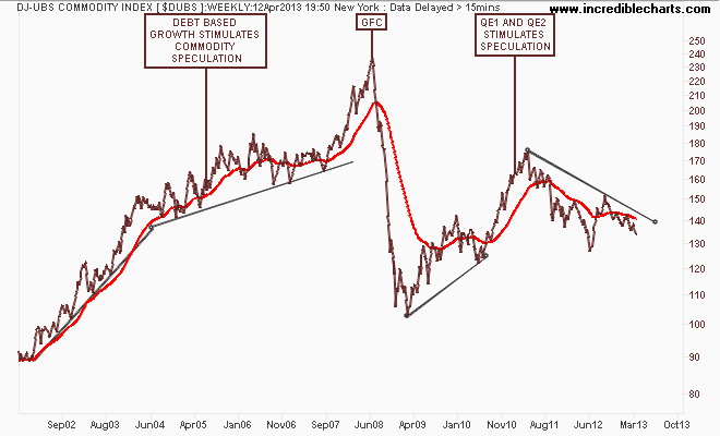
This view is summed up in the DJ-UBS Commodity Index, a basket of commodity future prices. Here’s is the longer term view, where a world economy, fueled by Chinese economic growth and Western debt, propelled commodity prices to the moon; crashed during the GFC and re-flated due to emergency monetary responses:
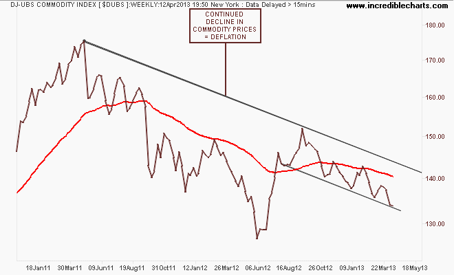
A closer look at the weekly chart shows the more recent trajectory: if the world is expecting an inflationary future, and real growth has taken over from monetary induced stimulus, why are prices deflating?
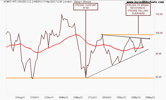
Looking at the main components, the only light in this darkness is the WTI Crude marker, which at first glance looks rather bullish with an ascending triangle pattern that is trying to break out to the upside. But each successive high within this pattern is lower than the last:
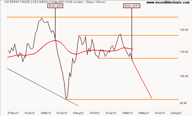
ICE Brent Crude – a marker of European demand – paints a markedly different picture, with the weekly chart of the spot price following through on its break below support after bouncing off it previously. The technical target here is the former low in the risk-off move in early 2012 – are we going to repeat it in 2013?
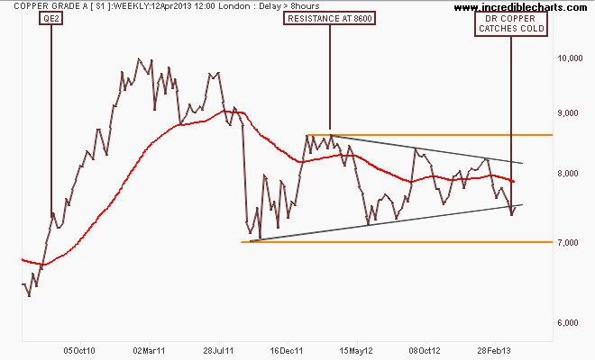
Finally, Dr Copper (so called because its the only “real” economic expert out there) what is your diagnosis? Using the weekly chart of the London spot price, the pattern has morphed into a symmetrical triangle, but with a definite bearish bias with prices well below the early 2011 highs. Last week saw copper break below the trendline as it caught a cold, but this week it has rallied some (less than 2%).
But is the breakdown in gold a harbinger of more to follow? I contend that a full risk-off situation would be confirmed if it drops below terminal support at 7000:
Currencies and Gold
The US Dollar Index (DXY), made up of a basket of major currency pairs against the USD is a good way of measuring the so-called “risk on/risk off” meme prevalent in asset markets, with a lower USD usually meaning higher risk as US stock markets rise and push other risk assets higher, such as our own share market.
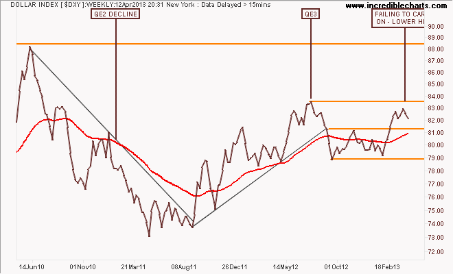
On the weekly chart you can see that in comparison with QE2, where the DXY declined some 12%, QE3 – if measured by USD weakness – has not been successful at all as the currency wars continue. The DXY is still above resistance at 81.5 points but has been unable to break through the interim pre-QE3 84 point target, also failing to make a new high, which is bearish – and normally be good for “undollar” assets, including gold:
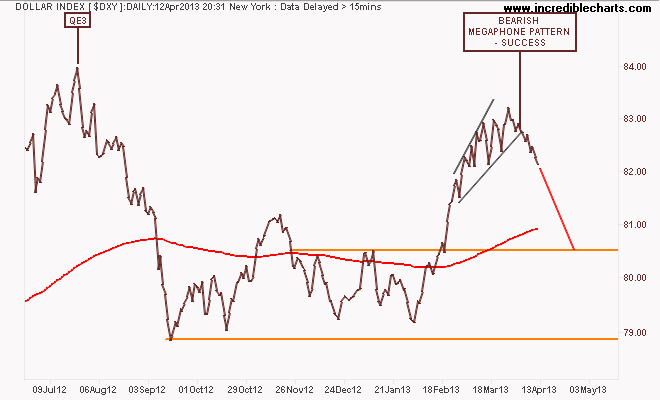
The bearish megaphone pattern that I highlighted previously has succeeded, with the DXY breaking down during the week, possibly retracing all of its strength to 80.5 points. Maybe the monthly QE is having an effect – with rotation to stocks, Yen and Euro:
The first general opposite of the DXY is the euro (EUR/USD). Time to roll out the monthly chart since the euro’s inception, where its been in a decline since the GFC, for some context:
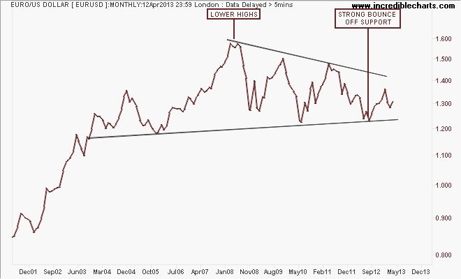
After its break of the year plus down trend in August last year, which was followed by a blowoff as it tried to reach 1.37, the euro had retraced and consolidated below resistance at 1.31 with tentative support is forming at around 1.28:
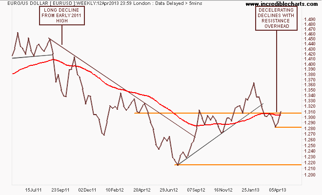
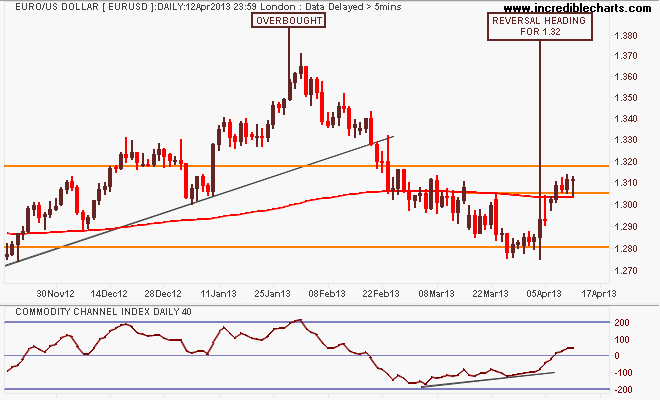
Here’s the shorter term picture with a reversal off the 1.28 key level as I identified previously, and now a break of short term resistance at 1.305, but the daily candles indicate a pause just above this level before trying out for the 1.32 handle. Wait and see mode:
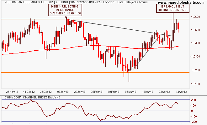
The Aussie “battler” (AUDUSD) continues to consolidate its strength on foreign safe harbor buying. The weekly chart is a fascinating picture, giving an insight into how this is playing out. The key takeaway in the medium term is that clear, strong channel between support and resistance at 1.02 and 1.06 respectively since mid 2012:
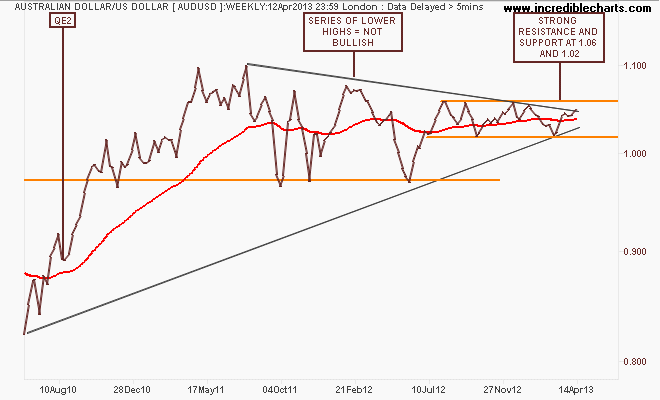
The daily chart below shows how after the recent rebound rally from 1.02 to 1.045 was completed, it took a breakout through to 1.05 for the AUD to get going again, but it is hitting resistance overhead, as indicated by the long upper wick on the Thursday candle, and the bearish Friday candle:
I’ll finish the currency section with the undollar currency of the moment, gold (USD).
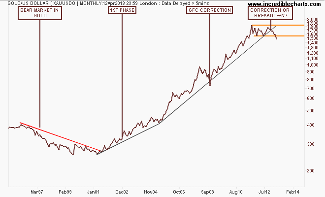
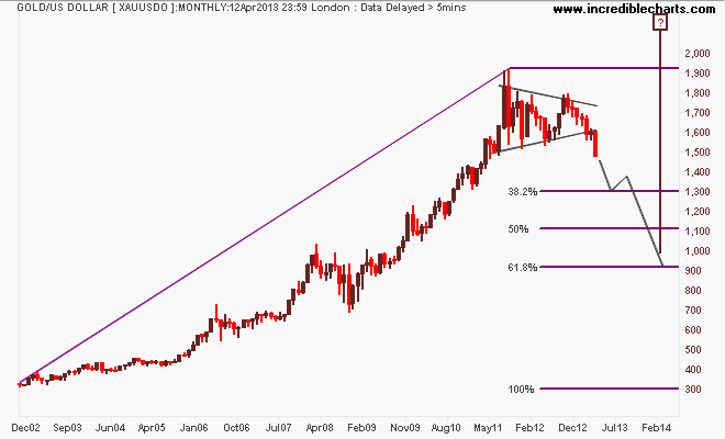
Need some context, so here’s the monthly chart back to 1995, encapsulating the last bear market, the 1st phase of the bull market, the GFC correction (a harbinger or what happens to gold when debt is destroyed) and the current “Situation”:
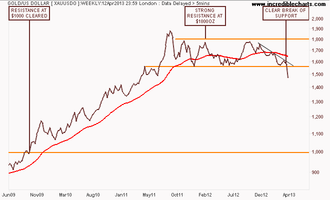
Here’s the weekly chart showing a sideways consolidation, where price kept on bouncing off a support level at $1560 per ounce. I said last week that the “first deflating (sic) problem calling gold a bubble, is that when bubbles end, they don’t go sideways for 2 years…They go down and they keep going down.” – maybe with this absolutely clear break of support, we’ve seen a new definition or maybe gold isn’t a bubble – its just like any other speculative asset prone to excess and calamity?
I’ve always said that a short term view of gold can provide different opportunities, depending on your bent. Intra-day traders, swing traders looking for 3-5 day reversals, trend and breakout traders and “long-term” investors looking for cheap buying opportunities. The daily chart gives a medium term and short term bearish view, with a descending triangle with support at $1560 the breakthrough, and also the bottom of a channel with resistance overhead at $1615USD per ounce.
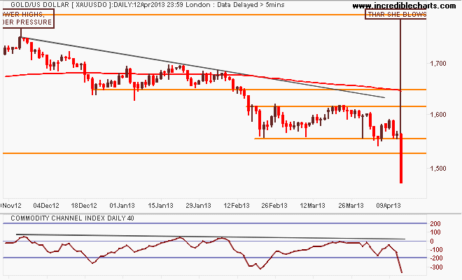
With Friday’s collapsing result through support, the short term picture is pretty clear (although I wouldn’t be surprised to see a rally back up to but not through $1550 in the opening days of next week). Good luck if your “investing” in gold at these levels – because the next stop could be $1300 or even below $1100:
Equity Markets
Before I get to the Aussie market, let’s look at the US S&P500 starting with the monthly chart showing a possible end to the US secular bear market, going on 13 years from the tech bubble high in 2000:
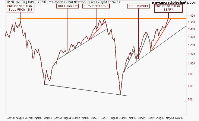
Note how the index before the GFC almost broke that high after a blowoff trend (marked in red) that accelerated in 2006 from the main trend. Note also that this pattern has been repeated – albeit with a lot more volatility and acceleration due to continued bouts of QE – with an accelerated uptrend from the August 2011 low. Not the same, but very similar.
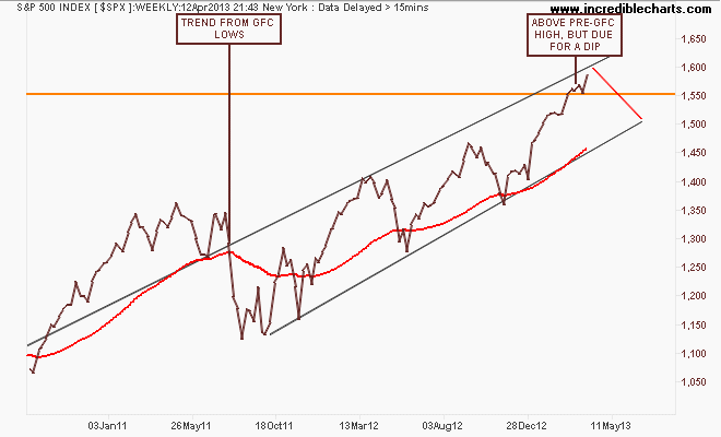
The weekly chart below shows this blowoff in greater detail, with a series of higher highs that is smaller on each up cycle. But the market remains on trend from the GFC low and a trend channel of sorts is apparent, with the weekly price basing off the pre-GFC high at 1550 points, although it remains due for a dip:
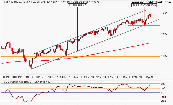
Looking at the short term point of view, as the US market moves into another earnings season, this market remains technically bullish, with the 200 day moving average moving smoothly up left to right with a clear trend in place. Support at 1540 points (touched twice in last few weeks) remains key and if the market approaches the trendline at 1570 points in another dip, for the trend to remain intact – i.e buy the dip – this has to be respected. For now, it’s don’t fight the Fed….
I contend that our own share market, the S&P/ASX200 index is only halfway through its own secular bear market – mainly on the back of the banking sector, which is completely dependent on an easing cycle in interest rates AND continued increases in national income AND access to wholesale credit markets at cheap prices.
Note these important levels: the key levels at 3800-4000 (strong support), 4400 (intermediate resistance and the outer edge of the index’s real value), 4900-5000 (strong resistance) and 6850 (the former high of the 2003-2007 bubble).
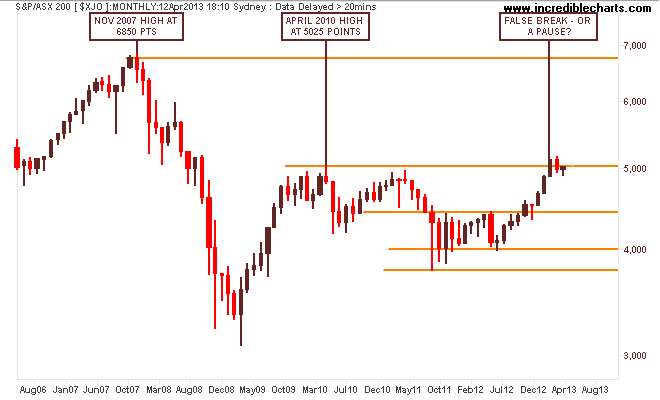
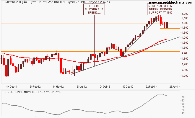
I have been warning of a possible correction and we’ve had a small dip, with this week reversing those very small falls and only going halfway towards a more sustainable trend that would follow the trajectory of the first uptick in the August 2012 lows, around 4600-4700 points:
On the daily chart, we can see how weakness in the previous week saw the market stay below the psychologically important 5000 point barrier, dipping to 4900 points before a bid in materials stocks this week (BHP/RIO etc):
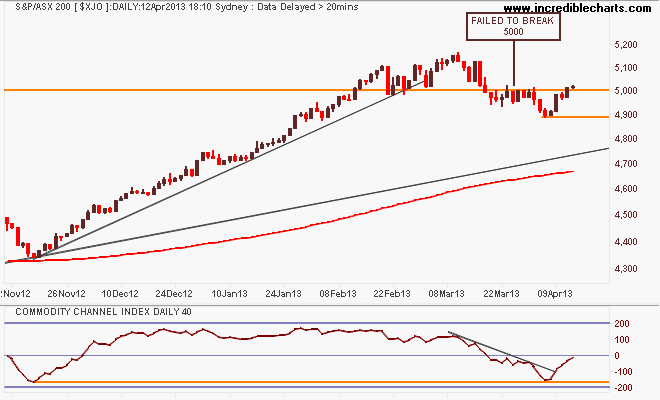
I asked last week, although I got some of the maths wrong, “are we seeing a rotation here from overbought banks to oversold miners? BHP now has a similar yield to CBA believe it or not! Remember, this has been a financial led rally, dependent upon easing by the RBA. If the economy is perceived as being strong enough to not need further rate cuts, this sends a signal to the market, and it is listening. It’s perverse but true. Further, if Chinese markets do not rally soon, any uptick in the mining sector could be short lived.”
With the Woodside postponement of Browse signalling the probable end to the mining investment boom, and as I started this week’s analysis, commodity charts signalling deflation – i.e lower prices – this maybe a short-lived rotation.
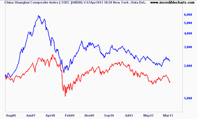
Here’s the weekly chart of the Shanghai Composite vs the ASX200 Materials sector (red) for context, not the most pretty of charts:
That’s all for now, remember to manage your risk first and the returns will come thereafter. See you next week and stay safe.