

by Chris Becker
I want to start the (slow) week off with some positivity so we can step back from the news about terrorism, climate change or your local/national sport team losing over the weekend. What’s to be happy about?
Put simply, the world is getting richer and living longer! These charts from Max Roser show the brilliance of modern society, where even the poorest and unhealthiest are doing much better than the West’s predecessors.
First, life expectancy has skyrocketed across time and country, we’re living longer and better (although most of us watch too much TV):
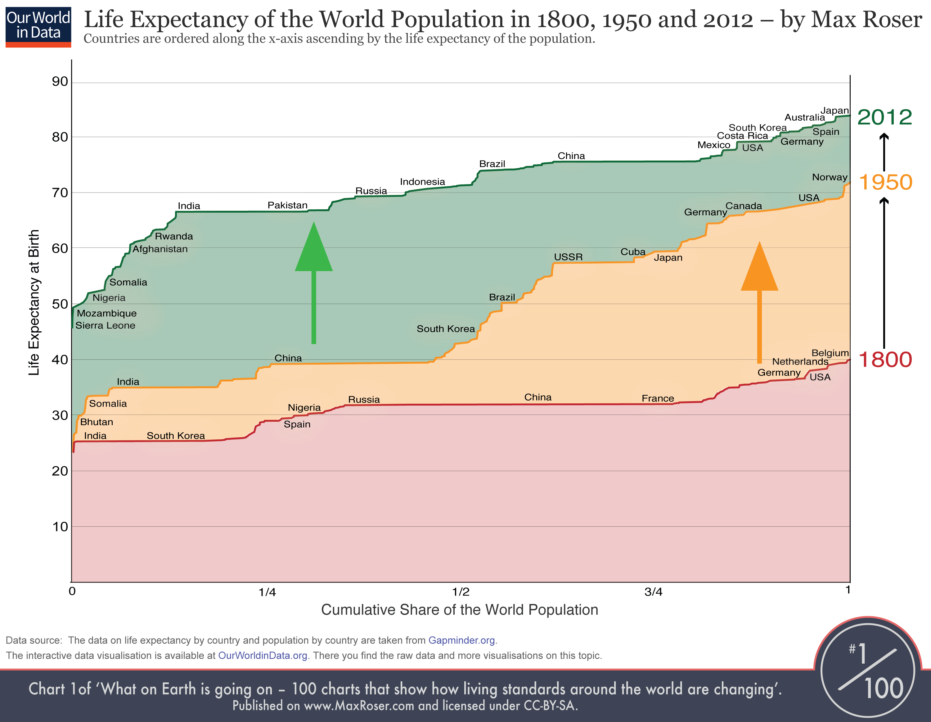
Here’s some cliffnotes to help decipher if not clear:
- For 1800 (red line) you see that the countries on the left – India and also South Korea – have a life expectancy around 25.
- On the very right you see that in 1800 no country had a life expectancy above 40 (Belgium had the highest life expectancy with just 40 years).
- In 1950 the life expectancy of all countries was higher than in 1800 and the richer countries in Europe and North America had life expectancies over 60 years – over the course of modernisation and industrialisation the health of the population improved dramatically.
- But half of the world’s population – look at India and China – made only little progress. Therefore the world in 1950 was highly unequal in living standards – clearly devided between developed countries and developing countries.
- Look at the change between 1950 and 2012! Now it is the former developing countries – the countries that were worst off in 1950 – that achieved the fastest progress. While some countries (mostly in Africa) are lacking behind.
- But many of the former developing countries have caught up and we achieved a dramatic reduction of global health inequality.
- The world developed from equally poor health in 1800 to great inequality in 1950 and back to more equality today – but equality on a much higher level.
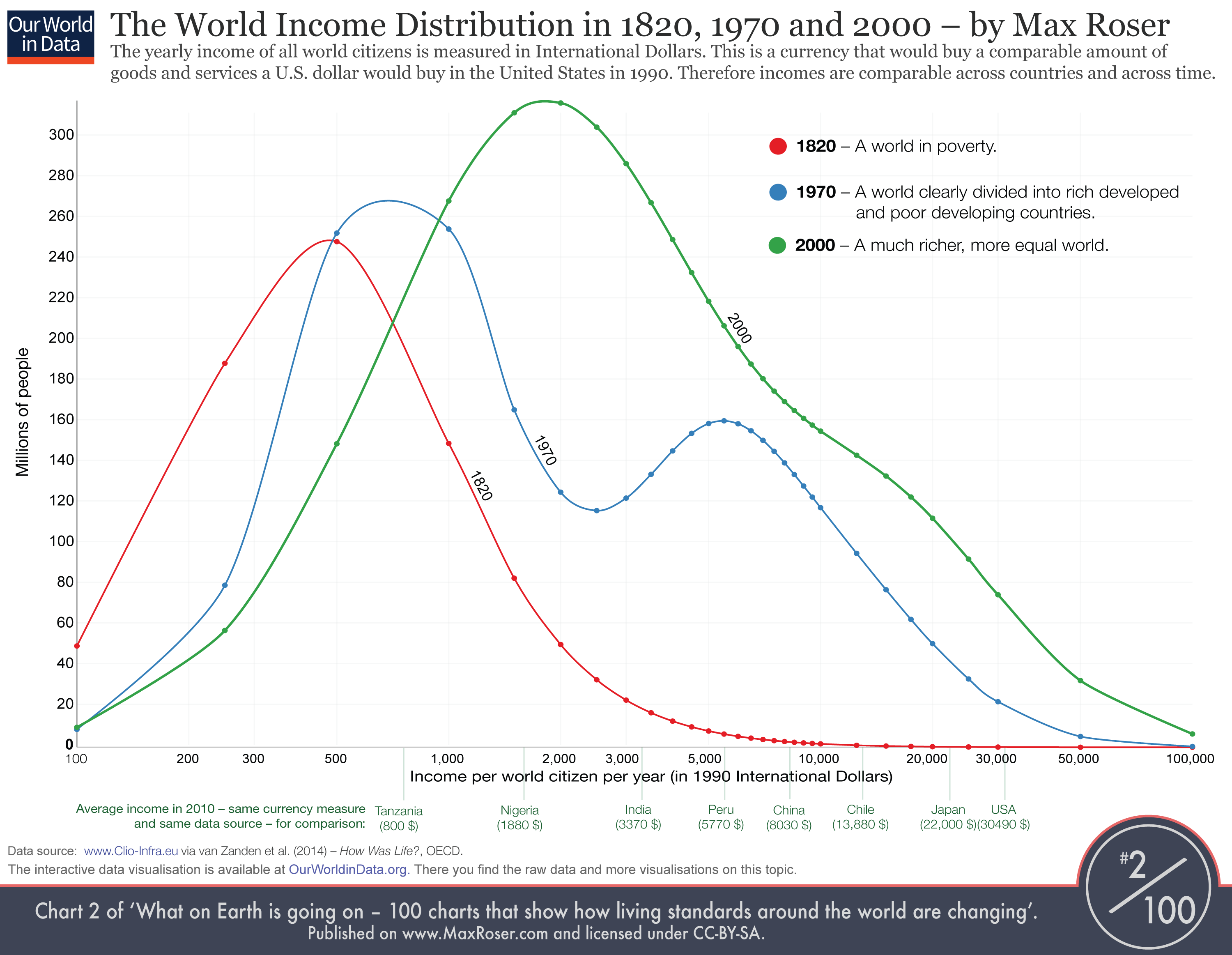
And this shows quite clearly in the distribution of income across the world and time as prosperity takes hold:
Sure, there’s lots of problems out there, but we are collectively getting richer and healthier across almost all metrics.
Keep that in mind next time you complain about house prices or the cost of coffee.