

By Chris Becker
The local finance news this week has been agog at the Australian dollar, as it fell, and kept falling, below parity with the USD. Beyond the actual price volatility, is the reaction of a mainstream press looking for an excuse for the weakness in the USD rising.
As I said last week, something else is afoot with the AUD/risk-on/commodity nexus. Stock markets continue to rise, commodities rebound, but the “battler” to crumble. Are we seeing the start of the great Australian adjustment, long considered the most beautiful in the Great Ugly Western Economy contest?
….
Remember, the following views are my own, do not constitute advice and are for information purposes only. I may have positions in any or all of the below and their associated markets both long and short, on an intra-day, daily and weekly basis for my own account. Please seek advice from a licensed adviser before making any investment decisions.
Currencies, Bonds and Gold
The US Dollar Index (DXY), made up of a basket of major currency pairs against the USD is a good way of measuring the so-called “risk on/risk off” meme prevalent in asset markets, with a lower USD usually meaning higher risk as US stock markets rise and push other risk assets higher, such as our own share market.
Previously on the weekly chart I drew a “buy box” where it was apparent that there was some major repositioning or repatriation of USD going on, and after last week’s bullish engulfing candle incorporating the whole box area, there has been a clean breakout to new highs above the pre-QE3 period:
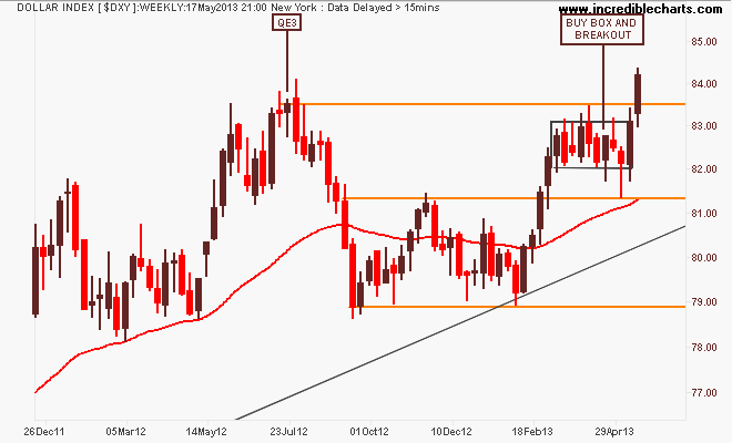
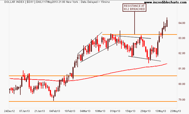
Here’s the daily chart where you can see the consolidation in the past few weeks has been going on, with the DXY bouncing off its climbing 200 day moving average (the red line in all charts). King Dollar remounts the throne!
The first general opposite of the DXY is the euro (EUR/USD) and is the first casualty in this move. After its break of the year plus down trend in August last year, which was followed by a blowoff as it tried to reach 1.37 on the back of QE3, the euro has retraced and consolidated at the key level of 1.30 – but is now feeling considerable downward pressure. The road to 1.22 is open:
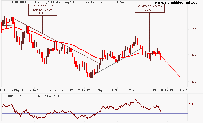
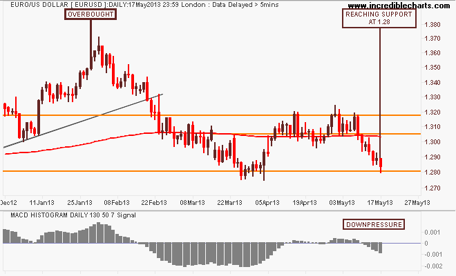
As I said last week, my preferred momentum indicator (200 day CCI as marked above) suggested weakness in the near term, and the MACDH buy/sell indicator is lurching to the latter, as the cross rests on the 1.28 support level:
Now for the Aussie “battler” (AUDUSD) First, let’s step back and look at the monthly chart, using candlesticks because I think this is the clearest way to look at the big picture (note, this is just a sketch of possible tactics not a recommendation):
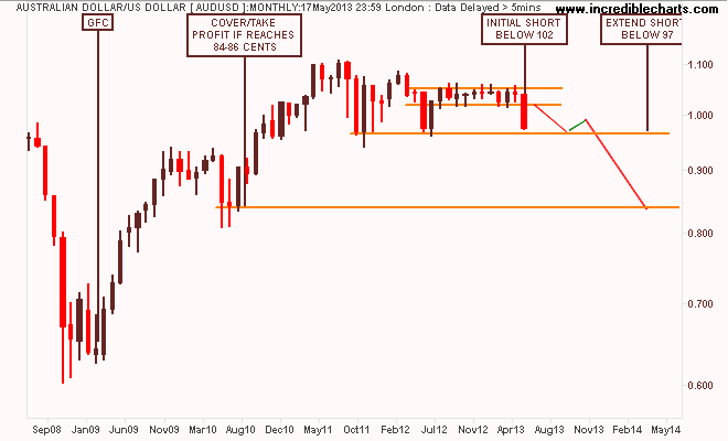
As you can see, since July 2012, the AUD has been in a very tight band between 1.02 and 1.06 which is now clearly broken, but not to the general level of support at 96 to 97 cents, last seen during the previous two down cycles in the “Great Volatility”. The next level of support is 84 to 86 cents, which is my probable medium term target – and from a macro point of view, probably not good enough for the economy in the long run…
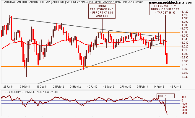
The weekly chart remains a fascinating picture, and depending on your poison shows how technical analysis is a powerful tool in positioning against these big moves in FX markets. For now, the AUDUSD looks considerably oversold, in fact the sharpness of this move equates to the fall during the GFC:
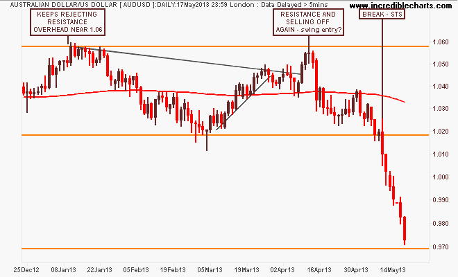
The daily chart is just painful to look at if you weren’t short. If you missed the swing entry, the breakdown was as obvious as the proverbial (i.e sell new lows, which is psychologically hard for people to do):
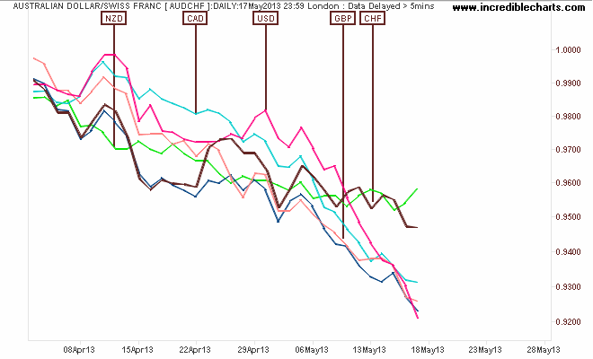
And here’s the anti-MSM chart showing how the AUD is falling against…everything! So its not just the pretty candles, but the whole cake getting thrown on the ground here….will it bounce?
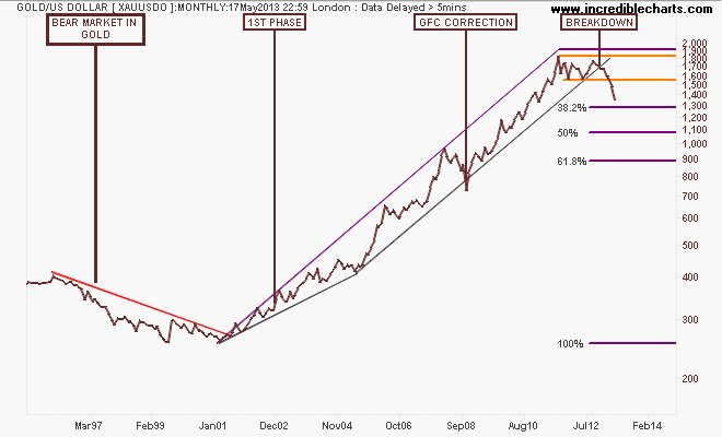
I’ll finish the currency section with the undollar currency of the moment, gold (USD) which seems to have also lost its gilded (sic) “safe haven” label. Here’s the monthly chart, with my Fibonacci retracement levels plotted in from a while ago. If it runs true to script, gold is likely to find support at $1300USD before heading to the $900 to $1100 area:
If you’re in the camp of “buy things when they are cheaper”, can I just suggest you look instead at buying gold IF it comes up again? Some basic systematic trading techniques can help here. Sometimes I think gold bugs are just as bad as dyed in the wool value investors…
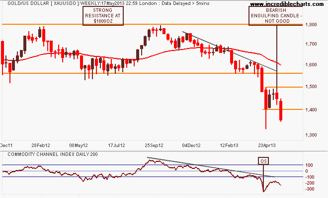
Anyway, let’s look at the weekly chart quickly before the daily. Last week I noted that “gold’s inevitable rebound has now completely lost momentum with a bearish engulfing candle clearly indicating the market has no confidence of further rises here” and indeed, this bearish stance was confirmed by the momentum indicator failing to revert above oversold, with gold falling through support at $1400USD per ounce:
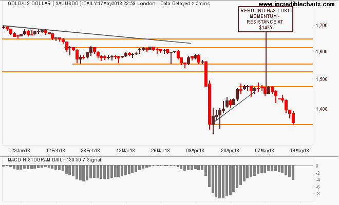
The loss of momentum was extremely clear on the daily chart, with resistance hit at $1475 and the swing and trend traders exiting their small long positions, before reversing and going short as the physical gold buying frenzy has not been repeated in the spot markets:
Commodities
For Australian investors particularly, there’s three major commodities to watch: crude oil, copper and iron ore. I’ll leave the last to Houses and Holes with his excellent daily updates (although it’s non tradeable for retail/private investors – Fortescue Metals (FMG) and Atlas Iron (AGO) both of which I trade regularly as proxies).
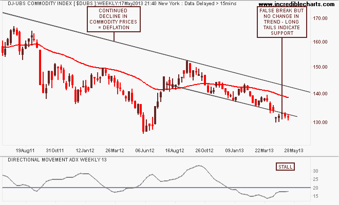
The medium term view in commodity prices is summed up in the DJ-UBS Commodity Index, a basket of commodity future prices. The trend is still down, from the mid-2011 high, with a recent breakdown in the trend channel proving false, but the long tails under the weekly candles suggest some support is building. If not for a reversal, but a consolidation of further downward moves:
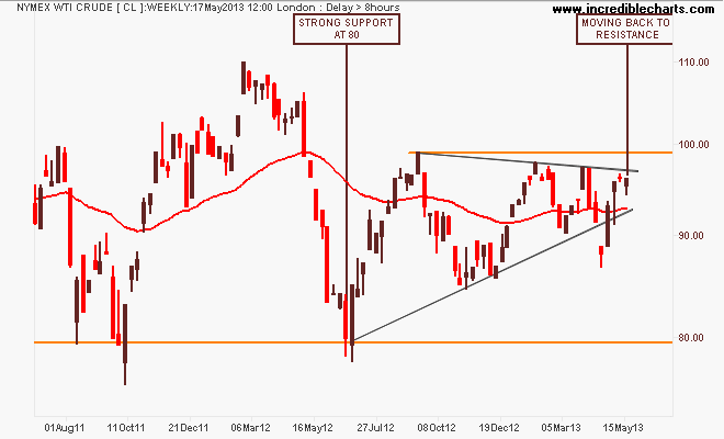
Looking at the main components, the most closely watched – WTI Crude – had recently broken down out of its ascending triangle pattern in what has been a false break that became a very bullish as it rallied nearly $10USD a barrel. This is not yet a confirmed upward sustained moved, which would require a breakout well above $96USD per barrel and then above $100USD for the full enchilada:
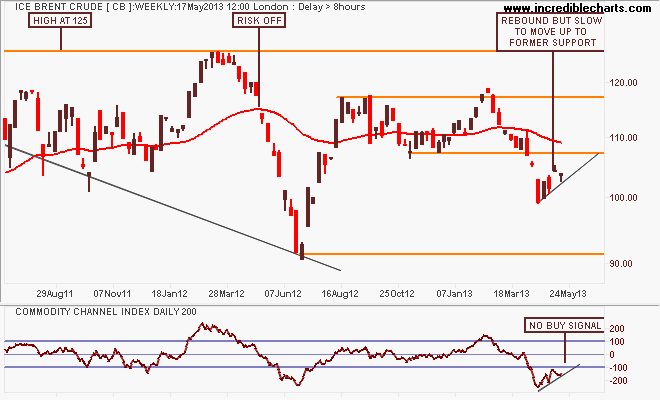
ICE Brent Crude – a marker of European demand – has reversed properly, reflecting the bullishness that seems to be building. I remain quite biased towards expecting a bearish 2nd quarter with strong resistance overhead, which will reflects the weak European post-Christmas cycle. But this could be a very good buy signal, only if it can breakthrough above resistance at $107:
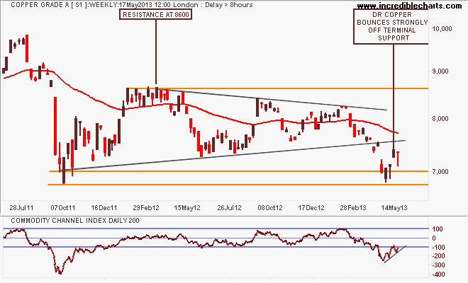
Finally, Dr Copper (so called because it’s the only “real” economic expert out there) maybe lagging its periodic brother gold and is showing some signs of weakness/lack of support as it is unable to get back on trend and its 200 day moving average. Wait and see mode here:
Equity Markets
If ever you wanted a lesson on why the hypothesis of “higher stock markets=stronger economies” is nonsense, and why in the post-GFC age its all about central bank liquidity and monetary operations, now is the best time to make your observations and judgements….
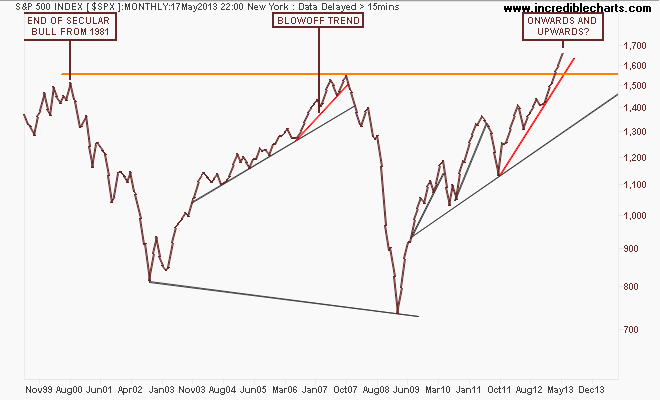
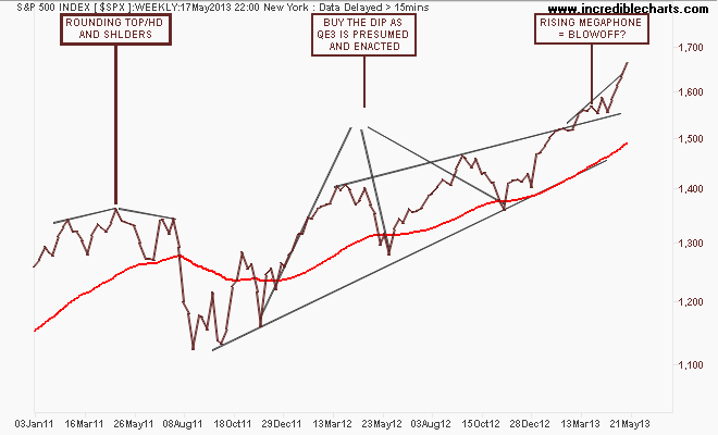
This week I’ll just look at the ASX200 and the US S&P500 starting with the monthly chart below of the latter, showing the huge blowoff trend in prices – all from support by the Fed – as the market shoots past its former highs. Is nobody else concerned about the angle of that red line? If you were Japanese you’d consider that childs play….
The weekly chart shows this blowoff in more detail with a series of higher highs that is smaller on each up cycle. But the market remains on trend with the weekly price staying above the upper trend line:
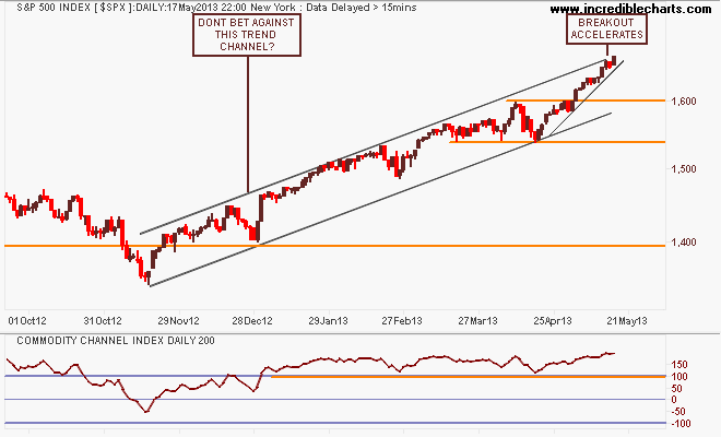
Looking at the short term point of view, note the key levels of support at 1540 points and resistance at 1600, as the breakout sharply accelerates. Looks like “Sell in May” and go away will be a tougher decision this year: book massive profits or ride this liquidity led roller coaster up and up. Don’t fight that trend channel when backstopped by the Fed?
I still contend that our own share market, the S&P/ASX200 index is only halfway through its own secular bear market – mainly on the back of the banking sector – which is completely dependent on an easing cycle in interest rates AND continued increases in national income AND access to wholesale credit markets at cheap prices. IMO, only one of the above is assured, and with the AUD falling, the certainly of the last is slipping…
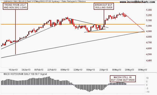
Note these important levels: the key levels at 3800-4000 (strong support), 4400 (intermediate resistance and the outer edge of the index’s real value), 4900-5000 (strong resistance, but now broken) and 6850 (the former high of the 2003-2007 bubble).
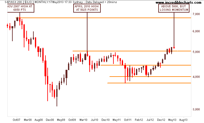
So on a long term view, it seems likely now that the key level of 5000 points will form strong support for further rallies or consolidation to come but there is not much upside due to the internal structure and the macro effect of external forces. This is being displayed in the current lack of momentum, as I think everyone who wants to buy bank stocks has done so…
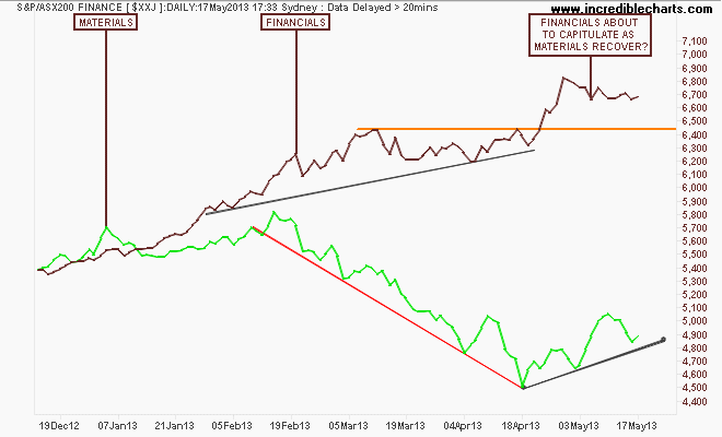
My medium term view remains that the recent rally has been unsustainable, and completely carried by the financials sector as the RBA eased rates to re-inflate the housing sector. That the materials sector has corrected sharply during this time as commodity prices came off the boil while Chinese authorities try to transition their economy continues to add to the risk of a correction and back to the trajectory from the first uptick in the August 2012 lows, around 4600-4700 points.
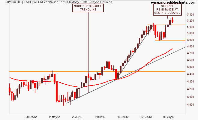
On the weekly chart, the market has broken through resistance at 5130 points as it absorbed “Bank Week” but this week’s spinning top as the AUD cracked does not display a lot of bullishness follow through:
On the daily chart we can see the drawn out dip over March and April at the end of earnings season, but breaking to the upside again above 5000 points as the banks reported and pushed the index ever higher. My preferred MACDH still remains in the buy zone, but the following chart puts paid to taking some risk off here on a trend line reversion back below 5000:
Here’s the financials and materials (green) sector daily charts are plotted and we can see a possible capitulation – following the AUD – of banks in the coming weeks. But it looks like materials are finally finding a bid. Can they replace the banks? (An ironic question, given it’s the other way around in the macro settings with re-inflation of the housing bubble replacing the mining investment cliff):
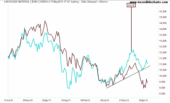
And for a possible leading index for the Materials index, here’s the Hang Seng China Enterprises (HSCE) Index, which is starting to recover:
Trading Diary
On the back of the podcast I did on Trading Psychology, I’ve started a Trading Diary at my personal website in the past week, as I needed somewhere to jot down my random thoughts about markets, trading and life. So if you want to follow my infrequent and irregular thoughts, have a look.
Remember to manage your risk first and the returns should come thereafter. Oh, and in case you haven’t seen the full “Threw it on the ground” video, here it is:
Join the Forum discussion on this post