By Chris Becker
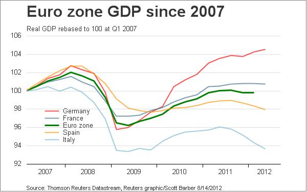
Last night we saw the flash 2Q GDP print for the French, German and EMU economies (unchanged, up 0.3% and down 0.2% respectively) – you’ll hear more on the composition and expected flow on effects from Delusional Economics later on today.
I’ve always contended that using GDP (gross domestic product – a metric devised before WW2 whose designer said it shouldn’t be used to gauge “economic welfare”) to measure the prosperity of a nation’s economy is sub-optimal (at least use GDP per capita please economists!), this chart from Scotty Barber at Reuters highlights in a glance the defining problem across the Eurozone:

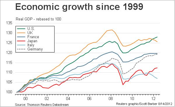
Here’s the longer term chart going back to inception (not the movie, but it feels like it doesn’t it?)

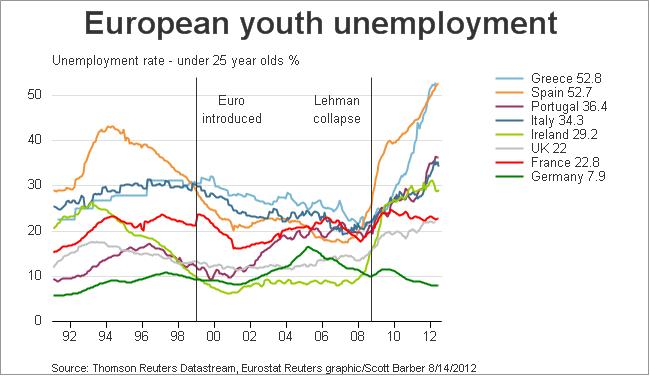
Here’s the chart that has always mattered with the Eurozone – youth unemployment. Economic growth is the only alternative to getting rid of the debt (which for ideological reasons, is not a meaningful alternative), but where is this going to come from?

Chris Becker is an investment strategist at Macro Investor, Australia’s leading independent investment newsletter covering stocks, trades, property and fixed interest. Each week Macro Investor publishes tables on the top ten most undervalued and overvalued stocks on the ASX. A free 21-day trial is available at the site.
You can follow Chris on Twitter.