Independent economist, Tarric Brooker, has a penchant for summarising a situation with a single chart.
Brooker did it again, summarising Australia’s housing affordability crisis with the next chart showing the wide disconnect between real household disposable incomes and real house prices:
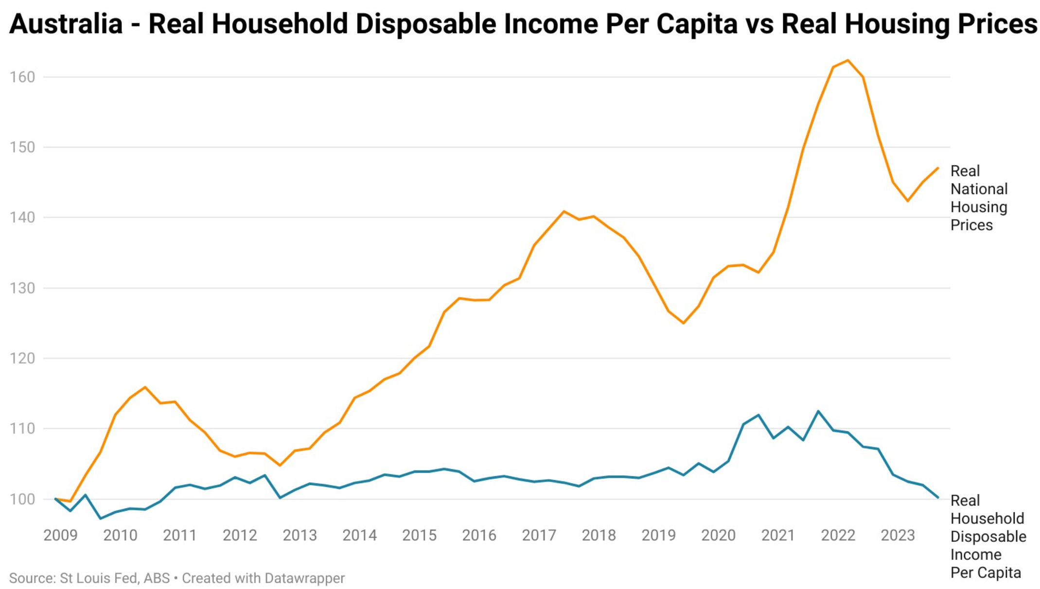
Source: Tarric Brooker
“Since December 2008, real household disposable income has gone basically nowhere”, noted Brooker.
“Meanwhile, real housing prices have gone to the moon”.
“This is not a recipe for a healthy society”, he warned.
Brooker also created a similar chart from 2000, which is even more abysmal given the strong house price growth experienced in the early 2000s:
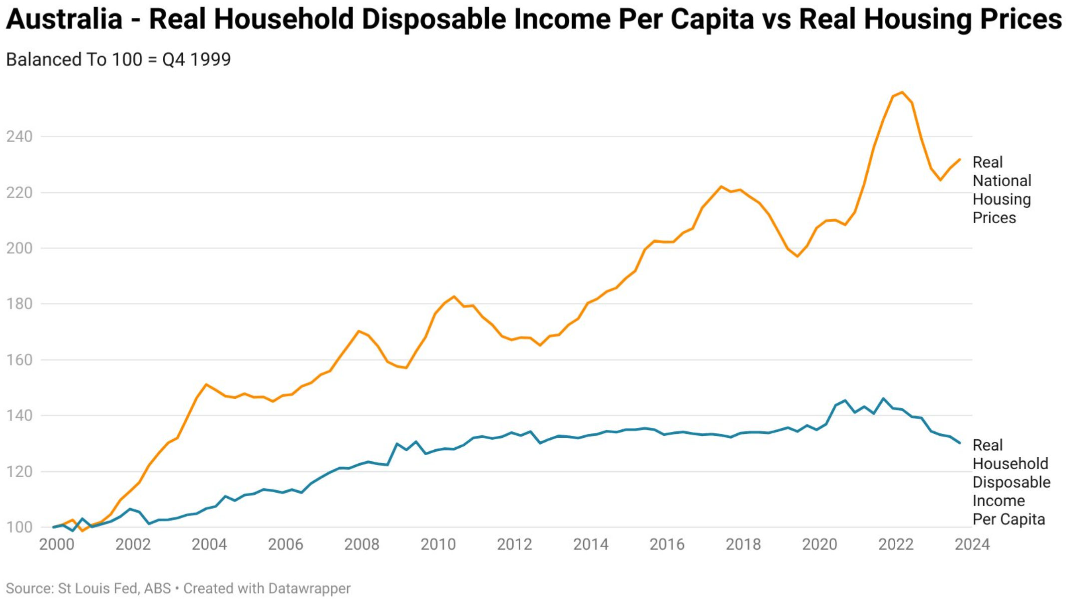
Source: Tarric Brooker
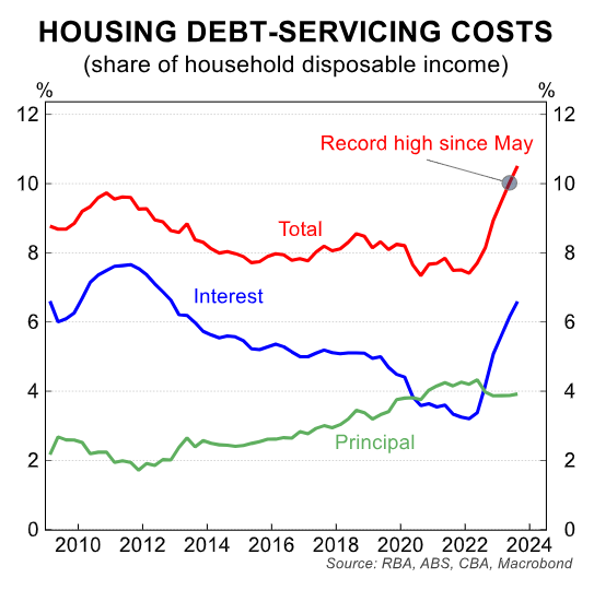
Collapsing interest rates over the 20 years to May 2022 (the RBA’s first rate hike) masked the decline in housing affordability.
However, the subsequent 4.25% increase in the official cash rate has driven home loan repayments to record levels:
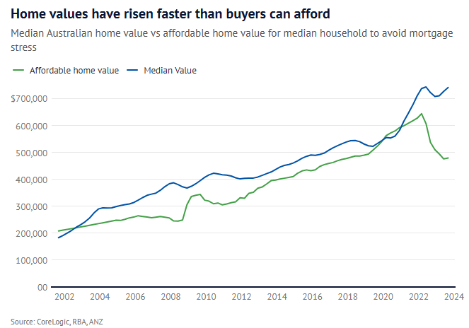
In turn, analysis from AMP’s Shane Oliver, published in The AFR, shows a record gap between home values and what buyers can actually afford to avoid mortgage stress:
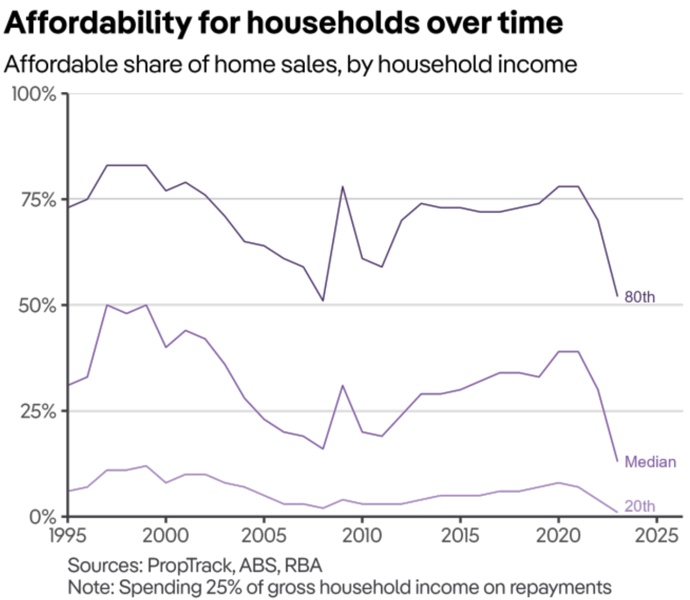
PropTrack analysis likewise shows that only 13% of Australian homes are affordable to the median buyer, the worst result in 30 years of data:
No matter which way you cut it, Australia’s housing affordability is the worst in history due to a combination of excessively high purchase prices and elevated mortgage rates.