The 2016 Census was released late June and, as always, it provided some useful insights into the Australian housing market. This member’s special report delves into the key summary data and provides a snapshot of how the housing market has changed on a variety of metrics.
Home ownership:
The below charts plot home ownership back to the 1961 Census. The earlier data has been taken from Dr Judith Yates’ submission to the parliamentary inquiry into home ownership with the 2016 Census data added.
First, here’s the overall picture on home ownership by age group:
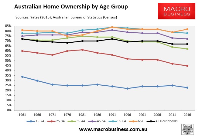
As shown above, the overall home ownership rate has declined gradually from 72% in 1961 to an equal low of 67% in 2016.
However, there has been significant variation between age groups. Below is the same data zoomed in on younger age groups:
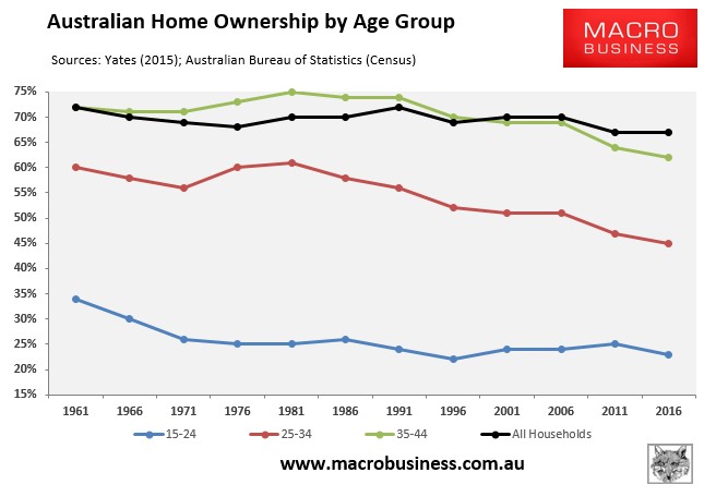
As you can see, all younger aged cohorts have experienced large declines in home ownership, with the key 25 to 35 year age group experiencing the sharpest fall.
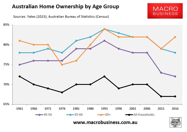
By contrast, older Australians have experienced largely stable rates of home ownership, with those aged 65+ actually increasing:
Below are the changes in home ownership in the 55 years since 1961:
- 15 to 24 year-olds: 34% in 1961 to 23% in 2016 (decrease of 11%)
- 25 to 34 year-olds: 60% in 1961 to 45% in 2016 (decrease of 15%)
- 35 to 44 year-olds: 72% in 1961 to 62% in 2016 (decrease of 10%)
- 45 to 54 year-olds: 75% in 1961 to 72% in 2016 (decrease of 3%)
- 55 to 64 year-olds: 78% in 1961 to 78% in 2016 (no change)
- 65+: 81% in 1961 to 82% in 2016 (increase of 1%)
So, clearly fortunes are favouring the old when it comes to Australian home ownership. The two oldest cohorts have managed to maintain or increase their share of home ownership over the past 55 years, whereas home ownership rates have fallen significantly amongst the younger age groups.
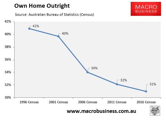
In addition to the overall falling home ownership rate, the proportion of households that own their homes outright has also collapsed, from 41% in 1996 to 31% as at the 2016 Census:
The below charts track the change in overall home ownership across the capitals since the 2001 Census:
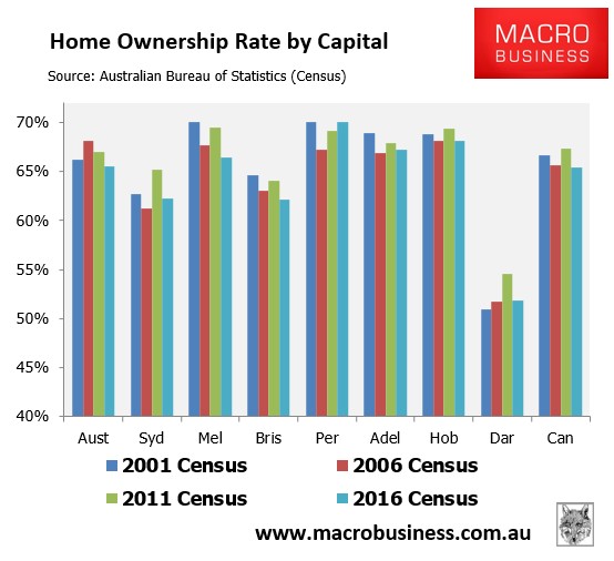
All capitals except Perth (flat) and Darwin (increase) experienced a decline in home ownership between 2001 and 2016.
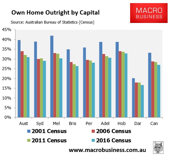
Again, the decline in the proportion of households that own their homes outright has been much worse, and has been evident across all capitals:
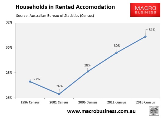
As expected, the decline in home ownership has been met with an increase in households in rental accommodation, which has increased from 27% in 1999 to 31% as at the 2016 Census:
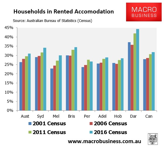
The growth in rented accommodation has been broad-based, with all jurisdiction experiencing large increases since 2001:
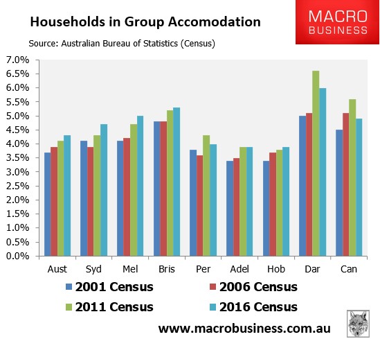
In a similar vein, the percentage of households in group accommodation – defined as one that consists of two or more unrelated people, where all residents are 15 or over – has increased across all jurisdictions and nationally since 2001:
Housing supply and characteristics:
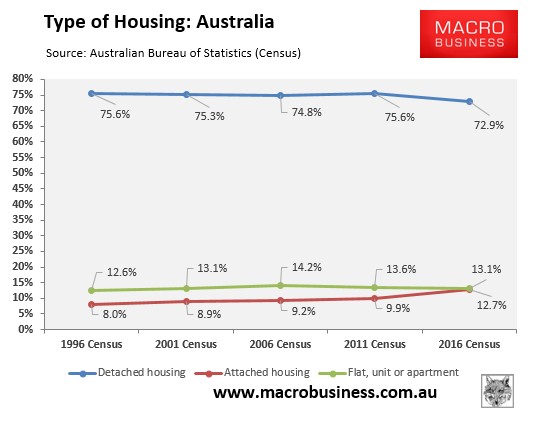
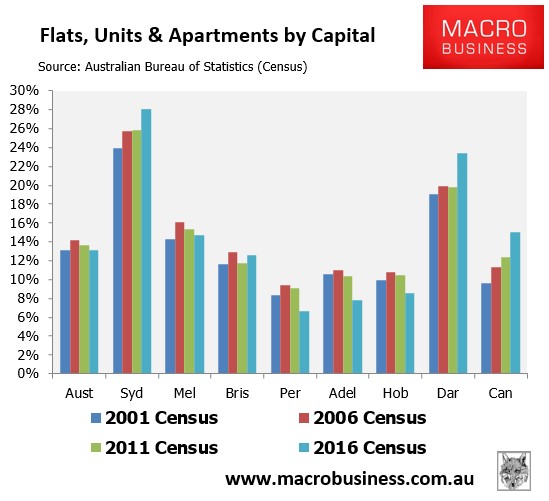
The 2016 Census revealed a gradual shifting of Australia’s housing stock away from detached houses towards attached homes (i.e. semi’s, terraces and town houses) as well as flats, units and apartments:
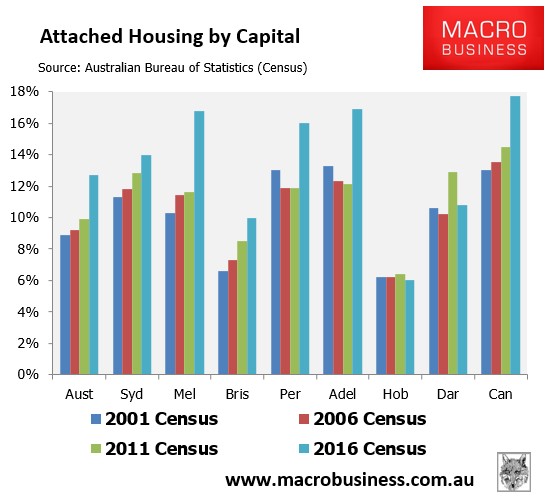
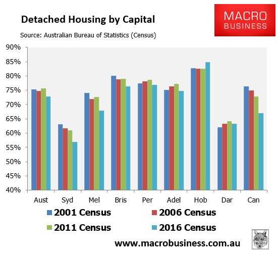
As expected, this shift has been most noticeable across the Eastern capitals:
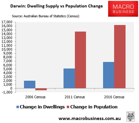
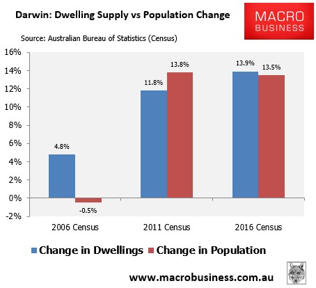
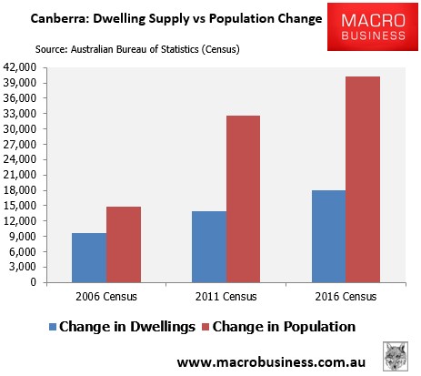
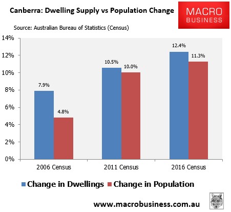
The latest Census also revealed that Australian dwelling supply has generally failed to match the growth in the population.
The below charts plot the change in Australia’s population versus the change in dwellings in the five years leading up to the 2001, 2006, 2011 and 2012 Censuses:
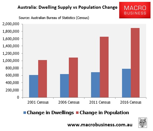
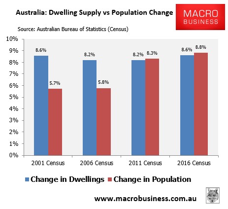
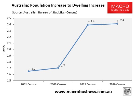
As you can see, the past decade has seen a huge increase in Australia’s population, but has failed to commensurately increase the dwelling stock. This is illustrated by the ratio of population increase to dwelling increase jumping for 1.7 in the five years leading up to the 2001 and 2006 Censuses to 2.4 in the five years leading up to the 2001 and 2016 Censuses:
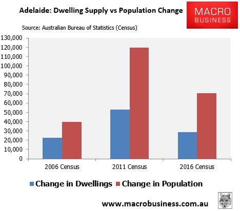
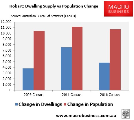
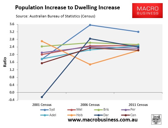
The below charts track the change in population versus the change in dwellings at the capital city level:
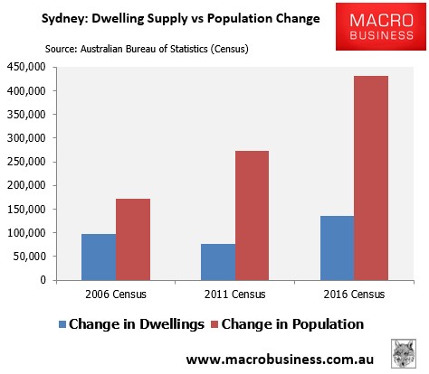
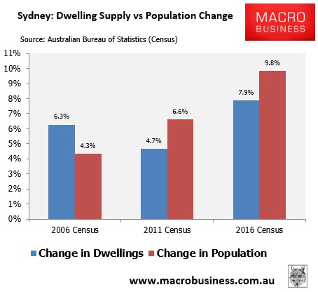
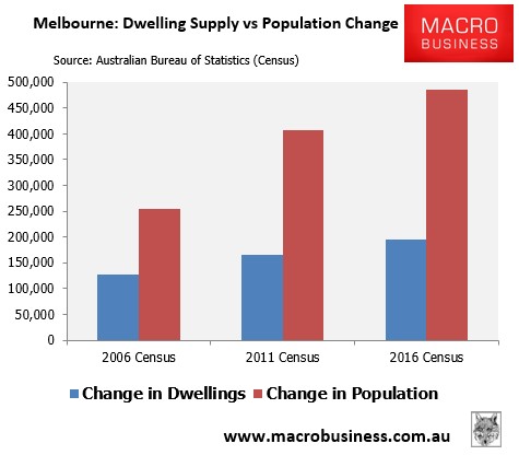
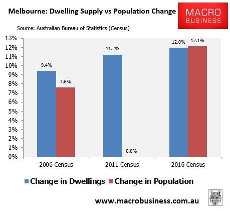
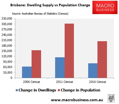
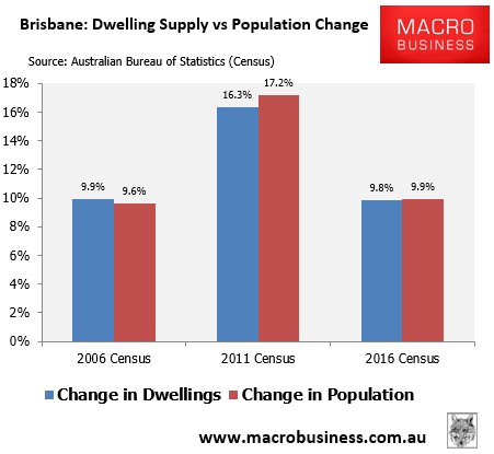
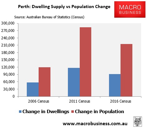
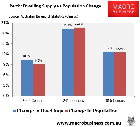
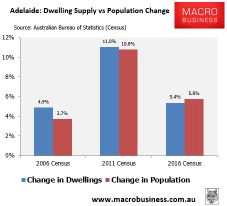
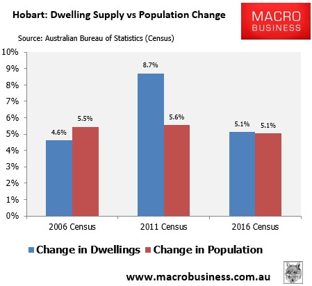
The below chart plots the ratio of population increase to dwelling increase across the last three Censuses, and suggests that Sydney has driven the lion’s share of the increase in this ratio nationally:
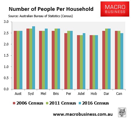
The below charts shows that while the average number of people per household has remains stable nationally over the past three Censuses, it has increased across most capitals, including Sydney and Melbourne:
Thus, the data overall suggests that Australia’s housing market has tightened over the past decade, as population growth has exceeded the growth in dwellings. And most of this tightening has been driven by Sydney.
Housing affordability:
The 2016 Census painted a mixed picture on housing affordability.
As expected, the large reduction in mortgage to historical lows:
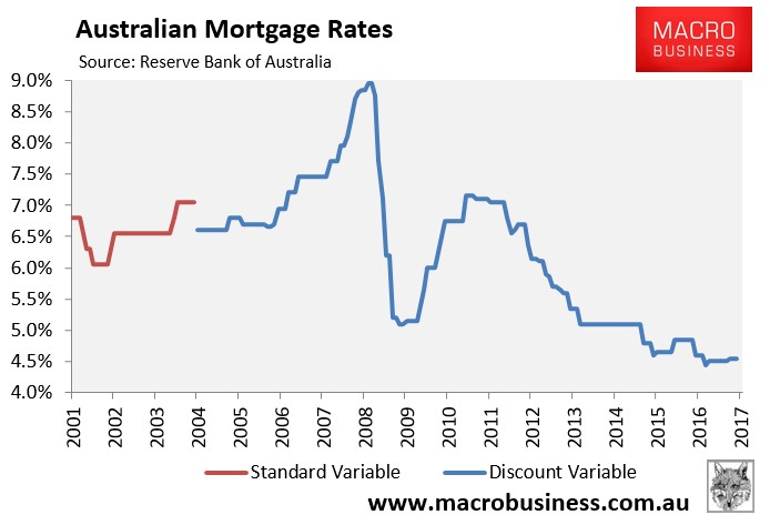
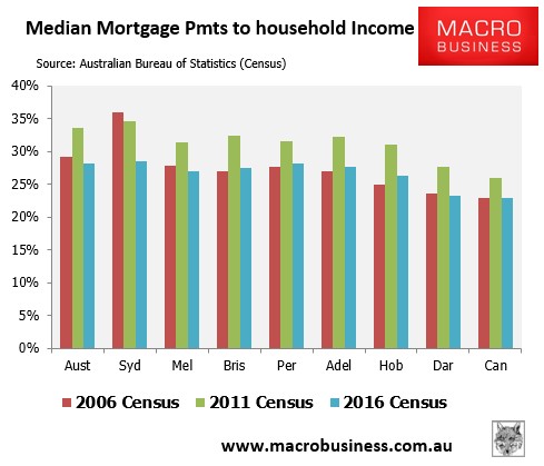
Has resulted in a decent reduction in mortgage payments relative to household income:
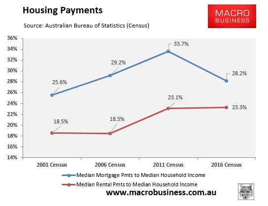
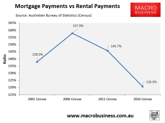
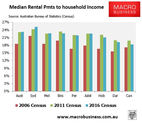
However, as shown above, the cost of renting has increased relative to household income. In turn, the ratio of median mortgage payments to median rental payments was the lowest in at least 15 years in 2016:
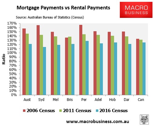
The below chart summarises the situation at the capital city level, with Sydney unsurprisingly having by far the highest mortgage burden as well as the highest rental cost burden:
However, Sydney had the lowest differential between mortgage payments and rental payments in 2016, whereas Perth’s were the highest:
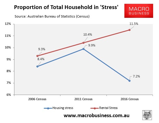
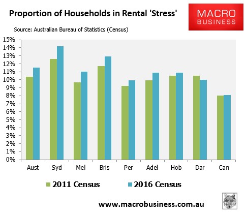
The percentage of total households nationally in ‘housing stress’ – defined as spending more than 30% of their household incomes on servicing their mortgage or paying their rents – fell significantly for mortgage holders between 2011 and 2016 (due to cratering mortgage rates), whereas it continued to rise for renters (reflecting tightening supply):
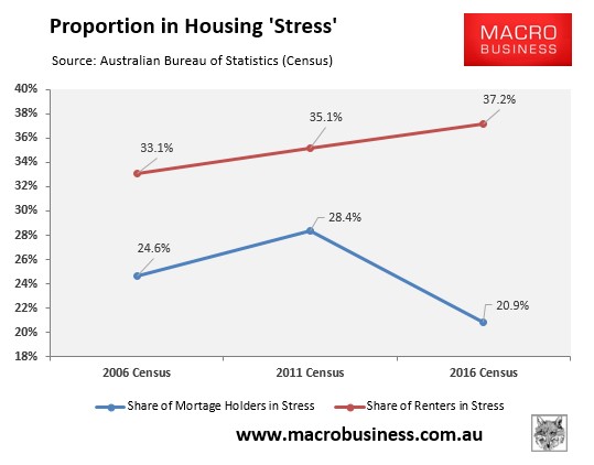
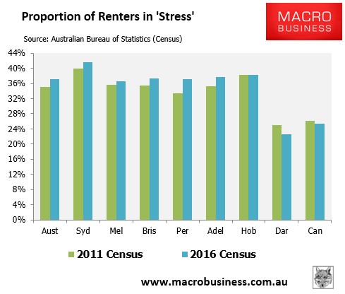
The next chart presents the same data differently by showing the proportion of mortgage holders in stress and the proportion of renters in stress:
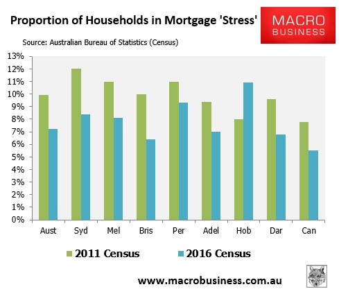
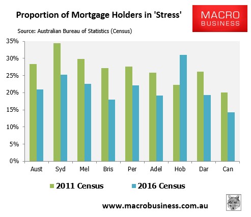
The below chart plots the situation at the capital city level, which shows that Hobart residents are suffering the most acute mortgage stress, whereas Sydneysiders are suffering the most acute rental stress:
In general we can say renters are worse off, existing mortgage holders are enjoying a reprieve from record low interest rates, affordability has cratered as reflected in the collapsing home ownership rate among the young, and wild levels of immigration have made it all worse by pressuring supply.