How strong population growth is lowering living standards
Cross-posted from Gareth Aird, senior economist at the Commonwealth Bank.
Key Points
- Australia’s commendable aggregate growth rates are boosted by strong population growth.
- Per capita measures of the economy paint a more sobering picture, particularly those relating to income.
- Local policymakers should place a greater emphasis on per capita measures of the economy, rather than aggregate growth rates which are heavily impacted by population growth.
Overview
Most economic commentary focuses on aggregate growth rates. GDP and employment growth, for example, can be headline grabbing statistics. But they are heavenly influenced by population growth – more people means more spending. Making comparisons of economic performance between countries using aggregate growth rates can be misleading if population growth rates materially differ.
Australia’s strong population growth, driven by net overseas migration, means the economy needs to be expanding at a faster rate than otherwise to achieve full employment. That of course means that the economy has the capacity to expand at a faster rate too. This means that potential growth, which is a function of population growth and productivity, is higher in Australia than most other OECD countries because of a faster growing population (chart 1).

Having a strong population growth rate is great for aggregate growth rates, like GDP, because it allows them to be higher than otherwise for a given level of productivity growth. It also means it is much harder for the economy to enter a technical recession – defined as a fall in GDP over two consecutive quarters. But if we want to measure changes in living standards, which ultimately matters most to households, then we need to look at how the economy is going on a per capita basis rather than just reporting and focusing on measures of aggregate demand. On that score, the news is a little more sobering in Australia. It suggests that policymakers should place a greater emphasis on per capita metrics and a little less emphasis on headline GDP growth…
GDP per capita
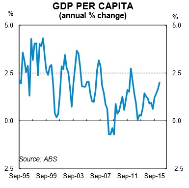
Let’s start with some good news. GDP growth in Australia is growing at a robust rate which means GDP per capita has also been lifting at a healthy clip. The latest national accounts data shows that GDP per capita rose by 2% in the year to QII 2016 (chart 3). This is a solid rate and is the fastest pace of growth since the Global Financial Crisis (GFC). So far so good. The acceleration in GDP per capita growth is attributable to a massive lift in productivity growth in the resources sector – essentially the dividend of the mining investment boom.
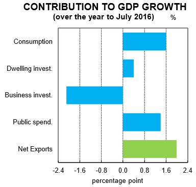
There has been a substantial contribution to GDP growth coming from net exports and more specifically resource exports (chart 4). Mining production is not labour intensive like mining investment and therefore productivity rises once production comes on stream. But this lift in productivity will wane over time. And unfortunately, the lift in output hasn’t generated the increase in national income that was originally envisaged because hard commodity prices have fallen significantly from their peak, notwithstanding the recent bounce. As a result, GDP per capita growth looks healthy and should continue to stay buoyant over the next few years. But it gives a misleading impression at the moment of both domestic demand per capita and income per capita – we focus here on the latter.
Real net national disposable income per capita
Real net national disposable income (RNNDI) per capita is a bit of a mouthful to say. But according to the ABS, it is “considered a good measure of progress for living standards because it is an indicator of Australians’ capacity to purchase goods and services for consumption”. We agree with this assessment, but note that this measure doesn’t take into account the distribution of income and therefore doesn’t take into account changes in inequality. Still, it’s a good proxy for measuring changes in the living standards of households. And the data is available in the national accounts on a quarterly basis.
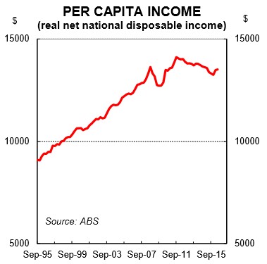
The news on RNNDI per capita is pretty ordinary at present. Fortunately growth in RNNDI per capita recently turned positive, but only after a four-year period where it was falling. The decline in the terms of trade contributed, in part, to the fall in RNNDI per capita, just as it boosted per capita growth in the decade up to 2012. The latest read on RNNDI per capita put it 4% lower in QII 2016 than the peak back in September 2011. Over that period there has been a big lift in GDP growth, population growth and employment growth. But real per capita income has fallen for most of that period which is what households feel most acutely (chart 5).
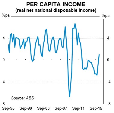
The drivers of real per capita income are (i) productivity, (ii) the employment to population ratio (i.e. participation), (iii) the terms of trade; and (iv) net foreign income. On that score, real per capita income growth has had plenty of headwinds to contend with over the recent past. And it has only just recently risen after trending downwards for five years. Without a sustained lift in the terms of trade, which we aren’t forecasting, per capita income growth looks like it will remain soft over the foreseeable future.
Unemployment rate
Back to some good news. At the headline level, the narrative around the unemployment rate has been a positive one over the past year. Since peaking at 6.3% in July 2015, the unemployment rate has been grinding lower despite the ongoing downturn in mining-related investment and associated job losses…
But before we get carried away, the quality of the jobs growth has been suboptimal as evidenced by the lack of full-time jobs growth and the rise in the underemployment rate…
Underemployment and underutilisation rates
And now to the not-so-good news. The underemployment rate has been rising. Underemployment provides a gauge of the proportion of people who are employed but whose labour is not fully utilised. That is, they have a job but want to work more and can’t find the work. The latest read on the underemployment rate showed that it hit a record high of 8.7% in August 2016 (chart 9). This is undesirable and means spare capacity in the labour market is a lot higher than the unemployment rate implies. As we have discussed previously, the rise in the underemployment rate is due to the casualisation of the labour force…
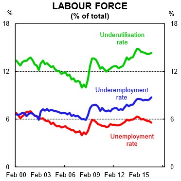
If policymakers focus too much on the unemployment rate and not enough on underemployment and underutilisation then they will be overstating the strength of the labour market. In addition, they will also be underestimating the amount of spare capacity in the economy which means inflation and wages growth forecasts will overshoot the mark, as has been the case lately…
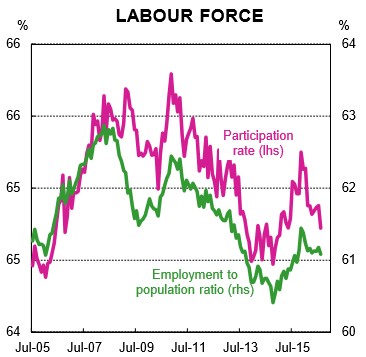
Employment to population ratio and participation rate
The employment to population ratio has been roughly flat over 2016 at around 61.1% (chart 10). This basically means that employment growth has been in line with population growth. Normally that would be associated with a flat unemployment rate, but a decline in the participation rate has allowed the unemployment rate to grind lower. A declining participation rate and flat employment to population ratio means that the downward trend in the unemployment rate is overstating the relative strength of labour demand…
The ‘grey army’ – those aged 65 and over – has continued to grow as a share of Australia’s population (chart 11). The growth of this age cohort underpins the structural decline in labour force participation. The ageing of the population has increased the dependency ratio (the age-to-population ratio of those typically not in the labour force) which underpins the need for fiscal reform.
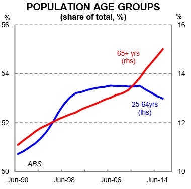
Australia’s immigration policy is designed, in part, to help offset the impacts of the growth in the dependency ratio. But it’s not a long term solution. As the Productivity Commission argued in April 2016, “the continuation of an immigration system oriented towards younger working-age people can boost the proportion of the population in the workforce and, thereby, provide a ‘demographic dividend’ to the Australian economy. However, this demographic dividend comes with a larger population and over time permanent immigrants will themselves age and add to the proportion of the population aged over 65 years.” In other words, it’s a policy more akin to kicking the can down the road.
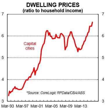
Dwelling price to income ratio
Dwelling prices to income is an interesting measure to look at when thinking about living standards and the economic wellbeing of current and future residents of a nation. Dwelling price growth has run well ahead of income growth since late 2012 (chart 12).
For the owners of property, this is basically a windfall and has underpinned a fall in the national savings rate – a phenomena otherwise known as the wealth effect (chart 13)…
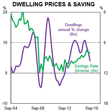
But in many ways, a rising dwelling price-to-income ratio is a zero sum game – the winners are those who own property and the losers are those who aspire to own property. The latter are generally younger in age and are now faced with the task of needing to save a much greater share of their income for a deposit – generally considered the first hurdle to overcome in purchasing a property. In addition, having to save a higher deposit is effectively a handbrake on spending to aspirational property owners. This is an undesirable consequence of dwelling prices rising faster than incomes.
… it is worth thinking about changes in the price-to-income ratio in the context of the economy because it is depicting a relationship between changes in dwelling prices over time relative to income. This allows for a greater appreciation and understanding of the distribution of wealth as well as income across the economy. Policymakers tend to focus almost exclusively on the latter…
The high dwelling price to income ratio is reflecting the combination of low interest rates and strong population growth, which have fuelled dwelling prices, coupled with weak household income growth. So there is both a numerator and denominator effect at work. As the Australian Productivity Commission noted in April 2016, “high rates of immigration put upward pressure on land and housing prices in Australia’s largest cities. Upward pressures are exacerbated by the persistent failure of successive state, territory and local governments to implement sound urban planning and zoning policies”…
Household debt to income ratio
Commensurate with the lift in dwelling price-to-income ratio, the household debt-to-income ratio in Australia has been rising (chart 14). Since mid-2012, it has risen from around 148% to a recent record high of 163% in June-2016. That puts Australia in the top tier of household indebtedness globally…
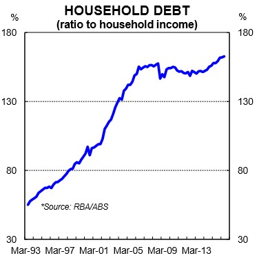
The reality is that an increase in debt relative to income means households have borrowed from the future to consume in the present. If debt is to fall as a share of income then households will need to reduce consumption as a share of income in the future. This can have major economic consequences if/when the long term debt cycle unwinds…
Public investment per capita
The economic debate clearly highlights the need to lift spending on infrastructure. And fortunately that is beginning to happen after six years of falling public investment per capita (chart 15). But it is coming off a low base.
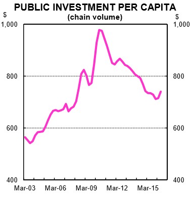
… the policy decision to run a relatively high immigration intake should be accompanied by commensurate growth in public investment. If not, in addition to the capital stock ageing, the existing stock of public infrastructure gets diluted which ultimately lowers living standards, all else equal. As a basic rule of thumb, public investment should at least be sufficient in size to both replenish the capital stock and match the lift in population…
Traffic congestion
Ok, this looks a little left field, but we consider traffic congestion and commuter times to be an important measurable component of well-being. Traffic congestion has the properties of a per capita measure because it is measuring something at the individual level. Urban congestion costs the economy dearly and is a handbrake on both productivity growth and living standards.
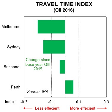
Strong population growth in Melbourne and Sydney, in particular, has led to an increase in average travel times for commuters on the road. A recent report by Infrastructure Partnerships Australia (IPA) found that road network performance has been negatively correlated with population growth. In other words, road networks have become less efficient as population growth has lifted. According to the report, Melbourne has had the sharpest deterioration in road efficiency over the past year and unsurprisingly it has the strongest population growth rate across Australia’s capital cities. Sydney has experienced the second biggest deterioration in road efficiency and also sits just under Melbourne in terms of population growth. Road efficiency has actually improved in Perth and again this is consistent with a much softer population growth rate (chart 16).
The relationship between population growth, public investment and traffic congestion illustrates that if population growth is lifting without a commensurate increase in transport infrastructure then traffic congestion by definition will rise. This means that all else equal, living standards are lowered.
Policy implications
… we think that the per capita measures of the economy warrant a broader policy discussion and response…
Strong population growth is boosting aggregate demand and therefore the growth rate of the economy. But measures of per capita outcomes are more sobering and suggest that not enough emphasis is being placed on them in the policy debate. A brief look at income per capita, dwelling prices to income, infrastructure spend per capita and traffic congestion points to the need for a comprehensive and open discussion around the policy direction Australia is taking.
