
by Chris Becker
After looking at a myriad of charts over the years, one has always struck me as being both extremely interesting and potentially – rare in technical analysis – predictable. I refer to the long term chart of stalwart staple, Woolworths (WOW):
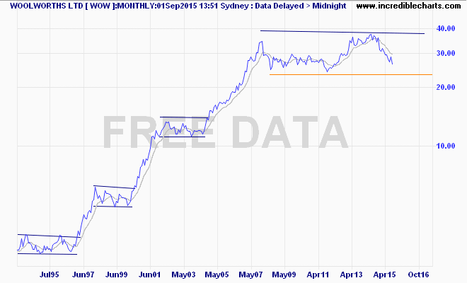
What makes the chart so interesting is the share price of Woolworths traces the move up in bull markets but goes sideways in bear markets (note 2001-2004 in particular). We’ve seen a muted response to the GFC with a sharp rally up to nearly $40 per share as the RBA unleashed its easing cycle, which lifted all boats on the ASX200. In recent months, a significant correction has transpired as the stock loses favour with even the most defensive investors as profits slid over 12% recently. But its still within the band from the GFC high…