
by Chris Becker
Regular readers of my technical analysis heavy Macro Morning piece would know that I’m looking at a possible top in US equities, namely the broader S&P500 index. Primary price analysis shows a rounding top in the weekly and monthly price action, a bearish pattern that if confirmed would see a 20-50% retracement.
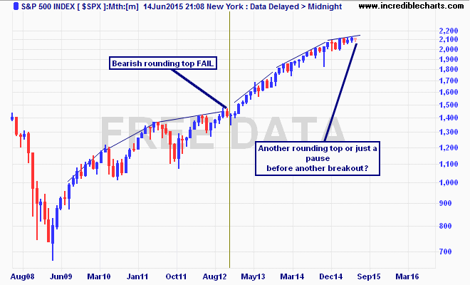
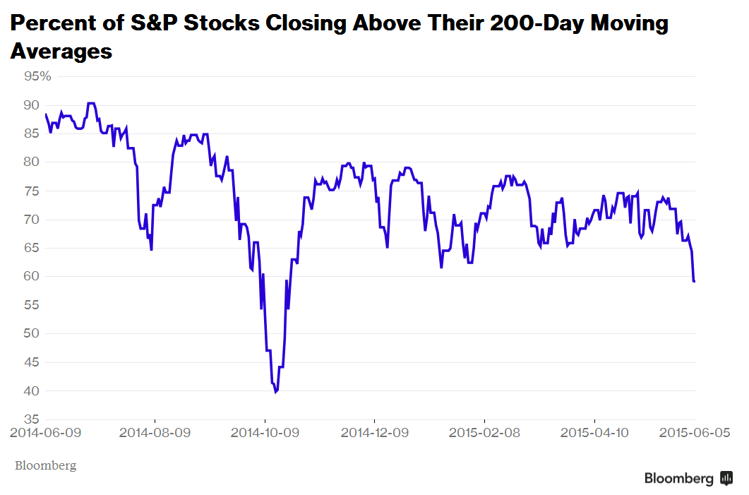
This pattern has failed before, with a major breakout in late 2012, but worked for the end of the last two secular bull markets in US stocks. Possible confirmation maybe at hand with “leading” indicator that measures the number of stocks closing above their long run moving average, which took a nosedive last week:
Analysis is not evidence and we must be careful to let our biases overrule common sense. Permabulls always look for a silver lining, while permabears always look for stormclouds, when in fact we maybe just witnessing some passing weather.
A recent post by Nick Radge at The Chartist looks much closer at this leading indicator and puts it into crystal clear context:
Notwithstanding that it’s almost an everyday event, the perma-bears seem to be digging a little harder for evidence to back up their ongoing “Dow 1000” theory. Slitting one’s wrists seems more enjoyable than reading the bearish media frenzy every day. Consider the following from Wednesday night (just before the US rallied +1.3%):

Let’s talk about breadth for a moment. Breadth refers to the ratio of rising stocks vs the ratio of falling stocks and can be measured in various ways; the number of stocks advancing vs. number declining, number hitting 52-week highs vs. number hitting 52-week lows and number above or below their 200-moving average. The more stocks falling, the more bearish the market is. It’s called a leading indicator because weakness tends to appear in breadth before the broader market rolls over.
The following chart in late 2014 offers a good example using the stocks above/below their 200-day moving average. In September the $SPX traded to a new high, yet the number of stocks above their respective 200-day moving was declining suggesting internal weakness. Come October the market took a dive.

Let’s move forward to today where where we can see a very distinct divergence taking shape. This is what the perma-bears are getting worked up about. However, there is a slight problem with their insight…

The S&P 500 is in a broad range that has been in place over the last 6-months which in turn suggests most stocks are, more or less, trading in similar ranges. But here’s the thing when using moving averages; when prices are in a range, the average itself will enter that range and trade sideways. The longer a stock remains in a range, the flatter the 200-day moving average becomes and eventually price will simply fluctuate above and below rather than definitively trend one way or the other.
In summary, yes there is divergence taking shape, but in the context of that divergence we probably shouldn’t read too much into it being a bearish signal. When looking at these leading indicators we should also combine them with other attributes to find a confluence of factors pointing to the same conclusion.
You can check out a recent podcast Nick Radge recorded here.