Earlier today, Cameron Murray, Phil Soos and Paul Egan (the “three musketeers”) co-authored what was meant to be a knock-out blow to those whom believe that Australia’s unaffordable housing has been driven in part by choked supply. Instead they argued that “Australia has built a persistently responsive supply of new dwellings, relative to the flow of new net population” and that “assertions of a housing shortage and/or restricted supply are not supported by long-term data and a host of metrics”.
Long-time readers will be aware that I do not buy the argument that Australia’s housing malaise has been caused solely by a housing shortage, but rather that a combination of demand-side factors and supply-side factors are to blame.
While I occupy the centre of this debate – and sit neither exclusively on the demand siders’ fence nor the supply siders’ fence – I want to provide my perspective on why I strongly disagree with the three musketeers, and believe that Australian housing supply has become increasingly unresponsive, which has added to affordability pressures.
Advertisement
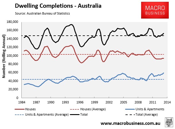
To set the scene, consider the below chart showing the rolling annual rate of dwelling completions since the early-1980s:
Viewed in isolation, there would not seem to be any problem. Dwelling completions have run more or less in line with the long-term average over the past decade, albeit with apartments (which tend to be smaller) taking share off houses.
Advertisement
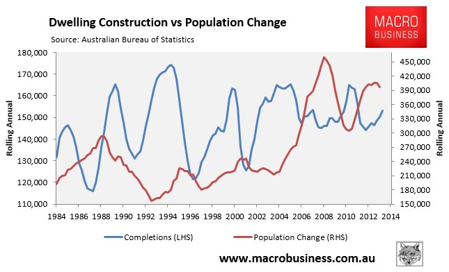
However, this chart gives a mis-leading impression of the situation, since it does not take into account Australia’s population growth, which has increased rapidly over the past decade (see next chart).
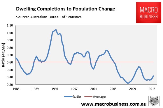
In fact, when the number of dwelling completions are compared against population growth, you can see that the rate of dwelling construction has plummeted over the past decade to well below the 30-year average (see next chart).
Advertisement
Arguably, this chart also understates the situation somewhat, since it does not take into account demolitions, which are likely to have increased in line with the growth in the housing stock as well as the increased planning focus on infill development.
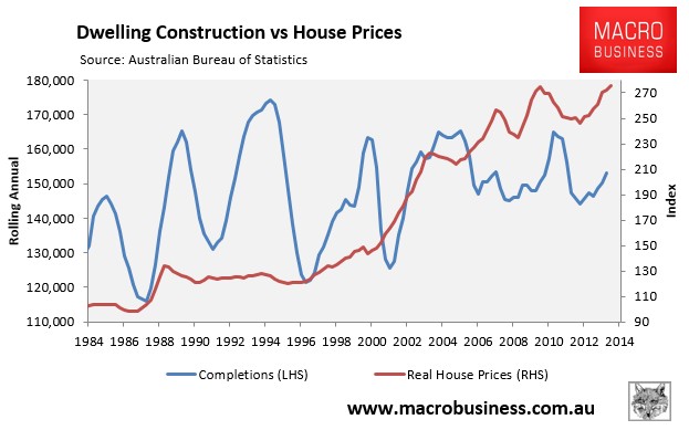
Nevertheless, if Australian housing supply was indeed responsive, as argued by the three musketeers, how do they explain the above chart? Why has the rate of dwelling construction plummeted over the past decade? Their claims are even more spurious when completions are plotted against real house price growth (see next chart).
Advertisement
As you can see, Australian house prices exploded from the late-1990s, yet there was zero lift in construction rates. Given the price elasticity (responsiveness) of supply is by definition measured as “the quantity supplied of a good or service to a change in its price” how can it then not be the case that Australian housing supply has become increasingly less responsive (“inelastic”), as argued ad nauseam on this blog over many years?
Put simply, the population and construction data does not support the three musketeers’ contention.
Advertisement
But don’t just take my word for it. Consider the below findings from leading economist, Saul Eslake, on Australia’s supply-side stasis, taken from his 50-years of housing policy failurespeech last year:
…the relationship between growth in the housing stock and population growth began to change after the early 1990s. Between 1991 and 2001, Australia’s population grew by 11.5% , while the housing stock grew by only 18.3% -less than 9 pc points more than the population. And between 2001 and 2011, while the population grew by 15.9%, the housing stock grew by only 15.2%. That is, over the past decade, the housing stock has grown at a slower rate than the population – for the first time since the end of World War II.
This gradual narrowing in the ‘gap’ between the growth rate of the housing stock and that of the population – to the point of eliminating it entirely over the past decade – has come in the face of demographic trends that would have warranted a widening of this gap:
• average family sizes declined between the early 1960s and the early 1990s, implying that more dwellings are required to accommodate the same number of people;
• family breakdowns have meant that more dwellings are required to accommodate the same number of people; and
• population ageing has resulted in more people living alone, again increasing the number of dwellings required to accommodate the same number of people.
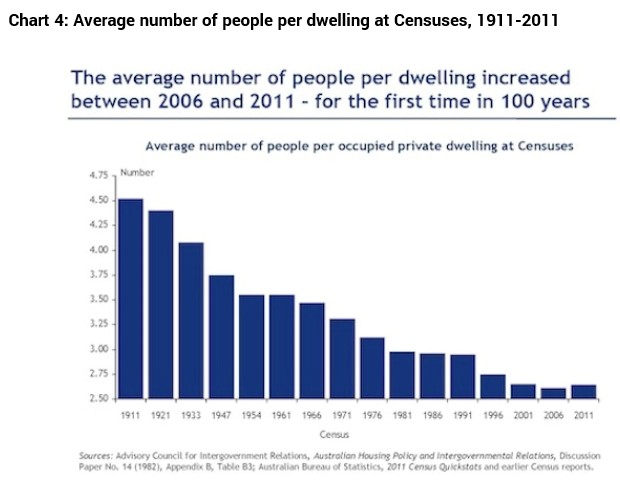
Yet, in the face of these ongoing trends, the average number of people per dwelling actually rose (from 2.61 to 2.64) between the 2006 and 2011 Censuses – for the first time in at least 100 years (since the first Commonwealth Census was conducted in 1911 – see Chart 3). From 1911 to 2006, the average number of people per dwelling had fallen from 4.52 to 2.61. It would seem that the widespread angst among ‘baby boomer’ parents about how difficult it is to get their 20-(and in some cases 30-) something children out of the family home has a sound basis in fact.
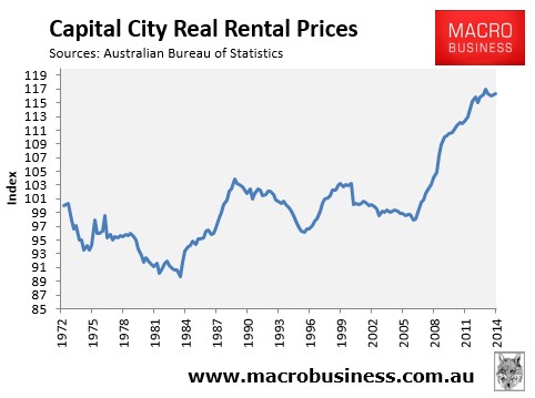
The three musketeers also go to great lengths to try and show that if supply were being restricted, then it should be showing up in rising rents. My view is that it has – rents have increased significantly over the past decade just as supply restrictions have bitten – breaking a prolonged period of relative calm whereby rents more or less tracked inflation (see next chart).
Advertisement
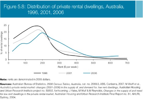
The National Housing Supply Council (NHSC) in its 2010 report also showed that rents have become significantly less affordable for lower income earners (see next chart).
Advertisement
The black line is the market in 1996. It shows a huge supply of properties let at low rents (about $150-$200 per week in 2006 dollars). However, the grey line and blue line (2001 and 2006) shows how the rental market has flattened out and pushed along the scale of rents.
Finally, the three musketeers use a straw man argument to try and debunk my claim that Texas’ relaxed approach to land/housing supply is primarily behind its affordable housing, instead arguing that Australia has actually built more homes than Texas over the period of 1990 and 2012.
Personally, I fail to see the logic here. The three musketeers have done the ultimate ‘apple and oranges’ comparison. For starters, Texas’ demographics are nothing like Australia’s and necessarily require a totally different supply response. For example, the median age in Texas is just 33.6 years old, whereas it is 37.0 in Australia. Moreover, Texas has 2.75 people per household – owing to its younger demographic – versus Australia’s 2.60.
Advertisement
Most importantly, Texas’ housing supply is affordable due to its lack of supply-side barriers, with typical starter homes built for less than three times incomes. Compare that to Australia, where typical starter homes on smaller blocks come in at 5-6 times incomes.
Further, because there is an abundance of ready-to-go lots always available at affordable prices, land values throughout Texas have remained cheap, even throughout the US housing bubble period. This has also helped curb speculative demand, since nobody expects to achieve strong price growth in Texas. Rather, investing is all about yield.
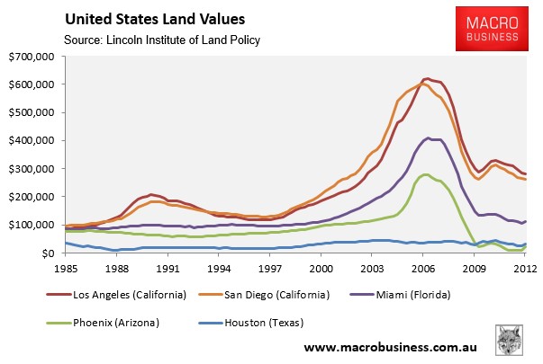
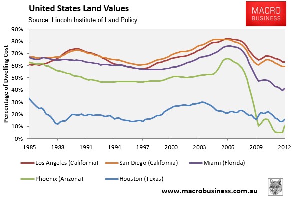
To illustrate, compare Houston’s stable and low cost land values against those of the key bubble cities of California, Florida, and Arizona where various constraints on land supply are in place (see below charts).
Advertisement
Seriously, how can the three musketeers even compare the manipulated land supply situation in Australia with Texas? They are poles apart.
Advertisement
Again, in Texas land values have remained relatively stable and affordable, whereas in Australia, the cost per square metre of vacant land has increased by around 500% over the past 15 years, with fewer lots produced in response to the rapidly rising prices – the very definition of unresponsive (inelastic) supply (see next chart).
As noted previously by the Brookings Institution’s Anthony Downs:
Advertisement
“[Competitive land supply] requires continual attention to land costs. A sufficient supply of land cannot be reliably measured by administrative attempts to match projections of supply with demand (such as a “20 year land supply”) are not fundamentally rooted in the price of land. There is a simple measure of land supply: there is enough if raw land prices permit development of new housing at historic price ratios to incomes.”
Texas meets Downs’ definition of competitive land supply. It is building for home owners exclusively. There is simply no speculation in that market due to their supply and tax policies working hand-in-hand. Therefore, the homes that are sold in Texas are entirely responsive to home buyer demand.
As long as the three musketeers continue to focus only on the demand-side of the housing equation, they will only ever see half the picture. Ditto the supply-side fanatics, who wrongly discount entirely the role played by Australia’s perverse tax incentives, amongst other things.
It is defective government policy – on both the demand and supply-sides – that are the primary cause of Australia’s housing problems. Why is it that I am one of only a few economists – Saul Eslake being another – that sees the full picture?
Leith van Onselen is Chief Economist at the MB Fund and MB Super. He is also a co-founder of MacroBusiness.
Leith has previously worked at the Australian Treasury, Victorian Treasury and Goldman Sachs.