
As summarised earlier, the Australian Bureau of Statistics (ABS) today released labour force data for the month of March, which registered a 0.2% decrease in the headline unemployment rate to 5.8%. The result beat analyst’s expectations that unemployment would rise to 6.1%. However, trend unemployment actually increased marginally to 6.0%.
Total employment increased by a seasonally adjusted 18,100 jobs in March, with the 22,100 decrease in full-time jobs more than offset by a 40,200 increase in part-time employment. Aggregate monthly hours worked also increased by 8.0 million hours (0.5%).
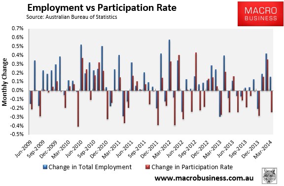
However, the fall in the unemployment rate was flattered by a 0.2% fall in the participation rate to 64.7%, which largely drove the result.
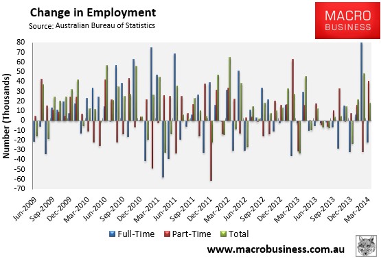
Following nearly a year of stagnation, total employment has built on last month’s gains (see next chart).
However, while recent gains are encouraging, it’s too early to pop the champagne corks, with growth in full-time jobs still in the gutter (0.3% YoY SA / 0.0% YoY Trend):
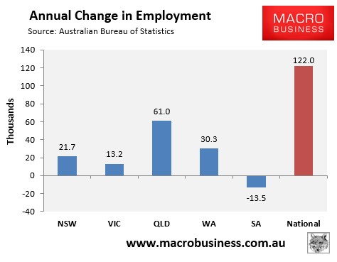
Four of the five mainland states added jobs over the year in seasonally-adjusted terms, with the mining states dominating (see next chart).
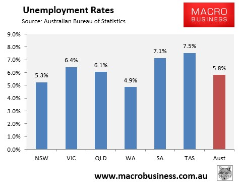
And the Southern States continue to have the highest unemployment rates (see next chart).
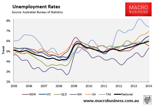
The state seasonally-adjusted figures are notoriously volatile and subject to a big margin of error. As such, the below chart shows the ABS’ trend unemployment rates, which shows Western Australia with the lowest unemployment (but rising), Tasmania and South Australia with the highest, and Victorian unemployment also rising. By contrast, New South Wales is the only state where unemployment is both below the national average and trending lower:
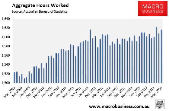
A positive from this release is that the aggregate number of hours worked rose by 0.5% in March and was up 1.6% over the year:
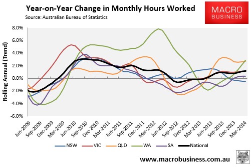
The below chart, which tracks the changes in hours worked on a trend basis, shows a mixed bag across the states:
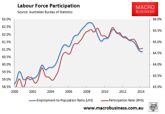
The employment-to-population ratio and the participation rate were mixed in March, with the former rising (+0.1%) and the latter falling (-0.2%) in seasonally-adjusted terms. However, both remained near 9 and 7 year lows respectively in trend terms (see next chart).
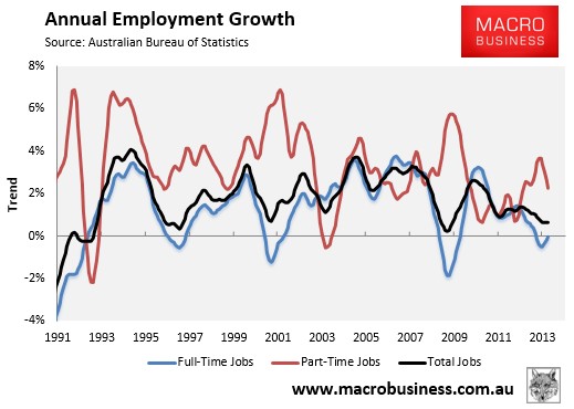
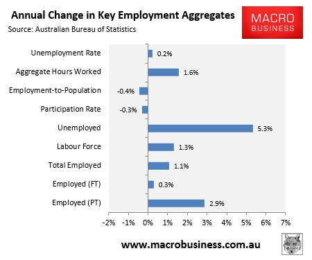
The below chart summarises the annual change in the key employment aggregates on a seasonally-adjusted basis:
Overall, it’s a positive release with an increase in the number of jobs and rising aggregate hours worked. That said, the sharp drop in the unemployment rate, which was driven by falling labour force participation, can largely be discounted as statistical noise, with the less volatile trend measure holding more or less steady.
Still, its a better result than most were expecting, with the labour market showing the markings of cyclical pick-up. The mining cliff awaits, however, which could spoil the party later in the year.