
As summarised earlier, the Australian Bureau of Statistics (ABS) today released labour force data for the month of January, which registered a 0.2% seasonally-adjusted increase in the headline unemployment rate – the highest level in a decade! The result disappointed analysts expectations, who had expected unemployment to increase to 5.9% only, as well as a 15,000 gain in employment.
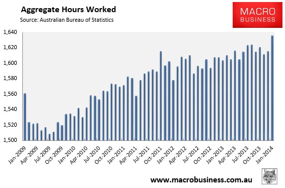
Total employment fell by a seasonally adjusted 3,700 jobs, with full-time jobs falling by 7,100 to 7,953,000 offset by a 3,400 increase in part-time employment to 3,506,500. However, aggregate monthly hours worked rose by 20.5 million hours to 1,635.8 million hours, which is one big positive from the report.
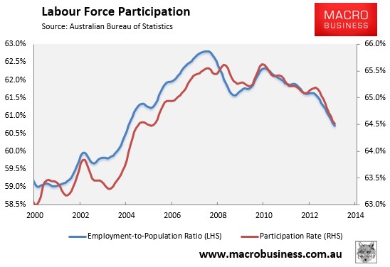
The participation rate also fell ever so slightly to 64.5% to the lowest level since January 2006.
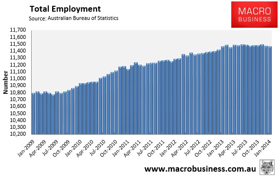
Despite the rapidly growing population, total employment is at its lowest level since March 2013 (see next chart).
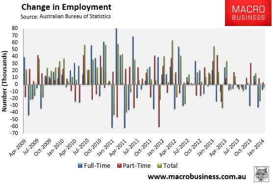
With all the jobs growth part-time and full-time jobs retrenching (see next chart):
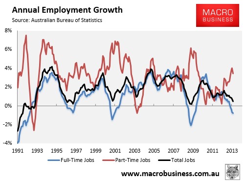
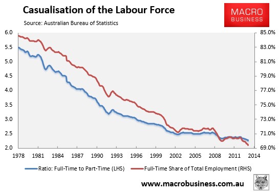
And the proportion of workers in full-time jobs at its lowest level on record:
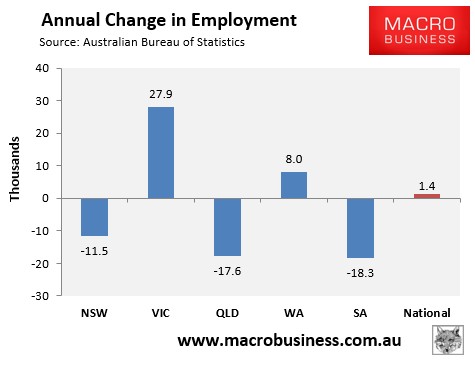
Three of the five mainland states lost jobs over the year, with overall jobs growth very weak (see next chart).
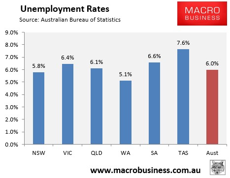
Whereas the Southern States have the highest unemployment rates (see next chart).
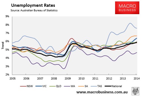
The state seasonally-adjusted figures are notoriously volatile and subject to a big margin of error. As such, the below chart shows the ABS’ trend unemployment rates, which shows Western Australia with the lowest unemployment, Tasmania and South Australia with the highest, and Victorian unemployment rising:
One big positive from this release is that the aggregate number of hours worked surged in January and was up by 2.0% over the year:
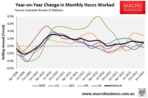
The below chart, which tracks the changes in hours worked on a trend basis, shows a mixed bag across the states:
The weakening labour market, combined with Australia’s aging population, has seen the employment-to-population ratio and the participation rate fall to their lowest level in around 9 and 7 years respectively in trend terms (see next chart).
The below chart summarises the annual change in the key employment aggregates:
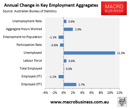
Obviously, the Australian labour market remains very weak, with jobs growth still well below the level required to absorb population growth (with all of the growth in employment over the past year part-time), and both the employment-to-population ratio and participation rate continuing to trend down. The only upside is that the aggregate number of hours worked rose to a record high, which could signal incipient demand for labour. That said, with the upcoming unwinding of the once-in-a-century mining boom and the exit of the Australian car industry, the median-term outlook is poor.
