Chart of the Day: does growth equal jobs?
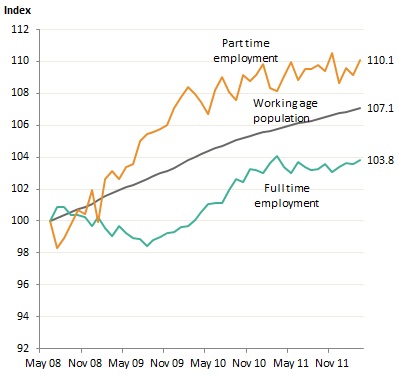
Today’s (late) chart, given the overwhelming subject throughout the day has been the “surprising” employment figures, is from Matt Cowgill, and is fairly self evident – most job growth has been via part time employment, whereas full time jobs remain static:

As Matt tweeted earlier, three points come about from the numbers released today.
First, the March 2011 figures were revised down a bit, making like for like comparisons even better. Secondly, the “44,000” jobs created must be remembered as a confidence level, not as exact numbers.
The actual range is between 10,800 jobs lost or up to 98,800 jobs gained. This equates to a 0.2% change in employment either way! (Edit: I got the figures wrong originally)
Given the methodology the ABS uses, you can never know the real numbers, which is why trend analysis makes more sense instead of monthly pinpoints.
Finally, as the above chart clearly shows, although employment grew by 0.3% over the year, the adult population grew by 1.2% – remember population growth was one of the biggest stimuli in the post GFC era, alongside many other tools.