Rismark International’s Joint managing director, Christopher Joye, yesterday posted an interesting comparison of the Australian and UK housing markets, which he cleverly uses to defend Australian housing values. Let’s take a look at some key extracts.
You often hear that Australian housing is more expensive than, say, UK or US housing, if not the dearest in the world…
One country Australia does share strong commonalities with is, naturally, the UK. The UK also has the benefit of very good housing data that is not plagued by “sample selection biases” (i.e., when you only get a fraction of the total population of home sales, as you do with US house price indices).
So today I wanted to address two simple questions.
First, have Australian housing costs risen more rapidly than their UK equivalents during the last couple of decades?
And, second, how far did UK house prices fall during the GFC, given the near complete disintegration of its banking system, with the whole or partial nationalisation of many of its largest lenders? (UK taxpayers ended up owning 100% of Northern Rock, 83% of RBS, and 41% of Lloyds.)
I ask this question because the correspondence between the Aussie and UK banking systems, which are both dominated by a small number of big institutions, and their housing markets (both have near-identical approaches to tax and similar demand and supply fundamentals) makes a study of the UK downturn a credible guide in the event that something – god forbid – catastrophic were to happen here.
That is, it gives us a reasonable indication as to how far Australian house prices might decline if our banking system imploded, the economy careened into an acute recession with soaring unemployment and default rates.
Up until this point, I agree with the way Mr Joye has framed his housing analysis. But that’s where our agreement ends. Back to the article.
Advertisement
For the purposes of this analysis we have taken the broadest possible UK house price measure, which is produced by a group called Academetrics. We then compare this with our standard RP Data-Rismark Hedonic Combined Capital Cities Index.
The results, which are illustrated in the two charts below (click to enlarge), are fascinating.
First, in the 15 or so years before the GFC, UK housing costs actually increased at a substantially greater rate than their Antipodean counterparts.
Of course, the cataclysmic economic and financial collapse subsequently experienced in the UK in 2007-08 resulted in a very significant contraction in UK dwelling prices.
Specifically, on a peak-to-trough basis, UK home values fell by 13.6%. This compares with a smaller 3.9% peak-to-trough decline in Australian dwelling values, which did not have to contend with big increases in unemployment (or arrears).
While it is true that Acadametrics (a.k.a. FT HPI) provides the broadest possible measure of UK home prices, since it comprises all sales lodged with the UK Land Registry, it is debatable that it is the most accurate measure of changes in UK home values. Importantly, the Academetrics price index uses the simple average (not median) price provided by the Land Registry. And because the index is not subject to hedonic regression (i.e. does not measure like-for-like sales), it is affected by changes in the composition of sales. Indeed, Mr Joye has previously questioned the validity of using such simplistic measures of house prices.
There are a range of UK house price measures that can be used (see here), each providing different results (see below chart).
Advertisement
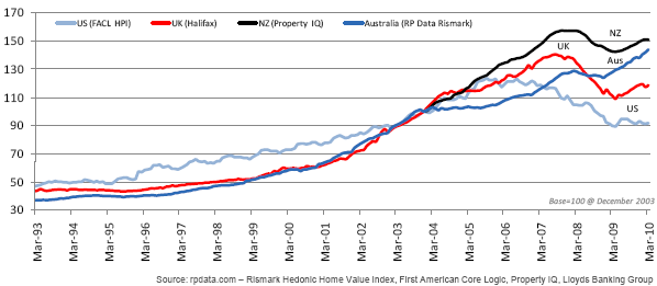
For example, had Mr Joye instead chosen the Halifax Price Series, which measures like-for-like sales via hedonic regression (in the same way RP Data-Rismark do), he would have discovered that UK home prices in fact fell 21% peak-to-trough and are still 19% below their peak. Incidentally, Rismark’s sister organisation, RP Data, has also previously used the Halifax price index to chart changes in UK home values compared with Australia’s (click to view RP Data’s chart).
Further, when the Halifax house price index is compared against the official Australian Bureau of Statistics house price index (sorry, I don’t have access to the RP Data-Rismark time-series), it shows that the growth of Australian house prices has, in fact, eclipsed that of the UK:
Advertisement
Back to the article.
Monetary policy also works differently in Australia, with almost all borrowers on “adjustable rate” loans. In the UK, the split between variable and fixed-rate loans has historically been around 50:50. This makes it harder for the UK central bank to deliver cash-flow relief to borrowers in the event of a crisis.
The circa 14% drop in UK house prices is noteworthy, but perhaps not as big as some might have expected. For example, the Aussie share market (as measured by the ASX/S&P200) has fallen further in the last month or so…
Again, when hedonic regression is applied, as it is with the Halifax index, UK home prices fell by 21% peak-to-trough, not the 14% claimed by Mr Joye.
Advertisement
Further, comparing the fall in house prices against the sharemarket is not particularly useful, since the overwhelming majority of homes are purchased with high levels of leverage, which magnifies such losses.
Again, back to the article.
A more interesting finding speaks to relative value. Because of the much stronger run-up in UK house prices prior to the GFC, the overall change in housing costs over the last 18 years has been virtually identical to Australia’s, notwithstanding the sharp recent correction.
This can be seen in two ways. First, the levels in the charts are similar after accounting for a couple of decades’ worth of value changes. Second, the compound annual growth rates between 1993 and 2011 are statistically indistinguishable (7.3% in the case of Australia, and 7.0% for the UK).
Once again, we’ll have to agree to disagree here. My chart above, along with RP Data’s chart (which also uses Halifax to measure UK house prices), shows that the growth of Australian home prices has eclipsed that of the UK’s.
Advertisement
Back to the article.
As a final test, we can compare house price-to-income ratios. Luckily the economists at ANZ, which happens to have a British CEO, have done this for us (see the third chart below). It turns out that the UK house price-to-income ratio is actually higher than Australia’s, which suggests that Aussie housing may actually be better priced.
The ANZ’s house price-to-income ratio contradicts other reputable reports, which show Australia’s ratio to be higher than the UK’s.
Second, in 2008, the RBA’s Anthony Richards gave a housing presentation that contained the below chart showing “Australia’s median house price to income ratio [to be] quite high by international standards”. Note that the ratios shown for the other nations are prior to the global house price crash. As you can see, Australia’s house price-to-income ratio is above the UK’s:
In any event, I find it curious that Mr Joye has concluded that Australia’s home prices might be better valued than the UK’s based on ANZ’s house price-to-income ratio, given that both he and ANZ are staunch critics of this measure, since it does not account for the structural lowering of interest rates over time, which obviously makes housing more affordable other things equal.
In May last year, Mr Joye wrote a post on his blog, entitled ANZ bursts house price-to-income ratio bubble, in which he lauded ANZ analysis lambasting the price-to-income measure (Mr Joye’s emphasis):
ANZ’s economists, led by Paul Braddick, have burst many of the myths surrounding Australia’s purportedly high house price-to-income ratio. Regular readers will know that I have written a great deal about this in the past. They will also know that Rismark’s produces the most comprehensive dwelling price-to-income ratio index that is available. Unfortunately, this data only begins in 1993 and did not provide a long enough time-series for ANZ to use in their note. Anyways, this is what ANZ had to say:
“International comparisons of house price to income ratios have been widely used to suggest that Australian house prices are significantly overvalued. These analyses are not only dangerously simplistic but explicitly ignore a key component of the housing affordability equation – interest rates.
House price to income ratio: a flawed measure of affordability
Simple house price to income ratios have been widely used to suggest that Australian house prices are significantly overvalued. These arguments centre around the concept of ‘mean reversion’ i.e. elevated house price to income ratios must revert to their long term historical average for ‘affordability’ to be ‘sustainable’.
However, as a measure of housing affordability, house price to income ratios are very misleading as they completely ignore interest rates. Ultimately, housing affordability comes down to debt servicing costs of which interest rates are a key driver. This not only means that house price to income ratios are fundamentally flawed as a measure of housing affordability but also makes intertemporal and cross border comparisons of these ratios next to meaningless.
In Australia, the [capital city] house price to income ratio rose from an average of around 3 in the 1980s to an average around 5 since late 2003.
That is, the median house price in recent years represents 5 times the average household’s annual disposable income compared to 3 times in the 1980s [nb: this compares capital city prices to national, all areas, incomes].
However, the major reason for this has been a structural (read permanent) reduction in interest rates. Mortgage interest rates in Australia in the 1980s averaged around 14%, however, since 2000 the average has been close to 7%. This reduction in mortgage interest rates has effectively been capitalised into house prices.
The halving of mortgage interest rates almost fully explains the measured rise in the house price to income ratio leaving the house price to income ‘mean reversion’ argument appearing myopic at best. Housing affordability and the sustainability (or otherwise) of current house price levels are extremely complex issues and drawing conclusions from simplistic aggregate metrics such as house price to income ratios is very unwise.”
A complete analysis of relative housing valuations also requires a comparison of rental yields. And on this score, Australia again compares unfavourably with the UK.
First, consider Australia’s gross rental yields as measured by RP Data:
Based on the analysis above, residential property in Australia looks to be just as good value as UK housing today. Indeed, with demonstrably superior economic and household income prospects, and faster household formation rates, one might reasonably project superior returns in future.
We’ll have to agree to disagree, Mr Joye. House prices are clearly more overvalued in Australia than in the UK.
Leith van Onselen is Chief Economist at the MB Fund and MB Super. He is also a co-founder of MacroBusiness.
Leith has previously worked at the Australian Treasury, Victorian Treasury and Goldman Sachs.


 .
. 


