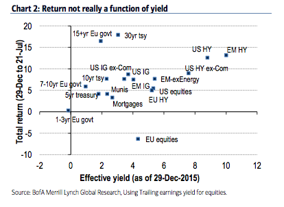
Our skepticism around the ‘yield chase’ narrative is driven by the dissonance between yields offered by various assets and realised returns since that time. Chart 2 shows the total return of various fixed income assets and equities as a function of their yield on 29-Dec-2015, the date of the recent peak in treasury yields. There is no discernable relationship between yield and return in the chart. Given a choice between extending duration and going down the risk spectrum to avoid negative yields, investors have overwhelmingly chosen the former. In our view, it is not so much that negative yields are driving investors into riskier assets, more so that they are being forced into a dwindling pool of ‘safe assets’. As an example, US IG yielded 3.7% back in December (3.44% ex-commodities), but returned less than half the performance of 30y US Treasuries, which themselves yielded a similar 3.04%, but with three times the duration.
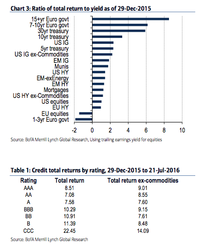
Chart 3 illustrates how the ‘safest’ assets have returned many multiples of their promised yields relative to ‘riskier’ but higher yielding assets. Within credit as well, there has been nary a difference across ratings, particularly after accounting for commodities (Table 1). Other than the CCC sector, which is quite idiosyncratic, there is scarce evidence here of a reach for yield. If anything, it furthers our argument that it has been about the reach for safety.
The full text of this article is available to MacroBusiness subscribers
David Llewellyn-Smith is Chief Strategist at the MB Fund and MB Super. David is the founding publisher and editor of MacroBusiness and was the founding publisher and global economy editor of The Diplomat, the Asia Pacific’s leading geo-politics and economics portal.
He is also a former gold trader and economic commentator at The Sydney Morning Herald, The Age, the ABC and Business Spectator. He is the co-author of The Great Crash of 2008 with Ross Garnaut and was the editor of the second Garnaut Climate Change Review.