As you know, dear reader, I have been hacking on for several years about the downward pressures on U.S. long-term growth prospects. What amazed me two years ago was to see the authorities, including the Fed, estimating a nearly 3% trend for the U.S., which seemed to me then and now as impossible. Negligible growth in population and man-hours offered to the workforce is the most important brake to growth, with a net drop of fully 1% from the pre-2000 trend. Less capital investment and growing income inequality do not help. But the most underappreciated important factor, in my opinion, is the drag on growth from the loss of sustained cheap energy as oil has moved from a $16/barrel 100-year trend pre-1972 to today’s approximate $75/barrel trend price.1 The GFC, in contrast, was a temporary factor and one that I believe (on my own, apparently) was given an exaggerated importance. Given these negative factors, I estimated a few years ago that the U.S. trend line growth for GDP was likely to be no higher than 1.5% a year, and perhaps only 1% for Europe and Japan. Well, wheels turn and estimates are re-estimated: official estimates for the longer-term growth trend of the U.S. have been falling slowly but surely over the last few years to a range from 2% to 2.5%. In the two or three years since 2012, I had expected to see them in the range of 1.5% to 2%.
Well, into this quiet world of creeping adjustment, an IMF paper released in early April of this year acted as an unexpected jolt of excitement as, unusually, estimates tumbled all the way down to 1.5%.2 Wonders never cease. Now, the question is how much will this affect the Fed’s beliefs? Presumably enough to matter. This would be timely because, as you may remember, I have been anxious about the Fed’s whipping our actual 1.5% donkey in the mistaken belief that it was a 3% racehorse. The danger was, as I said, that they would keep on whipping it until either the donkey turned into a racehorse or dropped dead. Death from overstimulation.
Not only has the IMF paper been a necessary gust of reality that might just convince Ms. Yellen that she is indeed dealing only with a humble donkey, but it has also raised some interesting further questions. It made its main point the reduced rate of growth and the ageing of the workforce. How, by the way, does this point, straight from the U.S. Bureau of Census, take over five years to make it into semi-official GDP growth estimates? It then references lower capital investment ratios in a traditional way. Also obvious enough. But what does it leave out? Resource limitations! I like to joke that the only thing that unites Austrians and Keynesians is their complete disregard for the limitations imposed by Spaceship Earth. In their thinking, a dramatic increase in price trend from the old $16/barrel to the new $75/barrel had no effect. Mainstream economics continues to represent our economic system as made up of capital, labor, and a perpetual motion machine. It apparently does not need resources, finite or otherwise. Mainstream economics is generous in its assumptions. Just as it assumes market efficiency and perpetually rational economic players, feeling no compulsion to reconcile the data of an inconvenient real world, so it also assumes away any long-term resource problems. “It’s just a question of price.” Yes, but one day just a price that a workable economy simply can’t afford!
I am still just about certain about three things: first, our secular growth rate in the U.S. is indeed about 1.5% (at least as stated in traditional GDP accounting, wherein expensive barrels of oil increase GDP; perhaps closer to 1% in real life); second, economists move their estimates slowly and carefully in order to stay near the pack and minimize career risk (despite the recent IMF heroics); and third, that we do not like to give or receive bad news and, when in doubt, we tend to be optimistic.
A brief update on the U.S. market: still not bubbling yet, but I think it will
■ The key point here is that in our strange, manipulated world, as long as the Fed is on the side of a strong market there is considerable hope for the bulls. In the Greenspan/ Bernanke/Yellen Era, the Fed historically did not stop its asset price pushing until fullyfledged bubbles had occurred, as they did in U.S. growth stocks in 2000 and in U.S. housing in 2006. Both of these were in fact stunning three-sigma events, by far the biggest equity bubble and housing bubble in U.S. history. Yellen, like both of her predecessors, has bragged about the Fed’s role in pushing up asset prices in order to get a wealth effect. Thus far, she seems to also share their view on feeling no responsibility to interfere with any asset bubble that may form. For me, recognizing the power of the Fed to move assets (although desperately limited power to boost the economy), it seems logical to assume that absent a major international economic accident, the current Fed is bound and determined to continue stimulating asset prices until we once again have a fully-fledged bubble. And we are not there yet.
■ To remind you, we at GMO still believe that bubble territory for the S&P 500 is about 2250 on our traditional assumption that a two-sigma event, based on historical price data only, is a good definition of a bubble.3 (As we like to describe it, arbitrary but reasonable, for it fits the historical patterns nicely.) 3 To be precise, using data from 1871 to today, a two-sigma level on the price series is as low as 2020. Starting in 1925, it is as high as 2400. Starting around 1900, it is 2250 and that, for good or bad, is our choice. (There is no getting away from judgment in this kind of data!) 9 GMO Quarterly Letter: 1Q 2015
■ For the record, probably the best two measures of market value – Shiller P/E and Tobin’s Q – have moved up over the last six months to 1.5 and 1.8 standard deviations (sigma), respectively. So, just as with the price-only series, they are also well on the way to bubble-dom but, clearly enough, not there yet. If we used these value series instead of just price it would add 5-10% to the bubble threshold, further improving my case that the current market still has a way to go before reaching bubble territory. Historically, we have often used the price series as both less judgmental than using measures of value, and as a much fairer comparison with other bubbles (e.g., commodities currencies and housing).
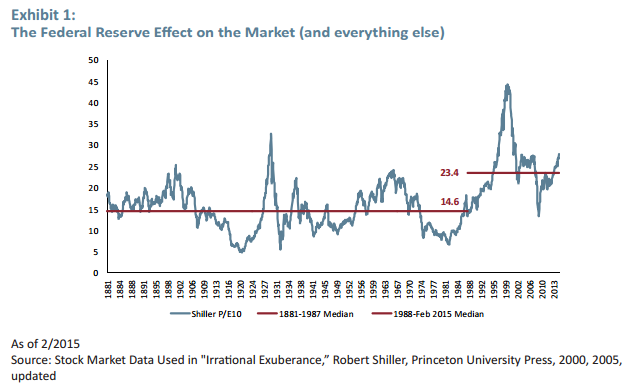
■ Bear in mind that in the Greenspan Era (from 1987 and still running) the market, measured by Shiller P/E, has averaged about 60% higher than it did prior to when the Fed’s habit (as in “addiction”) of pushing the market up in order to get a wealth effect became standard operating procedure (see Exhibit 1). It would be tempting to adjust the “normal” P/E downward for this, and treat it as a temporary anomalous phase, but we do not – we give each year equal weight.
■ Perhaps most importantly, the current economic cycle still seems only middle-aged, despite its measured long duration. For example, there is still plenty of available labor hiding in the participation rate for sure (male labor anyway).
■ It turns out that even the female labor force probably still holds substantial potential, for after a quick surge in the U.S. back in the 60s through the 90s, in recent years the female participation rate has pulled back while in other developed economies it has continued to increase. We are now well behind the average of the other 22 developed countries. So, we are in no danger at all of running out of labor.
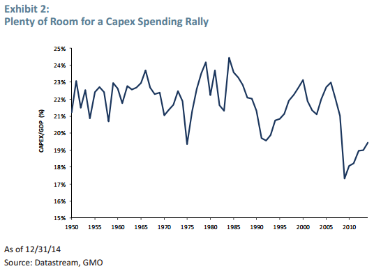
■ There is also room for an increase in capital spending, which has been quiet for years. Current capex to GDP ratio is still depressed below any level from 1950 through 2007 (see Exhibit 2). A steady rise in this capex ratio, particularly if coupled with an uptick in real hourly wages, is what is needed to inject more life into this slow-moving economic cycle. Exhibit 2: Plenty of Room for a Capex Spending Rally As of 12/31/14 Source: Datastream, GMO
■ The lower oil price should also have more of a stimulus effect for the U.S. as time passes. I argued in the last two quarters, however, that globally (in contrast to the U.S.) there would be surprisingly little benefit from lower-priced oil and that in GDP terms, as opposed to reality, it might well even be negative.
■ The U.S. housing market in terms of houses built is still way below the old average, and house prices are only around long-term fair value; there is room for improvement in both in the next two years.
■ It would, in my opinion, be odd to have a Fed-driven cycle end before the economy is working more or less flat out as it was in 1929, 2000, and 2007, to take the three other biggest equity bubbles of the last 100 years.
■ I still believe that before this cycle ends, the quantity of U.S. deals, including coinvestments, should rise to a record given the unprecedented low rates and the current extreme reluctance to make new investments in plant and equipment (how old-fashioned that sounds these days) rather than into stock buybacks, which may be good for corporate officers and stockholders, but bad for GDP growth and employment and, hence, wages.
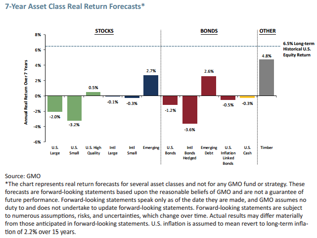
■ Please remember that this is my personal reading of the Fed’s impact. Our dismal 7-Year Forecasts speak for themselves in terms of longer-term risks and return. 7-Year Asset Class Real Return Forecasts* Source: GMO *The chart represents real return forecasts for several asset classes and not for any GMO fund or strategy. These forecasts are forward-looking statements based upon the reasonable beliefs of GMO and are not a guarantee of future performance. Forward-looking statements speak only as of the date they are made, and GMO assumes no duty to and does not undertake to update forward-looking statements. Forward-looking statements are subject to numerous assumptions, risks, and uncertainties, which change over time. Actual results may differ materially from those anticipated in forward-looking statements. U.S. inflation is assumed to mean revert to long-term inflation of 2.2% over 15 years.
David Llewellyn-Smith is Chief Strategist at the MB Fund and MB Super. David is the founding publisher and editor of MacroBusiness and was the founding publisher and global economy editor of The Diplomat, the Asia Pacific's leading geo-politics and economics portal.
He is also a former gold trader and economic commentator at The Sydney Morning Herald, The Age, the ABC and Business Spectator. He is the co-author of The Great Crash of 2008 with Ross Garnaut and was the editor of the second Garnaut Climate Change Review.