Cross-posted from Martin North’s DFA Blog.
The ratio between income and house prices in an important indicator, because if it gets too far out of whack, its a sign of stress in the system. Data is often cited to show that on average, the ratio of debt to disposable income verses house prices track quite closely and so we are not in a house price bubble. So when Christopher Joye wrote in the SMH yesterday about the risk to house prices, and published data to show the average ratio between prices and disposable income was a high 4.4, we were prompted to revisit this issue.
It is relevant because the RBA is talking about a ratio of 5.0 times using the national accounts data which includes a number of items like compulsory superannuation, workcover premiums, and owner-occupied imputed rents, none of which are really discretionary. An article in the AFR at the time, suggested a ratio of 7.0 was nearer the mark.
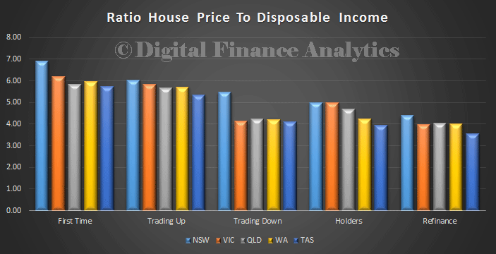
We already highlighted the risk of taking an average value across all households, and used the NSW data to show relative movements across time by segment. But we have just ran some numbers by segments, across states, from our surveys (latest date is 1 week old) and here are the results. No surprise the ratios vary by type of property owner, and also by state. First time buyers are at 7 times in NSW, whereas people refinancing in Tasmania are at 3.5 times.
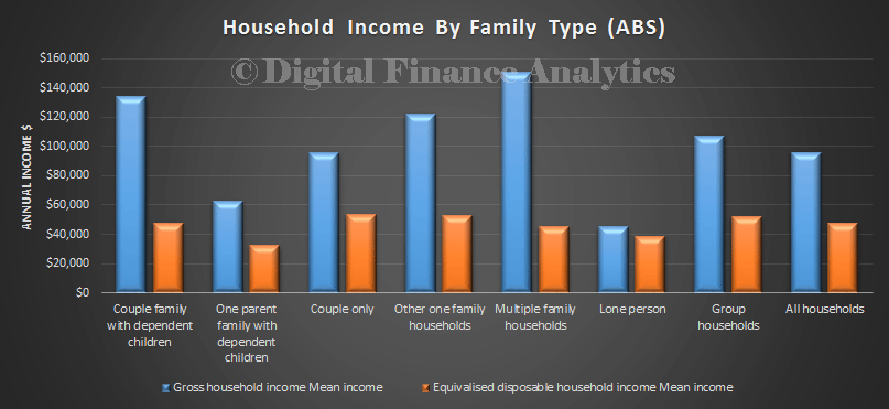
In addition, looking at data from the ABS Social Trends Database we see relative household income analysis. We show both the gross household income and disposable income, annualised in the chart below.
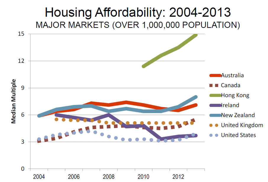
Finally, we referred back to the recent Demographia survey. Their method is based on rating affordability using the “Median Multiple” of house prices and income, which is widely used to evaluate urban markets, and which has been recommended by the World Bank and the United Nations. They do not consider mortgage costs, because interest rates vary, whereas the price for a property is more stable. Severely unaffordable geographies included Australia (6.3), New Zealand (8.0), and Hong Kong (14.9). Sydney (9.0) was the fourth least affordable major market. Highly elevated Median Multiples were also recorded in Melbourne (8.4), Auckland (8.0) and London (7.3).
It seems to me, on any of these measures, affordability is an issue, and spiraling house prices will probably lead to trouble later, either because they in turn fall, or households will extend themselves too far thanks to lax lending standards, and slip into mortgage stress. We will revisit our stress models shortly.
Bottom line is, which ever method you use to calculate these ratios, if you stick to a consistent method, the trend does not lie. And the trend is up – houses are simply not very affordable for many.
