

By Chris Becker
Australia’s currency has been used as the chief commodity proxy during, before and after the GFC. A rising AUD (vs USD, but also the other major crosses) equated with higher commodity prices, which loosely meant “risk-on”.
Last night the AUDUSD dropped below parity for the first time since June last year, accelerating its downtrend from the 1.06 level in the last month or so, whilst as I noted in last week’s report – and reinforced this week – commodity prices are now starting to recover.
So it seems, at first glance and with a very short time frame, something else is afoot with the AUD/risk-on/commodity nexus: are we seeing the start of the great AUD unwind as the underlying economy – long considered the most beautiful in the Great Ugly Western Economy contest – starts to lose its shine?
….
Remember, the following views are my own, do not constitute advice and are for information purposes only. I may have positions in any or all of the below and their associated markets both long and short, on an intra-day, daily and weekly basis for my own account. Please seek advice from a licensed adviser before making any investment decisions.
Currencies, Bonds and Gold
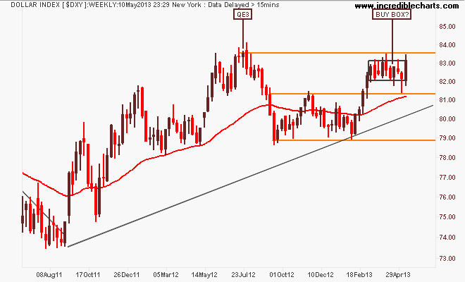
The US Dollar Index (DXY), made up of a basket of major currency pairs against the USD is a good way of measuring the so-called “risk on/risk off” meme prevalent in asset markets, with a lower USD usually meaning higher risk as US stock markets rise and push other risk assets higher, such as our own share market.
On the weekly chart last week I drew a “buy box” where it was apparent (to me at least!) that there was some major repositioning going on, and this week we’ve seen a bullish engulfing candle incorporating the whole box area. However as much as this is very bullish, the DXY has not broken above 83.5 points, yet:
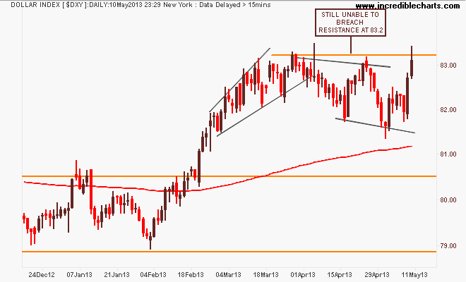
Here’s the daily chart where this consolidation has been going on, with an intraday breakout above the resistance level, but not quite yet. We would need to see a drop well below 82 points to reverse this current bullish bias – interesting in the context of the “endless” QE3 “destroying” the USD – read todays links from Zero Hedge re this:
The first general opposite of the DXY is the euro (EUR/USD). After its break of the year plus down trend in August last year, which was followed by a blowoff as it tried to reach 1.37 on the back of QE3, the euro has retraced and consolidated at the key level of 1.30 – not moving an inch:
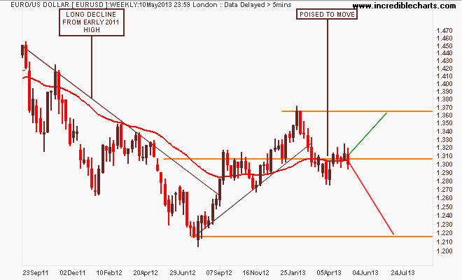
I still contend the euro is poised for a breakout – where is unknown, but my preferred momentum indicator is suggesting weakness is pushing it down in the near term:

Now for the Aussie “battler” (AUDUSD) The weekly chart remains a fascinating picture, giving an insight into how this is playing out. The key takeaway in the medium term is that clear, strong channel between support and resistance at 1.02 and 1.06 respectively since mid 2012 NO LONGER remains intact with a clear break of the former:

I said last week that “moving into the RBA meeting next Tuesday on the back of a commodity rally and risk on mood, the risk is growing of a whipsaw up through 1.04 and then a selloff if the RBA cuts rates” – I rest my case (i.e I luckily got it (mostly) right – and yes, I’m short):

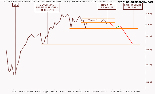
BTW heres a “sketch” I sent to someone using monthly prices, discussing possible tactics for a non-trader (i.e long only investor using the USD ETF):
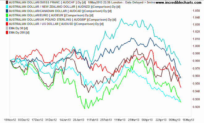
And here’s the anti-Pascoe BS chart showing how the AUD is falling against…everything!
I’ll finish the currency section with the undollar currency of the moment, gold (USD).
Four weeks after crashing through support (I don’t care how this happened, conspriacies et al, it happened, I shorted, I walked away) gold’s inevitable rebound has now completely lost momentum with a bearish engulfing candle clearly indicating the market has no confidence of further rises here, particularly the Friday night session dropping 2%:
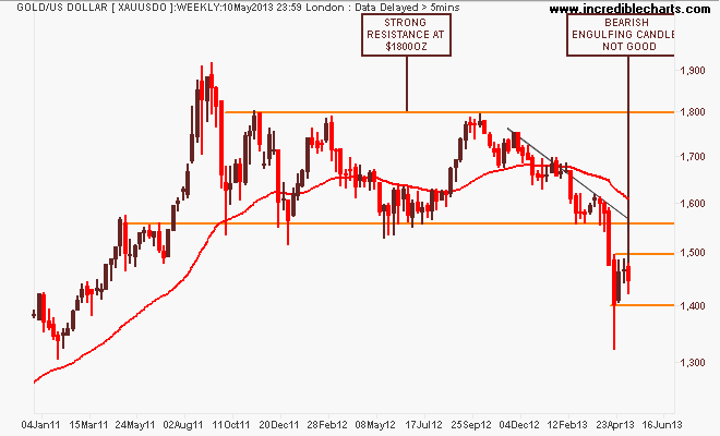
You can see this loss of momentum on the daily chart clearer, with resistance hit at $1475 and the swing and short term trend traders exiting their positions (same same) and the MACDH still remaining negative. Not a clear bullish signal at all…

Commodities
For Australian investors particularly, there’s three major commodities to watch: crude oil, copper and iron ore. I’ll leave the last to Houses and Holes with his excellent daily updates (although it’s non tradeable for retail/private investors – Fortescue Metals (FMG) and Atlas Iron (AGO) both of which I trade regularly as proxies).
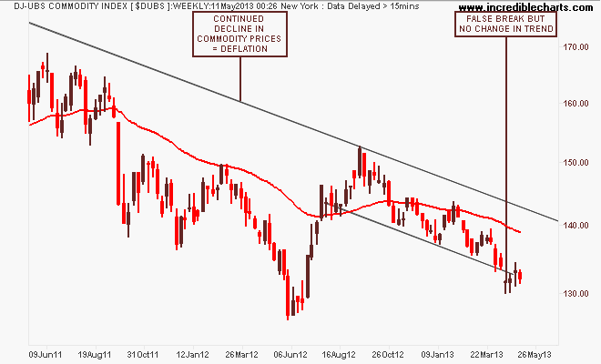
The medium term view in commodity prices is summed up in the DJ-UBS Commodity Index, a basket of commodity future prices. The trend is still clear, from the mid-2011 high, with a recent breakdown in the trend channel proving false, but no apparent change in trend for now:
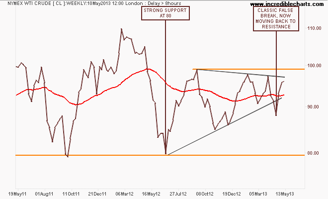
Looking at the main components, the most closely watched – WTI Crude – had recently broken down out of its ascending triangle pattern in what has been a false break. This is very bullish – a failed breakout usually means the underlying pattern bias is strong as this has wiped out the shorts and only longs remain. The target to watch is above $96USD per barrel and then above $100USD for the full enchilada:
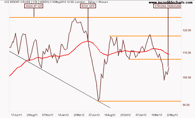
ICE Brent Crude – a marker of European demand – has now reversed properly, reflecting the bullishness that seems to be building. I still am biased towards expecting a bearish 2nd quarter with strong resistance overhead, which will reflects the weak European post-Christmas cycle – but this is a very good buy signal, particularly if it can breakthrough above resistance:
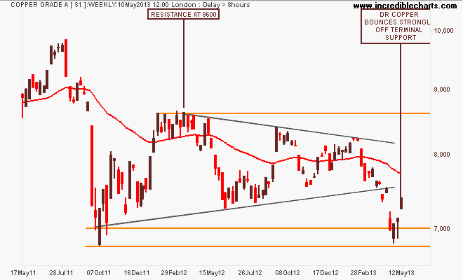
Finally, Dr Copper (so called because its the only “real” economic expert out there) continues to bounce off its September 2011 lows this week. Using the weekly chart of the London spot price, the symmetrical triangle pattern – an indication of a stalemate between bulls and bears – had broken to the downside and was on its way below terminal support at 7000.
The last couple of weeks, perhaps in reflection of gold’s rebound, has shown strong support for the key industrial metal with the previous week’s long tail under the candle indicating further rises:
Equity Markets
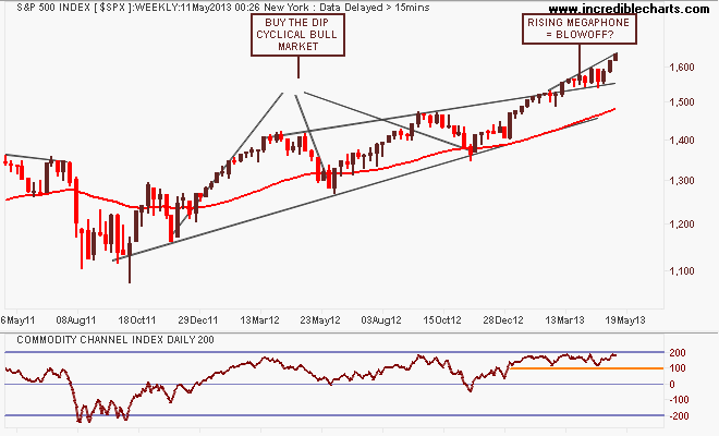
Before I get to the Aussie market, let’s look at the US S&P500 starting with the weekly chart below showing a possible blowoff again forming, with a series of higher highs that is smaller on each up cycle. But the market remains on trend with the weekly price staying above the upper trend line, as reflected in its overbought status according to CCI:
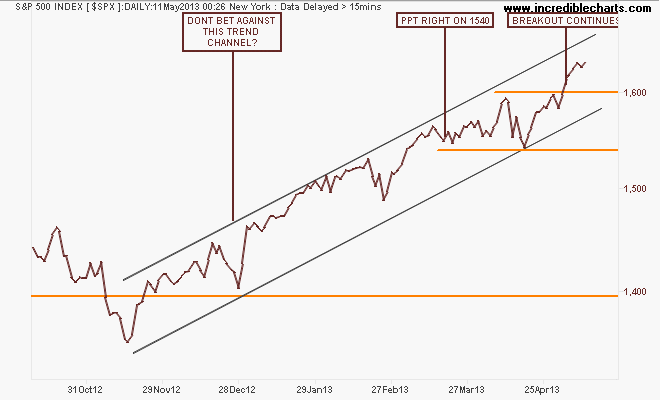
Looking at the short term point of view, note the key levels of support at 1540 points and resistance at 1600, as the breakout continues. Looks like “Sell in May” and go away will be a tougher decision this year: book massive profits or ride this liquidity led roller coaster up and up. Don’t fight that trend channel when backstopped by the Fed?
I contend that our own share market, the S&P/ASX200 index is only halfway through its own secular bear market – mainly on the back of the banking sector, which is completely dependent on an easing cycle in interest rates AND continued increases in national income AND access to wholesale credit markets at cheap prices. IMO, only one of the above is assured….
Note these important levels: the key levels at 3800-4000 (strong support), 4400 (intermediate resistance and the outer edge of the index’s real value), 4900-5000 (strong resistance, but now broken) and 6850 (the former high of the 2003-2007 bubble).
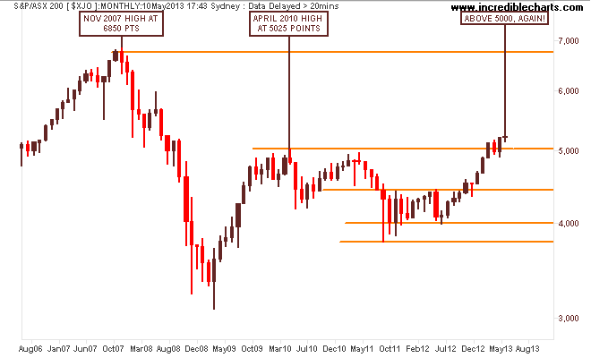
So on a long term view, it seems likely now that the key level of 5000 points will form strong support for further rallies or consolidation to come.
My medium term view remains that the recent rally has been unsustainable – and completely carried by the financials sector as the RBA eased rates to re-inflate the housing sector. That the materials sector has corrected sharply during this time as commodity prices came off the boil as Chinese authorities try to transition their economy continues to add to the risk of a correction and back to the trajectory from the first uptick in the August 2012 lows, around 4600-4700 points.
On the weekly chart, the market has broken through resistance at 5130 points as it absorbs “Bank Week” but concern will mount here that this is a false break as the three main banks go ex-dividend in the coming weeks:
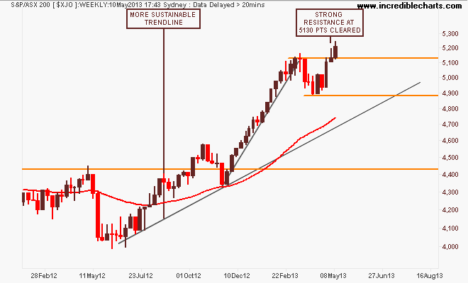
On the daily chart we can see the drawn out dip over March and April at the end of earnings season, but breaking to the upside again above 5000 points as the banks reported and pushed the index ever higher. My preferred MACDH remains in the buy zone, but the following chart puts paid to taking some risk off here:

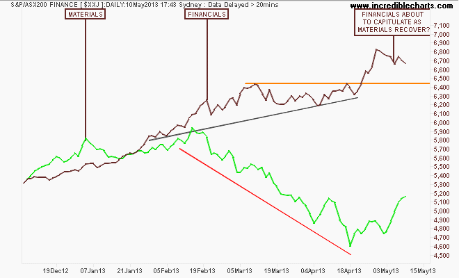
Here’s the financials and materials (green) sector daily charts are plotted and we can see a possible capitulation – following the AUD? – of banks in the coming weeks, but it looks like materials are finally finding a bid. Can they replace the banks? (An ironic question, given it’s the other way around in the macro settings with re-inflation of the housing bubble replacing the mining investment cliff):
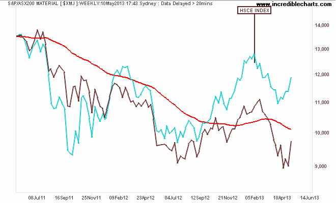
And for a possible leading index for the Materials index, here’s the Hang Seng China Enterprises (HSCE) Index:
That’s all for now, remember to manage your risk first and the returns will come thereafter. See you next week and stay safe.